Hi, I was trying to make a histogram in polar coordinate system. However, one category has a large amount of datapoint (>1000) whereas the other categories have significantly fewer points (<280). The graph turns out to be very hard to read. See below:

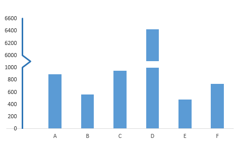
I wonder if I can add an axis break on the graph to make it nicer, like this:
I tried to manipulate the range of the axis but then it failed. And this is my code right now:
fig <- plot_ly(type = 'scatterpolar', r = df$Freq, fill = 'toself')  %>%
  add_trace(type = 'scatterpolar', r = df$Freq, fill = 'toself') %>%
  add_trace(type = 'scatterpolar', r = df$Freq, fill =  'toself') %>%
  add_trace(type = 'scatterpolar', r = df$Freq, fill =  'toself') %>%
  layout(polar = list(radialaxis = list(visible = T,range = c(0,1300))))
Could anyone help me?
Thank you for helping!!!