Update: A new post on version 5.15.0 was released since this was posted.
We are happy to announce that Plotly.py 5.13.0 is now available for download via pip and conda! For up-to-date installation and upgrading instructions, please see our Getting Started documentation page and if you run into trouble, check out our Troubleshooting Guide.
To start working with Plotly v5.13.0, using pip:
- pip install plotly==5.13.0
Or with conda:
- conda install -c plotly plotly=5.13.0
This is a combined announcement for Plotly.py versions 5.9.0 through 5.13.0 and highlights some of the main updates. See the full changelog
 Grouped Scatter Support
If you’ve ever wanted to overlay scatter points on bars, you can now do it with Plotly.py. In the following example, we use the new attributes scattermode and offsetgroup on scatter to create a figure that shows individual points on a grouped scatter and averages with grouped bars. For the full code for this example, see the multiple chart types page in the Plotly.py docs.

There’s also a new scattergap attribute that you can use to adjust the gap between the different scatter groups. These examples show grouped scatter points with 1) a default gap and with 2) a scattergap of 0.75.
import plotly.express as px

df = px.data.medals_long()

fig = px.scatter(df, y="count", x="nation", color="medal")
fig.update_traces(marker_size=10)
fig.update_layout(scattermode="group")
fig.show()

import plotly.express as px

df = px.data.medals_long()

fig = px.scatter(df, y="count", x="nation", color="medal")
fig.update_traces(marker_size=10)
fig.update_layout(scattermode="group", scattergap=0.75)
fig.show()

This feature was anonymously sponsored. Thank you to our sponsor! ![]()
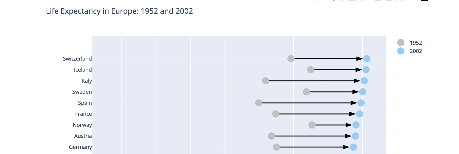
 New Markers and Angle Attributes
It’s now easier to build network graphs and other graphs that require arrows and angles to show change or direction. Plotly.py introduces new arrow symbols and the attributes angle, angleref and standoff on marker and backoff on line. This example of a dumbbell plot from the Plotly.py docs uses the new arrow markers. You’ll find further documentation and examples on the marker style page.
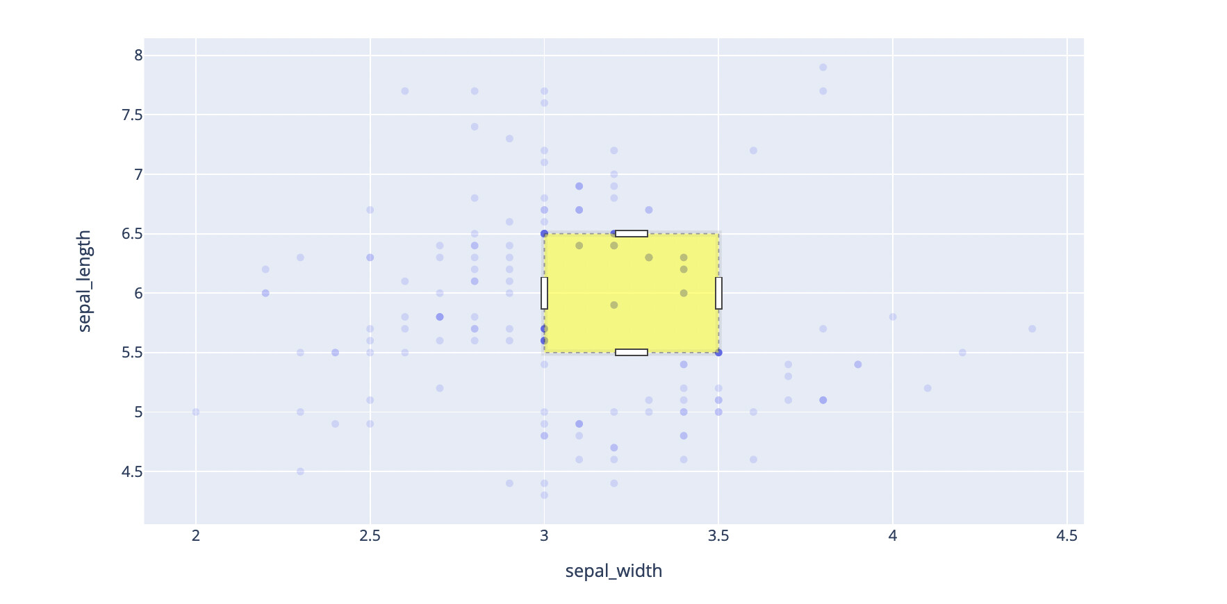
 Persistent Selections
If you want to capture information about a user selection when using Plotly.py graphs in a Dash app, the new persistent selections feature offers new possibilities. The Dash 2.6 announcement offers more detail on using selections in a Dash context. In addition to selections now being persistent, you can add selections that display when a graph renders as well as style selection lines and fills in different ways.
import plotly.express as px

df = px.data.iris()

fig = px.scatter(df, x="sepal_width", y="sepal_length")
fig.add_selection(x0=3.0, y0=6.5, x1=3.5, y1=5.5)

fig.show()

import plotly.express as px

df = px.data.iris()

fig = px.scatter(df, x="sepal_width", y="sepal_length")
fig.add_selection(x0=3.0, y0=6.5, x1=3.5, y1=5.5)

fig.update_layout(dragmode='select',
                  activeselection=dict(fillcolor='yellow'))

fig.show()
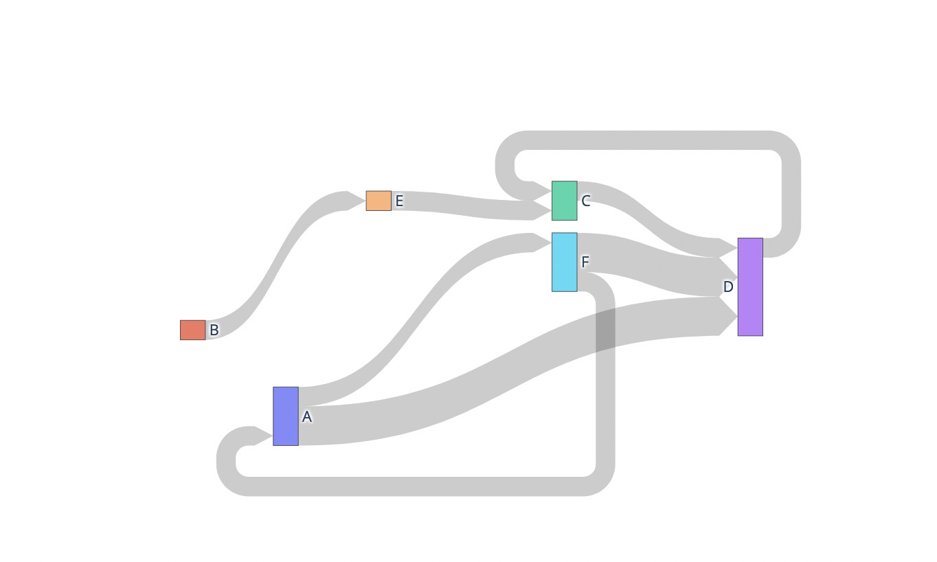
 Sankey Links with Arrows
You can now create Sankey diagrams with arrow links. Use arrowlen to set the length (in px) of link arrows.
import plotly.graph_objects as go

fig = go.Figure(go.Sankey(
    arrangement='snap',
    node=dict(
        label=['A', 'B', 'C', 'D', 'E', 'F'],
        x=[0.2, 0.1, 0.5, 0.7, 0.3, 0.5],
        y=[0.7, 0.5, 0.2, 0.4, 0.2, 0.3],
        pad=10
    ),
    link=dict(
        arrowlen=15,
        source=[0, 0, 1, 2, 5, 4, 3, 5],
        target=[5, 3, 4, 3, 0, 2, 2, 3],
        value=[1, 2, 1, 1, 1, 1, 1, 2]
    )
))

fig.show()
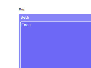
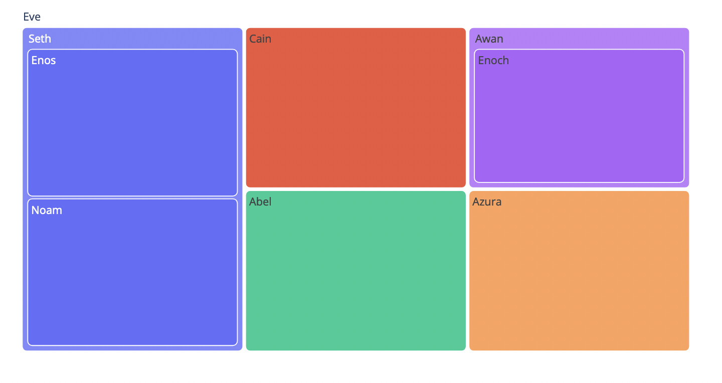
 Rounded Corners on Treemaps
Plotly.py now supports creating treemaps with rounded corners by setting cornerradius on marker:
import plotly.express as px
fig = px.treemap(
    names = ["Eve","Cain", "Seth", "Enos", "Noam", "Abel", "Awan", "Enoch", "Azura"],
    parents = ["", "Eve", "Eve", "Seth", "Seth", "Eve", "Eve", "Awan", "Eve"]
)
fig.update_traces(marker=dict(cornerradius=5))
fig.show()
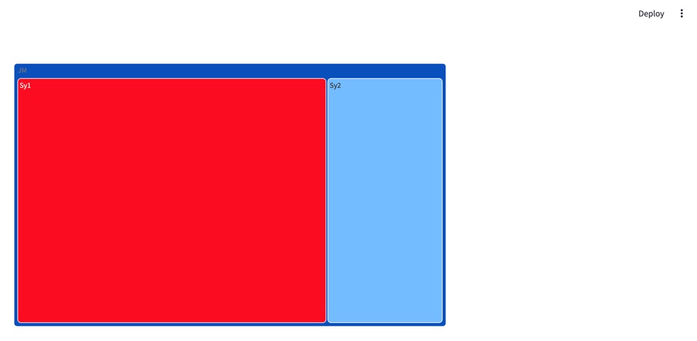
 Syncing Axes Ticks
With overlayed axes, each axis by default has its own number of ticks. This can lead to graphs like this with odd spacing on ticks and gridlines (see how the axes on both sides don’t align)

You can now sync the number of ticks on overlayed axes, by setting "tickmode=sync" on an axis that is overlaying another:

The full code for this example is available on the multiple axes page.
Avoiding Overlapping Y Axes
If you’ve ever encountered issues with axes with the same overlaying value overlapping, there are now two new attributes to help. To automatically reposition axes to avoid overlap with other axes with the same overlaying value, set autoshift=True.
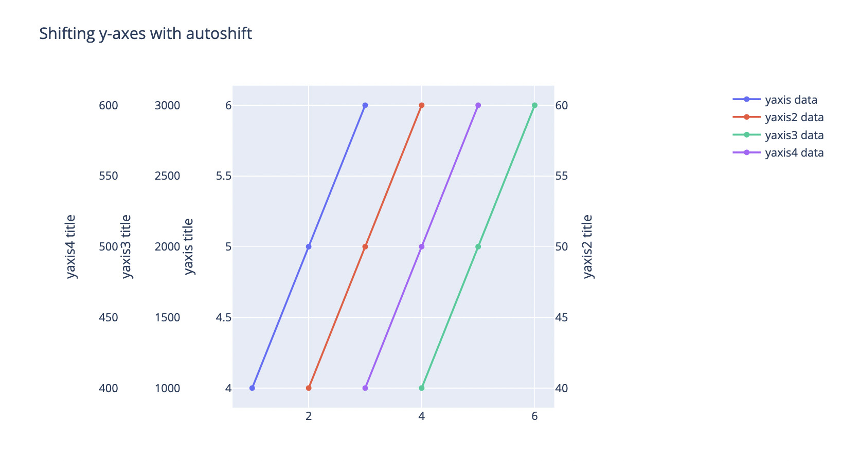
You can also set a shift value on an axis to shift an axis by that number of pixels.
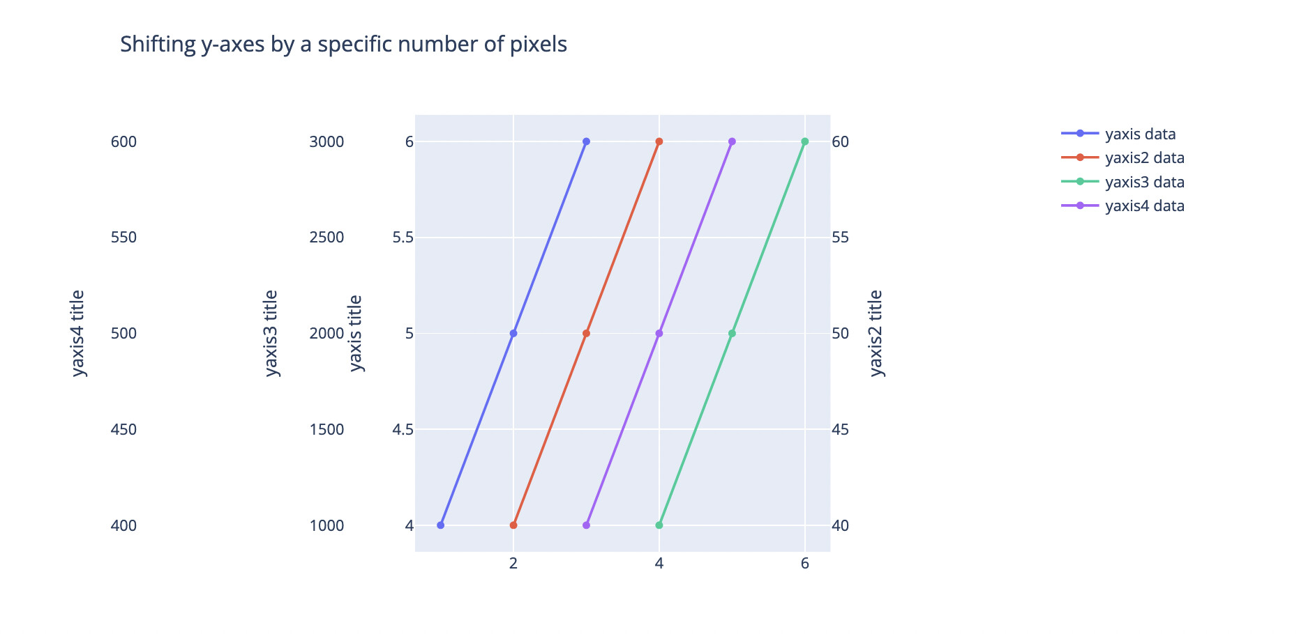
For the code for these examples see the multiple axes page.
Thanks to Gamma Technologies for sponsoring the related development! ![]()
 Setting Map Bounds
If you want to restrict a map to one area, outside which a user interacting with the map can’t pan or zoom, this is now possible on Mapbox scatter plots by using map bounds . Here we set a maximum longitude of -180, a minimum longitude of -50, a maximum latitude of 90, and a minimum latitude of 20.
import plotly.express as px
import pandas as pd

us_cities = pd.read_csv(
    "https://raw.githubusercontent.com/plotly/datasets/master/us-cities-top-1k.csv"
)

fig = px.scatter_mapbox(
    us_cities,
    lat="lat",
    lon="lon",
    hover_name="City",
    hover_data=["State", "Population"],
    color_discrete_sequence=["fuchsia"],
    zoom=3,
    height=300,
)
fig.update_layout(mapbox_style="open-street-map")
fig.update_layout(margin={"r": 0, "t": 0, "l": 0, "b": 0})
fig.update_layout(mapbox_bounds={"west": -180, "east": -50, "south": 20, "north": 90})
fig.show()

 Clusters
It is now possible to display clusters of data points on Mapbox scatter plots. Here, we enable clusters with enabled=True. You can also enable clusters by setting other cluster properties. See the reference docs for more details on available properties.
import plotly.express as px
import pandas as pd

px.set_mapbox_access_token(open(".mapbox_token").read())
df = pd.read_csv(
    "https://raw.githubusercontent.com/plotly/datasets/master/2011_february_us_airport_traffic.csv"
)
fig = px.scatter_mapbox(df, lat="lat", lon="long", size="cnt", zoom=3)
fig.update_traces(cluster=dict(enabled=True))
fig.show()

 Powered by Plotly.js 2.18.0 and perfect for Dash 2.8.1
The version of Plotly.js that Plotly.py 5.13.0 is built on is the same one that’s bundled with the just-released Dash 2.8.1, so we recommend that if you’re a Dash user you upgrade to Dash 2.8.1, to get the full benefit of all of these libraries working together.
 Get it now!
To sum up: Plotly.py 5.13.0 is out and if you’re excited about any of the above features, head on over to our Getting Started documentation page for full installation instructions!
 In Case You Missed It: Previous Announcements
- Plotly.py 5.8
- Better Autocompletions with Type Hints
- Minor Ticks
- Plotly.py 5.7
- Patterns on areas
- Tick label steps (Plotly 5.6)
- Text on histograms and heatmaps (Plotly 5.5)
- Smith charts (Plotly 5.4)
- Legend group click (Plotly 5.3)
- Plotly.py 5.2 and 5.1
- Trendlines
- ECDF Plots
- Markers on Lines
- Sharper WebGL
- Legend Group Titles
- Plotly.py 5.0
- A combined, federated JupyterLab Extension
- Bar Chart Patterns (aka Hatching or Textures)
- Icicle and Flame Charts
- Explicit Legend-Item Ordering
- Faster JSON serialization with
orjson