Hi all! I am fairly new to plotly and am trying to figure out a bug.
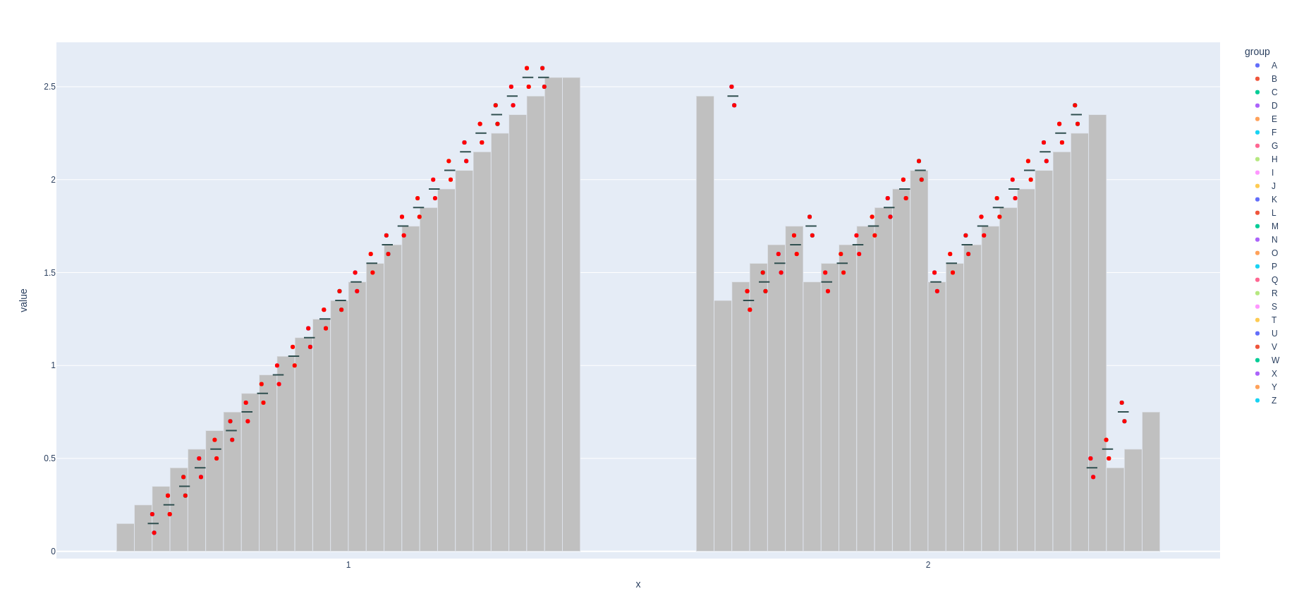
I have two major groups in my x-axis (here, “1” and “2”). When I add traces to my grouped figure, I get different x-axis scaling (?) for plotly express bar traces than I get when I add px box traces or strip traces. This does not occur for a non-grouped x-axis.
How I construct the initial figure:
fig = px.strip(df, x='x', y='value',color='group')
How I add traces:
for bar_data in pxbar.data:
    bar_data['marker']['color'] = 'silver'
    bar_data['showlegend'] = False
    fig.add_trace(bar_data)
Can someone please explain why this occurs, and help me troubleshoot how to fix it?
Thanks!