Hello guys,
I’m trying to create a Chord Diagram that will represent the relation between two different users, exactly as you can see on the image below;
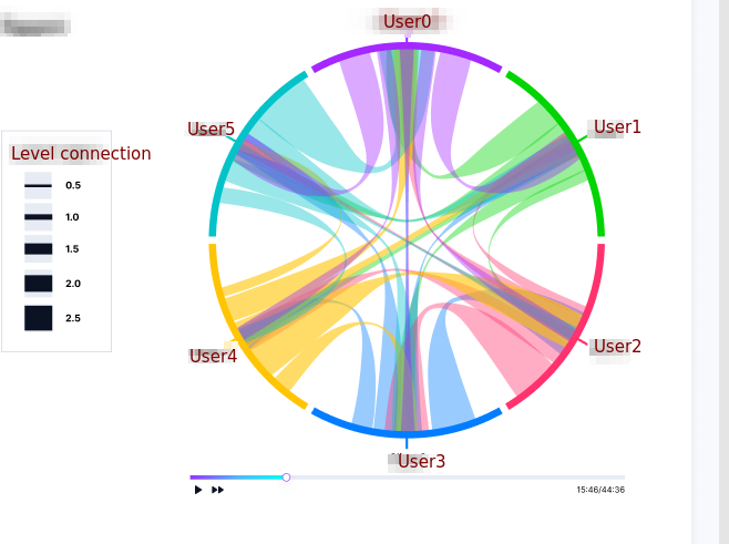
I read the Plotly tutorial Filled chord diagram in Python/v3 but unfortunately it’s not working well;
I would like to know if someone has experience with this chart or has a good reference that I can use to understand how to implement it
Below is a sample data:
[{'users_relation': '5ddd6939<->f3c525e3',
  'user_0_idx': '5ddd6939',
  'user_1_idx': 'f3c525e3',
  'score': 0.8205884909272926,
  'time_order': 0},
 {'users_relation': '5ddd6939<->825b50dc',
  'user_0_idx': '5ddd6939',
  'user_1_idx': '825b50dc',
  'score': 0.7253207649551456,
  'time_order': 0},
 {'users_relation': 'f3c525e3<->825b50dc',
  'user_0_idx': 'f3c525e3',
  'user_1_idx': '825b50dc',
  'score': 0.7933140542847614,
  'time_order': 0}]
Any help/suggestion will be really appreciated and welcome;
**Please note, you can ignore the “time” part, as my focus in building the chart;
Regards,