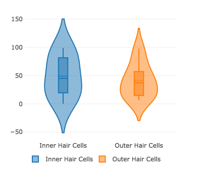
I am having trouble with the python violin plotting. The output plot (below) plots vertical lines instead of violins. The code I’ve included was correctly plotting violins earlier this week for me, but in case I inadvertently changed something to cause this, I thought I’d post this on here.
I have been using the example "Multiple Traces’ from here: https://plot.ly/python/violin/
expression is a pandas dataframe with columns raw_value and cell_type:
import pandas as pd
import plotly.offline as py

expression = pd.DataFrame({'raw_value': [25.0, 16.0, 98.0, 14.0, 14.0, 99.0, 6.0, 15.0, 32.0, 27.0, 93.0, 57.0, 37.0, 50.0, 40.0, 70.0, 33.0, 97.0, 9.0, 0.0, 53.0, 69.0, 48.0, 10.0, 75.0], 'cell_type': ['Inner Hair Cells', 'Outer Hair Cells', 'Outer Hair Cells', 'Outer Hair Cells', 'Inner Hair Cells', 'Inner Hair Cells', 'Outer Hair Cells', 'Outer Hair Cells', 'Outer Hair Cells', 'Outer Hair Cells', 'Inner Hair Cells', 'Inner Hair Cells', 'Outer Hair Cells', 'Outer Hair Cells', 'Outer Hair Cells', 'Inner Hair Cells', 'Inner Hair Cells', 'Outer Hair Cells', 'Outer Hair Cells', 'Inner Hair Cells', 'Outer Hair Cells', 'Outer Hair Cells', 'Outer Hair Cells', 'Outer Hair Cells', 'Outer Hair Cells']})


celltypes = expression['cell_type'].unique()
celltype_count = len(celltypes)
data = []
for i in range(0, celltype_count):
    trace = {
        "type": 'violin',
        "x": expression['cell_type'][expression['cell_type'] == celltypes[i]],
        "y": expression['raw_value'][expression['cell_type'] == celltypes[i]],
        "name": celltypes[i],
        "box": {
            "visible": True
        },
        "meanline": {
            "visible": True
        }
    }
    data.append(trace)

fig = {
    "data": data,
    "layout" : {
        "title": "",
        "yaxis": {
            "zeroline": False,
        },
        "legend": {
            "orientation": "h"
        },
        "height": 350,
        "width": 400,
        "margin": {
            "l": 50,
            "r": 50,
            "b": 75,
            "t": 25,
            "pad": 4
        }
    }
}
html = py.plot(fig, output_type='div', validate=False, include_plotlyjs=False, show_link=False)
Output:

Thank you in advance!