Hello,
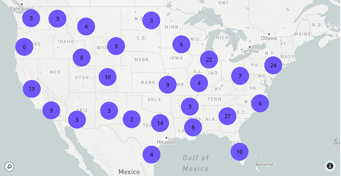
I’m following the official tutorial on this page to learn how to display clusters of data points. It as simple as:
import plotly.express as px
import pandas as pd

px.set_mapbox_access_token(open(".mapbox_token").read())
df = pd.read_csv(
    "https://raw.githubusercontent.com/plotly/datasets/master/2011_february_us_airport_traffic.csv"
)
fig = px.scatter_mapbox(df, lat="lat", lon="long", size="cnt", zoom=3)
fig.update_traces(cluster=dict(enabled=True))
fig.show()
However, it could be really nice if each individual point was the same size (in cases where each row of the DataFrame is equally important) and if the size of the clusters of data points varied according to the number of data points inside the clusters. For example, when we would zoom in to see each data point individually, they would all be exactly the same size. However, when we would zoom out to see clusters, then each of them would be bigger according to the number written in the center of the circle.
How can it be done?

