Hi guys,
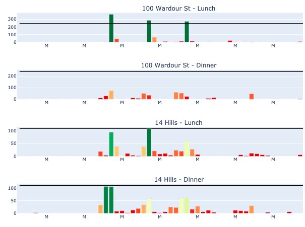
I’ve made an app that primarily consists of 1 figure of subplots generated from Plotly Graph Objects - the x values of the traces are dates, & Plotly automatically sets the x axis ticks at each Sunday value, & sets the tick values as the month abbreviation & day, e.g. ‘Dec 6’.

I want to change this, essentially to make the weeks as distinguishable as possible, & the best way I’ve found to do this is to make the ticks ‘M’ at each Monday value.*
I’ve added an update_xaxes method call to update the ticks of the figure (‘visit_day’ is the date column) :
mondays = [x for x in df[‘visit_day’].unique() if pd.to_datetime(x).date().weekday() == 0]
fig.update_xaxes(
tickmode=‘array’,
tickvals=mondays,
ticktext=[‘M’]*len(mondays)
)
When running this within Jupyter Notebook & simply showing the figure, it returns the below.
However, when I run this as an app in Dash, the x axes ticks revert back to the original Sun dates, i.e. the update_xaxes call doesn’t work.
The add_trace, update_layout method calls worked fine - is there another way to do this outside of the update_xaxes method? I’ve tried update_layout(xaxis=dict( etc., but can only manage to change the x axis ticks of the first subplot this route.
Here’s my code for generating the figure :
def totals(restaurant_list):
title_strings = [[x + ' - Lunch', x + ' - Dinner'] for x in restaurant_list]
titles = tuple(title_strings[i][j] for i in range(len(restaurant_list)) for j in [0,1])

fig = make_subplots(
    rows=len(restaurant_list)*2,
    cols=1,
    subplot_titles = titles
)

for i in range(len(restaurant_list)):
    fig = add_totals(lunch_df, i, 1, restaurant_list, fig)
    fig = add_totals(dinner_df, i, 2, restaurant_list, fig)

fig.update_layout(
    height=len(restaurant_list)*300,
    width=900,
    coloraxis=dict(
        colorscale='RdYlGn',
        cmin=0,
        cmax=1,
        showscale=False),
    showlegend=False,
    margin=dict(t=30,b=10,l=10,r=10),
)

fig.update_xaxes(
    tickmode='array',
    tickvals=mondays,
    ticktext=['M' for x in range(len(mondays))]
)

return fig
def add_totals(df, i, num, restaurant_list, fig):
dff = df[df['restaurant'] == restaurant_list[i]]
ymax = max(max(dff['max_guests TW']), max(dff['capacity']))
row = (i*2)+num
bookings_hover_template = '%{y} - %{customdata} %{x}'
capacity_hover_template = '%{y}'

fig.add_trace(
    go.Bar(
        x=dff['visit_day'],
        y=dff['max_guests TW'],
        name='Covers',
        customdata=dff['weekday'],
        hovertemplate=bookings_hover_template,
        marker=dict(
            color=dff['full TW'],
            coloraxis='coloraxis',
            cmin=0,
            cmax=1
        )
    ),
    row=row, col=1
)
fig.add_trace(
    go.Scatter(
        x=dff['visit_day'],
        y=dff['capacity'],
        name='Capacity',
        hovertemplate=capacity_hover_template,
        marker=dict(color='black')
    ),
    row=row, col=1
)
return fig
*I’ve tried adding vlines & vrects on the Monday values, which would theoretically distinguish the weeks more clearly, but the vlines/boundaries of the vrects fall in the middle of the Monday bars, instead of between the Sunday & Mondays bars - I’m not sure how to make them fall in between Sunday & Monday? Any other suggestions would be massively appreciated
Thanks!