Hi, everyone. I’m new to using plotly. I would like to know if someone can help me with this issue.
I did a histogram using plotly express. The x-axis of the histogram changes with an update button, so I can show the histogram monthly or annual. I did it using the next code:
color = {'2.0 - 2.9':'#2c7bb6','3.0 - 3.9':'#abd9e9','4.0 - 4.9':'#ffffbf','5.0 - 5.9':'#fdae61','6+':'#d7191c'}
fig = px.histogram(earth, y="Mes", color='Magnitud', color_discrete_map=color)
data_info=['Mes','Año']


fig.update_layout(
    updatemenus=[
        {
            "buttons": [
                {
                    "label": c,
                    "method": "update",
                    "args": [{"y": [earth[c]]}, {"yaxis.title":c}],
                }
                for c in data_info
            ],
            "direction": "right",
            "type":"buttons",
            "x":1,
            "y":1.10
        }
    ],
)
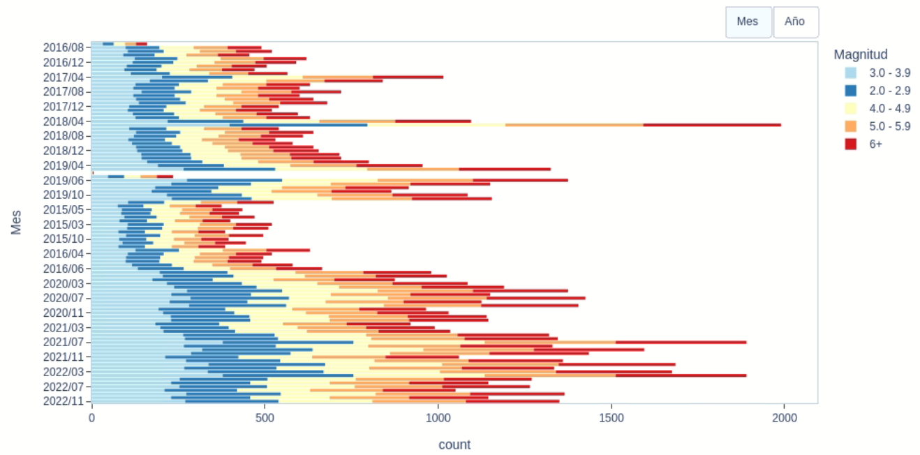
The button works fine. However, when I update the histogram the data in the color categories changes.
But every time I update the histogram, I get this:
Thanks for the help!
Hello @KPinedaO
Using your code I face the same issue, I don’t rely understand the why the color categories change.
However, I wrote this lines of code and adapt it to your data.
Try it and let’s me know if it solve your problem.
color = {'2.0 - 2.9':'#2c7bb6','3.0 - 3.9':'#abd9e9','4.0 - 4.9':'#ffffbf','5.0 - 5.9':'#fdae61','6+':'#d7191c'}
data_info=['Mes','Año']

fig = go.Figure()
for c in earth['Magnitud'].unique():
    for i,j in enumerate(data_info):
        fig.add_histogram( y=earth[earth['Magnitud']==c][j],
                          name=c,
                          marker={'color': color[c]},
                          visible = bool(i))

# # buttons for updatemenu
buttons = [dict(method='restyle',
                label='Mes',
                visible=True,
                args=[{'label': 'linear',
                       'visible':[True,False]*earth['Magnitud'].nunique() ,
                      }
                     ]),
           dict(method='restyle',
                label='Año',
                visible=True,
                args=[{'label': 'linear',
                       'visible':[False,True]*earth['Magnitud'].nunique(),
                      }
                     ])]

# specify updatemenu
um = [{'buttons':buttons,
       'type':'buttons',
      'showactive': True,
      'active': 1,
      'direction': 'right',
      'x': 1,'y': 1.3,}
      ]

fig.update_layout(updatemenus=um,
                  legend_title='Magnitud',
                  barmode='stack')
1 Like
Thanks for your help!!!
I used your codes and that solve my help!
AIMPED
December 17, 2022, 9:39pm
5
Hi is your y-axis data type might be a string intead of a datetime object- did you check this?
Yes, put 'Mes' and 'Año' as datetime type, it’s will solve the problem
Thanks for the reply.
I converted my data to datetime type using:
earth["Anual"] = pd.DatetimeIndex(earth["GMT-OT"]).year
earth["Mensual"] = earth["GMT-OT"].dt.strftime('%Y/%m')
But now the histogram is not working. For the annual data, the bars are not stacked:
And for the monthly data, the data is not stacked by month:
Hello @KPinedaO , seems like converting to datetime type corrupt the code, what I can suggest to you now is to ordored your data before using the code
earth.sort_values('Mes',inplace=True)
Hope it helps
Is it possible to sort every time we click the update button?
Once you sort the data, it’s automatically save in memory and no need for you to sort it again
Thanks for the help but even with that, it was not possible to sort in the graph
 replace:
 y=earth[earth['Magnitud']==c][j]

by:
 y=earth[earth['Magnitud']==c][j].sort_values(j)
2 Likes
Thanks for the help.
1 Like