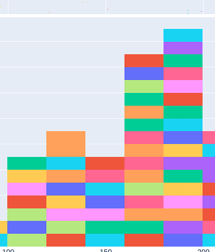
Plotly offers the ability to change plot colors when creating a histogram, such as here, under the “Stacked Histogram” section.
However, when I am doing this with a larger data set, I get the same colors to border each other and result in what appears to be a larger box. I have uploaded an example of this below. The orange box on the top of the second column is actually two points.
Is there any way to force different colors for each point, or is this unavoidable?
Thanks for any help!
