Hi @dlea144,
Welcome to Plotly forum!
Theoretically we can plot a heatmap like that displayed at the link you posted, on a spherical earth map, but practically not.
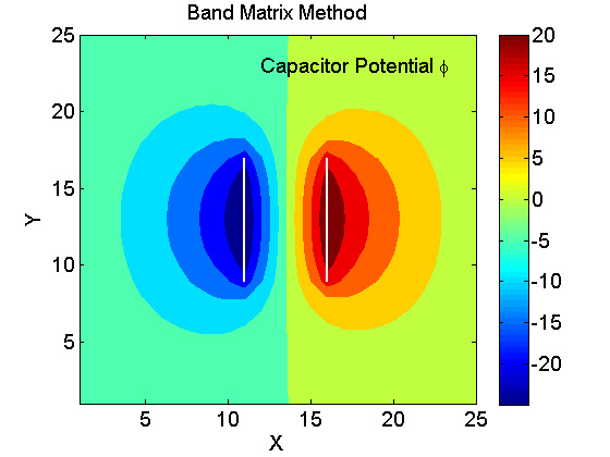
That heatmap is an image of resolution at least 26 x 26.
To map it within the boundary of a country (on the sphere) that can contain a rectangular/square region with sides of, let us say, 10 lon units x 10 lat units, we have to transform it to a rectangular region measured in radians.
This means that in radians we have the sides of length 10\pi/180 \approx 0.1745. It is so small that you cannot see on the map.
Below I illustrate this drawback:
import numpy as np
from numpy import pi, sin, cos
import plotly.graph_objects as go

x = y = np.arange(26)
X, Y = np.meshgrid(x,y)
Z = np.cos(X*Y/4)
m, n = Z.shape
fig = go.Figure(go.Heatmap(x=x, y=y, z=Z, colorscale='RdBu', zsmooth='best'))
fig.update_layout(width=500, height=500)
fig.show()
Define a function that transforms into radians the lon in [-180, 180, and lat in [-90, 90], and a function that maps points within the rectangle [-pi, pi] x [-pi/2, pi/2] to a sphere of radius 1.
def degree2radians(degree):
    #convert degrees to radians
    return degree*pi/180

def mapping_map_to_sphere(lon, lat, radius=1):
    # lon in [-pi, pi), lat in [-pi/2,pi/2]
    #this function maps the points of coords (lon, lat) to points onto the  sphere of radius=1

    lon = np.array(lon, dtype=np.float64)
    lat = np.array(lat, dtype=np.float64)
    lon = degree2radians(lon)
    lat = degree2radians(lat)
    xs = radius*cos(lon)*cos(lat)
    ys = radius*sin(lon)*cos(lat)
    zs = radius*sin(lat)
    return xs, ys, zs
When I plotted a global heatmap on the spherical map, here https://plot.ly/~empet/14813/heatmap-plot-on-a-spherical-map/#/,
I saved in this file https://github.com/empet/Datasets/blob/master/map_sphere.npy
the coordinates of country boundaries and coastlines, to be plotted as a go.Scatter3d chart on the sphere.
spherical_earth_map = np.load('map_sphere.npy')
xm, ym, zm = spherical_earth_map.T

fig = go.Figure(go.Scatter3d(x=xm, y=ym, z=zm, mode='lines'))
fig.update_layout(width=900, height=900);
fig.show()
Let us say that we want to plot the above heatmap on the spherical map into the region coresponding to lon in the interval londeg, and lat in the interval latdeg:
londeg = [30, 40]
latdeg = [50, 60]
#convert londeg, latdeg to radians:
lonrad = [degree2radians(londeg[0]), degree2radians(londeg[1])]
latrad = [degree2radians(latdeg[0]), degree2radians(latdeg[1])]
print(lonrad, '\n', latrad)
# Define a meshgrid from lonrad, latrad of the same size like Z in our heatmap:
lon = np.linspace(lonrad[0], lonrad[1], n)
lat = np.linspace(latrad[0], latrad[1], m)
lon, lat = np.meshgrid(lon, lat)
Xs, Ys, Zs = mapping_map_to_sphere(lon, lat)
#add the heatmap on sphere as a surface
fig.add_surface(x=Xs, y=Ys, z=Zs, surfacecolor=Z, colorscale='RdBu');
fig.show()
As you can notice, the heatmap is invisible.
But let us plot it in an independent figure:
figg =go.Figure(go.Surface(x=Xs, y=Ys, z=Zs, surfacecolor=Z, colorscale='RdBu'))
figg.update_layout(width=600, height=600)
figg.show()
Looking at the xaxis, yaxis, zaxis tick labels we see that the heatmap on sphere is concentrated in a very, very small region. That’s why it was invisible in the previous plot.


