Stacked bar chart with calculated mean and sem

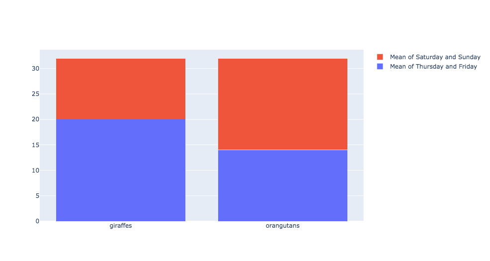
How can I display the calculated mean of the total bill of Thursday and Friday versus the calculated mean of Saturday and Sunday in a stacked bar chart?

Thus, instead of 20 and 12 I want to display 17.15 and 17.68 and instead of 14 and 18 I want to display 20.44 and 21.41? Of course, I could just copy and paste the calculated values, but I prefer to take them directly from pandas.

In the next step, I would like to add error bars depicting the calculated sem for the respective days.

import plotly.graph_objects as go
import pandas as pd

df = pd.read_csv('https://raw.githubusercontent.com/mwaskom/seaborn-data/master/tips.csv')

animals=['giraffes', 'orangutans']

# Group and calculate the mean and sem
mean = df.groupby('day').mean()
sem = df.groupby('day').sem()

fig = go.Figure(data=[
    go.Bar(name='Mean of Thursday and Friday', x=animals, y=[20, 14]),
    go.Bar(name='Mean of Saturday and Sunday', x=animals, y=[12, 18])
])

# Change the bar mode
fig.update_layout(barmode='stack')
fig.show()

print(mean)    
print(sem)

Mean

total_bill tip size
day
Fri 17.151579 2.734737 2.105263
Sat 20.441379 2.993103 2.517241
Sun 21.410000 3.255132 2.842105
Thur 17.682742 2.771452 2.451613

SEM

total_bill tip size
day
Fri 1.904761 0.233907 0.130109
Sat 1.016408 0.174863 0.087835
Sun 1.013114 0.141650 0.115550
Thur 1.001545 0.157509 0.135418

I now got the values in there using mean_thur=df.query("day=='Thur'")['total_bill'].mean(); however, is there not an easier way? I am sorry if this example is a little confusing. Here is where I currently stand and data are now depicted correctly, but I still need to add the error bars for the sem.

import plotly.graph_objects as go
import pandas as pd

df = pd.read_csv('https://raw.githubusercontent.com/mwaskom/seaborn-data/master/tips.csv')

days=['day1 and day 2', 'day 3 and day 4']
n_numbers = ['n = 20', 'n = 14']

# Group and calculate the mean and sem
mean = df.groupby('day').mean()
sem = df.groupby('day').sem()

# Extract mean from days for input
mean_thur=df.query("day=='Thur'")['total_bill'].mean()
mean_fri=df.query("day=='Fri'")['total_bill'].mean()
mean_sat=df.query("day=='Sat'")['total_bill'].mean()
mean_sun=df.query("day=='Sun'")['total_bill'].mean()


fig = go.Figure(data=[
    go.Bar(name='Thursday and Saturday', x=days, y=[mean_thur, mean_sat]),
    go.Bar(name='Friday and Sunday', x=days, y=[mean_fri, mean_sun],
           text=n_numbers,
           textposition='outside')
])

# Change the bar mode
fig.update_layout(template='simple_white', barmode='stack')
fig.show()


print(mean)
print(mean_thur)
print(mean_fri)
print(mean_sat)
print(mean_sun)
print(sem)

Here is the thing with the error bars. How can I move the n=20 higher up (magenta outline) and show the top error bars in Thursday and Saturday (green outline)?

import plotly.graph_objects as go
import pandas as pd

df = pd.read_csv('https://raw.githubusercontent.com/mwaskom/seaborn-data/master/tips.csv')

days=['day1 and day 2', 'day 3 and day 4']
n_numbers = ['n = 20', 'n = 14']

# Group and calculate the mean and sem
mean = df.groupby('day').mean()
sem = df.groupby('day').sem()

# Extract mean from days for input
mean_thur=df.query("day=='Thur'")['total_bill'].mean()
mean_fri=df.query("day=='Fri'")['total_bill'].mean()
mean_sat=df.query("day=='Sat'")['total_bill'].mean()
mean_sun=df.query("day=='Sun'")['total_bill'].mean()

# Extract sem from days for input
sem_thur=df.query("day=='Thur'")['total_bill'].sem()
sem_fri=df.query("day=='Fri'")['total_bill'].sem()
sem_sat=df.query("day=='Sat'")['total_bill'].sem()
sem_sun=df.query("day=='Sun'")['total_bill'].sem()


fig = go.Figure(data=[
    go.Bar(name='Thursday and Saturday', x=days, y=[mean_thur, mean_sat],
           error_y=dict(
           type='data', # value of error bar given in data coordinates
            array=[sem_thur, sem_sat],
            visible=True)),
    
    go.Bar(name='Friday and Sunday', x=days, y=[mean_fri, mean_sun],
           text=n_numbers,
           textposition='outside',
           error_y=dict(
           type='data', # value of error bar given in data coordinates
            array=[sem_fri, sem_sun],
            visible=True))
])

# Change the bar mode
fig.update_layout(template='simple_white', barmode='stack')
fig.show()


print(mean)
print(mean_thur)
print(mean_fri)
print(mean_sat)
print(mean_sun)
print(sem)
print(sem_thur)
print(sem_fri)
print(sem_sat)
print(sem_sun)

Used fig.add_trace to display n numbers; Now how do I get to display the lower error bars?

import plotly.graph_objects as go
import pandas as pd

df = pd.read_csv('https://raw.githubusercontent.com/mwaskom/seaborn-data/master/tips.csv')

days=['day1 and day 2', 'day 3 and day 4']
#n_numbers = ['n = 20', 'n = 14']

# Group and calculate the mean and sem
mean = df.groupby('day').mean()
sem = df.groupby('day').sem()

# Extract mean from days for input
mean_thur=df.query("day=='Thur'")['total_bill'].mean()
mean_fri=df.query("day=='Fri'")['total_bill'].mean()
mean_sat=df.query("day=='Sat'")['total_bill'].mean()
mean_sun=df.query("day=='Sun'")['total_bill'].mean()

# Extract sem from days for input
sem_thur=df.query("day=='Thur'")['total_bill'].sem()
sem_fri=df.query("day=='Fri'")['total_bill'].sem()
sem_sat=df.query("day=='Sat'")['total_bill'].sem()
sem_sun=df.query("day=='Sun'")['total_bill'].sem()


fig = go.Figure(data=[
    go.Bar(name='Thursday and Saturday', x=days, y=[mean_thur, mean_sat],
           error_y=dict(
           type='data', # value of error bar given in data coordinates
            array=[sem_thur, sem_sat],
            visible=True)),
    
    go.Bar(name='Friday and Sunday', x=days, y=[mean_fri, mean_sun],
           error_y=dict(
           type='data', # value of error bar given in data coordinates
            array=[sem_fri, sem_sun],
            visible=True))
])

fig.add_trace(go.Scatter(
    x=['day1 and day 2', 'day 3 and day 4'],
    y=[40, 47],
    mode="text",
    name="n_numbers",
    text=['n=20', 'n=50'],
    textposition="top center",
    showlegend=False
))

# Change the bar mode
fig.update_layout(template='simple_white', barmode='stack')
fig.show()


print(mean)
print(mean_thur)
print(mean_fri)
print(mean_sat)
print(mean_sun)
print(sem)
print(sem_thur)
print(sem_fri)
print(sem_sat)
print(sem_sun)

@Alexboiboi do you have perhaps a suggestion on how to display the error bars on the lower/blue bars correctly other than changing the opacity of the bar graph as a whole?

Found a solution; it is probably too far-fetched, but it works. If you have something more elegant and simpler, please let me know …

I used 2x fig.add_trace to add error bars specifically for the 2 lower/blue bars and removed error_y from one of the go.Bar lines.

import plotly.graph_objects as go
import pandas as pd

df = pd.read_csv('https://raw.githubusercontent.com/mwaskom/seaborn-data/master/tips.csv')

days=['day1 and day 2', 'day 3 and day 4']
#n_numbers = ['n = 20', 'n = 14']

# Group and calculate the mean and sem
mean = df.groupby('day').mean()
sem = df.groupby('day').sem()

# Extract mean from days for input
mean_thur=df.query("day=='Thur'")['total_bill'].mean()
mean_fri=df.query("day=='Fri'")['total_bill'].mean()
mean_sat=df.query("day=='Sat'")['total_bill'].mean()
mean_sun=df.query("day=='Sun'")['total_bill'].mean()

# Extract sem from days for input
sem_thur=df.query("day=='Thur'")['total_bill'].sem()
sem_fri=df.query("day=='Fri'")['total_bill'].sem()
sem_sat=df.query("day=='Sat'")['total_bill'].sem()
sem_sun=df.query("day=='Sun'")['total_bill'].sem()

# Bar graphs and error bars for top stack only
fig = go.Figure(data=[
    go.Bar(name='Thursday and Saturday', x=days, y=[mean_thur, mean_sat], opacity=0.8),           
    
    go.Bar(name='Friday and Sunday', x=days, y=[mean_fri, mean_sun], opacity=0.8,           
           error_y=dict(
           type='data', # value of error bar given in data coordinates
           array=[sem_fri, sem_sun], color='rgba(0,0,0,1)', thickness=2, width=10,
           visible=True)
          )          
])

# Error bars for bottom stack
fig.add_trace(go.Scatter(
    x=['day1 and day 2'], y=[mean_thur, sem_thur],
    mode='markers',
    name='error_bars_thursday',
    error_y=dict(
        type='constant',
        value=sem_thur,
        color='magenta',
        thickness=2,
        width=30        
    ),
        marker=dict(color='rgba(0,0,0,0)', size=10, opacity=0),
    showlegend=False
))

fig.add_trace(go.Scatter(
    x=['day 3 and day 4'], y=[mean_sat, sem_sat],
    mode='markers',
    name='error_bars_thursday',
    error_y=dict(
        type='constant',
        value=sem_thur,
        color='green',
        thickness=2,
        width=30,
    ),
        marker=dict(color='rgba(0,0,0,0)', size=10, opacity=0),
    showlegend=False
))


# Add n numbers
fig.add_trace(go.Scatter(
    x=['day1 and day 2', 'day 3 and day 4'],
    y=[40, 47],
    mode="text",
    name="n_numbers",
    text=['n=20', 'n=50'],
    textposition="top center",
    showlegend=False
))

# Customization of layout and traces
fig.update_layout(template='simple_white', barmode='stack',
                  newshape_line_color='magenta', newshape_opacity=0.2)
fig.update_traces(marker_line_color='rgba(0,0,0,0.8)', marker_line_width=1, opacity=0.8)

# Make figure zoomable, hide logo et cetera
config = dict({'scrollZoom':True, 'displaylogo': True,
               'modeBarButtonsToAdd':['drawopenpath', 'eraseshape']
              })

fig.show()

print(mean)
print(mean_thur)
print(mean_fri)
print(mean_sat)
print(mean_sun)
print(sem)
print(sem_thur)
print(sem_fri)
print(sem_sat)
print(sem_sun)