Scatter plot with conditional error bars

How can I plot the error bars that depict the mean and standard error of the mean (sem) for genotype A, B, C during the light and dark phase? Data is here https://www.dropbox.com/s/ecerlnc9wvpfasz/example_1.csv?dl=0

import pandas as pd
import plotly.graph_objects as go
import plotly.express as px

df = pd.read_csv('/Users/Jakob/Dropbox/Public/example_1.csv', na_values=['NA']
                  )

fig = px.strip(df, x='genotype', y='Distance moved', color="period").update_traces(jitter = 1,
                                                                       opacity=0.8,
                                                                       marker_size=10,
                                                                       marker_line_width=1)

# Group and calculate the mean and sem for distance moved
mean = df.groupby('genotype').mean()
sem = df.groupby('genotype').sem()

# Group and calculate the mean and sem for distance moved during dark and light period
mean_period=df.groupby(['genotype','period']).mean()
sem_period=df.groupby(['genotype','period']).sem()


# Add traces for mean and sem
fig.add_trace(
    go.Scatter(
        mode='markers',
        x=mean.index, y=mean_period['Distance moved'],
        error_y_array=sem_period['Distance moved'],
        marker=dict(symbol='141', color='rgba(0,0,0,0.6)', size=30,
        line=dict(width=2)
        ),
        showlegend=False
    )
)


#  Customization of y-axis
#fig.update_yaxes(range=[0, 10])

# Figure layout
fig.update_layout(template='simple_white',  width=1000, height=500, title='', yaxis_title='Distance moved [mm]',
                  legend=dict(title='', itemclick='toggle', itemsizing='constant', traceorder='normal',
                  bgcolor='rgba(0,0,0,0)', x=1),
                  #margin=dict(color="black",width=3),
                  xaxis=dict(title='', showticklabels=True, ticks='outside', type='category')
                 )

# Make figure zoomable
config = dict({'scrollZoom':True})

print(df.groupby(['genotype', 'period']).mean())

fig.show(config=config)

I have this,

but I would like to get this

I got a little further with this. Now all I need to do is move the error bars into the correct position, i.e. “light” error bars to the left and “dark” error bars to the right. @Alexboiboi or @nicolaskruchten it seems that I cannot work with xref="paper" here or can I? Do you have a suggestion on this?

Again, data is here https://www.dropbox.com/s/ecerlnc9wvpfasz/example_1.csv

import pandas as pd
import plotly.graph_objects as go
import plotly.express as px

df = pd.read_csv('/Users/Jakob/Dropbox/Public/example_1.csv', na_values=['NA']
                  )

fig = px.strip(df, x='genotype', y='Distance moved', color="period").update_traces(jitter = 1,
                                                                       opacity=0.8,
                                                                       marker_size=10,
                                                                       marker_line_width=1)

# Group and calculate the mean and sem for distance moved during dark and light period
mean_period=df.groupby(['genotype','period']).mean()
sem_period=df.groupby(['genotype','period']).sem()

# Extract mean from the distance moved during the dark period
dark_mean_A=mean_period['Distance moved'].A['Dark']
dark_mean_B=mean_period['Distance moved'].B['Dark']
dark_mean_C=mean_period['Distance moved'].C['Dark']

# Extract mean from the distance moved during the dark period
light_mean_A=mean_period['Distance moved'].A['Light']
light_mean_B=mean_period['Distance moved'].B['Light']
light_mean_C=mean_period['Distance moved'].C['Light']


# Extract sem from the distance moved during the dark period
dark_sem_A=sem_period['Distance moved'].A['Dark']
dark_sem_B=sem_period['Distance moved'].B['Dark']
dark_sem_C=sem_period['Distance moved'].C['Dark']

# Extract sem from the distance moved during the light period
light_sem_A=sem_period['Distance moved'].A['Light']
light_sem_B=sem_period['Distance moved'].B['Light']
light_sem_C=sem_period['Distance moved'].C['Light']


# Error bars for genotype A
fig.add_trace(
    go.Scatter(
        mode='markers',
        x=['A'], y=[light_mean_A],
        error_y_array=[light_sem_A],
        marker=dict(symbol='141', color='rgba(0,0,0,0.6)', size=30,
        line=dict(width=2)
                   ),
        showlegend=False
    )
)

fig.add_trace(
    go.Scatter(
        mode='markers',
        x=['A'], y=[dark_mean_A],
        error_y_array=[dark_sem_A],
        marker=dict(symbol='141', color='rgba(0,0,0,0.6)', size=30,
        line=dict(width=2)
                   ),
        showlegend=False
    )
)

# Error bars for genotype B
fig.add_trace(
    go.Scatter(
        mode='markers',
        x=['B'], y=[light_mean_B],
        error_y_array=[light_sem_B],
        marker=dict(symbol='141', color='rgba(0,0,0,0.6)', size=30,
        line=dict(width=2)
                   ),
        showlegend=False
    )
)

fig.add_trace(
    go.Scatter(
        mode='markers',
        x=['B'], y=[dark_mean_B],
        error_y_array=[dark_sem_B],
        marker=dict(symbol='141', color='rgba(0,0,0,0.6)', size=30,
        line=dict(width=2)
                   ),
        showlegend=False
    )
)

# Error bars for genotype C
fig.add_trace(
    go.Scatter(
        mode='markers',
        x=['C'], y=[light_mean_C],
        error_y_array=[light_sem_C],
        marker=dict(symbol='141', color='rgba(0,0,0,0.6)', size=30,
        line=dict(width=2)
                   ),
        showlegend=False
    )
)

fig.add_trace(
    go.Scatter(
        mode='markers',
        x=['C'], y=[dark_mean_C],
        error_y_array=[dark_sem_C],
        marker=dict(symbol='141', color='rgba(0,0,0,0.6)', size=30,
        line=dict(width=2)
                   ),
        showlegend=False
    )
)


#  Customization of y-axis
#fig.update_yaxes(range=[0, 10])

# Figure layout
fig.update_layout(template='simple_white',  width=1000, height=500, title='', yaxis_title='Distance moved [mm]',
                  legend=dict(title='', itemclick='toggle', itemsizing='constant', traceorder='normal',
                  bgcolor='rgba(0,0,0,0)', x=1),
                  #margin=dict(color="black",width=3),
                  xaxis=dict(title='', showticklabels=True, ticks='outside', type='category')
                 )

# Make figure zoomable
config = dict({'scrollZoom':True})

print(df.groupby(['genotype', 'period']).mean())
print(df.groupby(['genotype', 'period']).sem())


fig.show(config=config)

I guess there is also an easier way to to this?

Since I could not figure out th issue above I now went for this

Is it possible to change the color of the scatter plot dots to correspond to the color of the bars, i.e. blue and red dots should be grey and yellow, respectively?

Data here > https://www.dropbox.com/s/t4j96etfw5t02qv/example_2.xlsx?dl=0

import plotly.graph_objects as go
import pandas as pd

df = pd.read_excel("/Users/Jakob/Dropbox/Public/example_2.xlsx",
                   sheet_name='sheet_1', header=0, skiprows=range(1,4), usecols = "A,B,E", na_values=['NA']
                  )

# Group and calculate the mean and sem for distance moved during dark and light period
mean_period=df.groupby(['genotype','period']).mean()
sem_period=df.groupby(['genotype','period']).sem()

# Extract mean from the distance moved during the dark period
dark_mean_A=mean_period['Distance moved'].A['Dark']
dark_mean_B=mean_period['Distance moved'].B['Dark']
dark_mean_C=mean_period['Distance moved'].C['Dark']

# Extract mean from the distance moved during the dark period
light_mean_A=mean_period['Distance moved'].A['Light']
light_mean_B=mean_period['Distance moved'].B['Light']
light_mean_C=mean_period['Distance moved'].C['Light']


# Extract sem from the distance moved during the dark period
dark_sem_A=sem_period['Distance moved'].A['Dark']
dark_sem_B=sem_period['Distance moved'].B['Dark']
dark_sem_C=sem_period['Distance moved'].C['Dark']

# Extract sem from the distance moved during the light period
light_sem_A=sem_period['Distance moved'].A['Light']
light_sem_B=sem_period['Distance moved'].B['Light']
light_sem_C=sem_period['Distance moved'].C['Light']


# Create Scatter plot
fig = px.strip(df, x='genotype', y='Distance moved', color="period").update_traces(jitter = 1,
                                                                       opacity=0.8,
                                                                       marker_size=10,
                                                                       marker_line_width=1,
                                                                       marker_line_color='rgba(0,0,0,0.8)',
                                                                       #marker_color='rgba(0,0,0,0.8)',
                                                                       showlegend=False)

# Create bar graphs with error bars
fig.add_bar(
    name='Dark',
    marker_color='rgba(0,0,0,0.5)', marker_line_color='rgba(0,0,0,1)', marker_line_width=1, opacity=0.8,
    x=['A', 'B', 'C'], y=[dark_mean_A, dark_mean_B, dark_mean_C], showlegend=True,
    error_y=dict(type='data', array=[dark_sem_A, dark_sem_B, dark_sem_C],
                color='rgba(0,0,0,1)', thickness=1.5, width=10)
)

fig.add_bar(
    name='Light',
    marker_color='rgba(255,255,0,0.5)', marker_line_color='rgba(0,0,0,1)', marker_line_width=1, opacity=0.8,
    x=['A', 'B', 'C'], y=[light_mean_A, light_mean_B, light_mean_C], showlegend=True,
    error_y=dict(type='data', array=[light_sem_A, light_sem_B, light_sem_C],
                color='rgba(0,0,0,1)', thickness=1.5, width=10)
)

# Customization of layout and traces
fig.update_layout(template='simple_white', title='', yaxis_title='Distance moved [mm]', barmode='group',
                  dragmode='drawrect', font_size=12, hoverlabel_namelength=-1, showlegend=True,
                  legend=dict(x=1, y=1,
                              title_text='',
                              traceorder="normal",
                              bordercolor="Black",
                              borderwidth=0,
                              font=dict(size=12, color="black"),
                            )
                 )
#fig.update_traces(marker_line_color='rgba(0,0,0,0.8)', marker_line_width=1.5, textfont_size=12, opacity=0.8)

#  Customization of x-axis
fig.update_xaxes(title='')


print(df.groupby(['genotype', 'period']).mean())
print(df.groupby(['genotype', 'period']).sem())

fig.show()

Explicitly Constructing a Color Sequence, see https://plotly.com/python/discrete-color/#explicitly-constructing-a-color-sequence, does the job and gives

import plotly.graph_objects as go
import pandas as pd

df = pd.read_excel("/Users/Jakob/Dropbox/Public/example_2.xlsx",
                   sheet_name='sheet_1', header=0, skiprows=range(1,4), usecols = "A,B,E", na_values=['NA']
                  )

# Group and calculate the mean and sem for distance moved during dark and light period
mean_period=df.groupby(['genotype','period']).mean()
sem_period=df.groupby(['genotype','period']).sem()

# Extract mean from the distance moved during the dark period
dark_mean_A=mean_period['Distance moved'].A['Dark']
dark_mean_B=mean_period['Distance moved'].B['Dark']
dark_mean_C=mean_period['Distance moved'].C['Dark']

# Extract mean from the distance moved during the dark period
light_mean_A=mean_period['Distance moved'].A['Light']
light_mean_B=mean_period['Distance moved'].B['Light']
light_mean_C=mean_period['Distance moved'].C['Light']


# Extract sem from the distance moved during the dark period
dark_sem_A=sem_period['Distance moved'].A['Dark']
dark_sem_B=sem_period['Distance moved'].B['Dark']
dark_sem_C=sem_period['Distance moved'].C['Dark']

# Extract sem from the distance moved during the light period
light_sem_A=sem_period['Distance moved'].A['Light']
light_sem_B=sem_period['Distance moved'].B['Light']
light_sem_C=sem_period['Distance moved'].C['Light']


# Create Scatter plot
fig = px.strip(df, x='genotype', y='Distance moved', color="period",
              color_discrete_sequence=['rgba(0,0,0,0.4)', 'rgba(255,255,0,0.4)']).update_traces(
                                                                       jitter = 1,
                                                                       opacity=0.8,
                                                                       marker_size=10,
                                                                       marker_line_width=1,
                                                                       marker_line_color='rgba(0,0,0,0.8)',
                                                                       #marker_color='rgba(0,0,0,0.8)',
                                                                       showlegend=False)

# Create bar graphs with error bars
fig.add_bar(
    name='Dark',
    marker_color='rgba(0,0,0,0.5)', marker_line_color='rgba(0,0,0,0.8)', marker_line_width=1, opacity=0.8,
    x=['A', 'B', 'C'], y=[dark_mean_A, dark_mean_B, dark_mean_C],
    error_y=dict(type='data', array=[dark_sem_A, dark_sem_B, dark_sem_C],
                color='rgba(0,0,0,1)', thickness=1.5, width=10)
)

fig.add_bar(
    name='Light',
    marker_color='rgba(255,255,0,0.5)', marker_line_color='rgba(0,0,0,0.8)', marker_line_width=1, opacity=0.8,
    x=['A', 'B', 'C'], y=[light_mean_A, light_mean_B, light_mean_C],
    error_y=dict(type='data', array=[light_sem_A, light_sem_B, light_sem_C],
                color='rgba(0,0,0,1)', thickness=1.5, width=10)
)

# Customization of layout and traces
fig.update_layout(template='simple_white', title='', yaxis_title='Distance moved [mm]', barmode='group',
                  dragmode='drawrect', font_size=12, hoverlabel_namelength=-1, legend_title_text='')
#fig.update_traces(marker_line_color='rgba(0,0,0,0.8)', marker_line_width=1.5, textfont_size=12, opacity=0.8)

#  Customization of x-axis
fig.update_xaxes(title='')


print(df.groupby(['genotype', 'period']).mean())
print(df.groupby(['genotype', 'period']).sem())

fig.show()

Adding p-values and statistical annotations in Plotly appears more complicated than it should be, I think.

Although the following codes produces what it should, I would greatly appreciate if the developers @nicolaskruchten could provide an easier way to accomplish it.

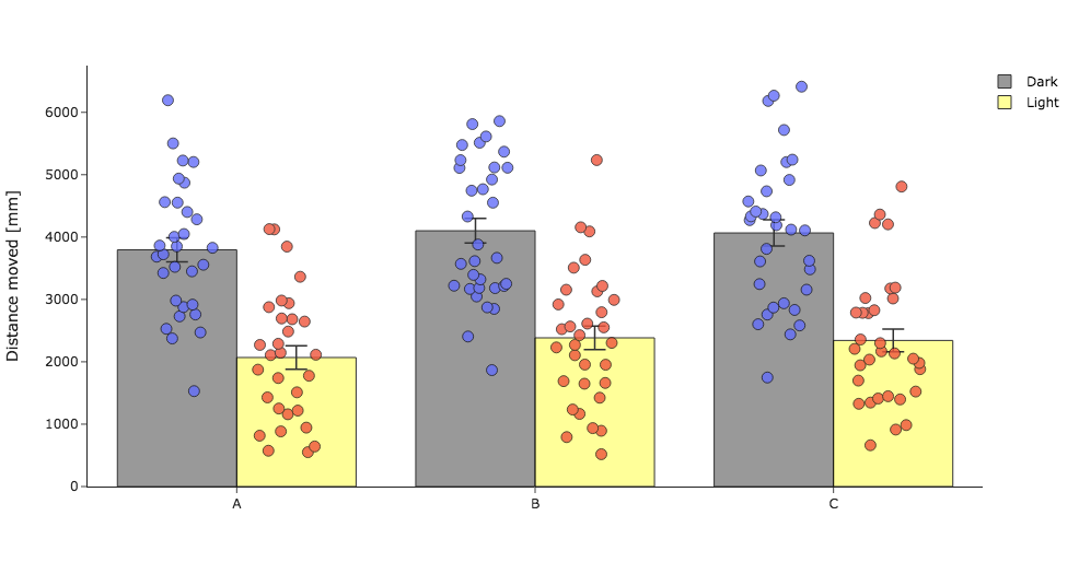
Here’s the graph with the data from https://www.dropbox.com/s/t4j96etfw5t02qv/example_2.xlsx?dl=0

and the code

import plotly.graph_objects as go
import plotly.express as px
import pandas as pd

df = pd.read_excel("/Users/Jakob/Dropbox/Public/example_2.xlsx",
                   sheet_name='sheet_1', header=0, skiprows=range(1,4), usecols = "A,B,E", na_values=['NA']
                  )


# Data Extraction
# Group and calculate the mean and sem for distance moved during dark and light period
mean_period=df.groupby(['genotype','period']).mean()
sem_period=df.groupby(['genotype','period']).sem()

# Extract mean from the distance moved during the dark period
dark_mean_A=mean_period['Distance moved'].A['Dark']
dark_mean_B=mean_period['Distance moved'].B['Dark']
dark_mean_C=mean_period['Distance moved'].C['Dark']

# Extract mean from the distance moved during the light period
light_mean_A=mean_period['Distance moved'].A['Light']
light_mean_B=mean_period['Distance moved'].B['Light']
light_mean_C=mean_period['Distance moved'].C['Light']


# Extract sem from the distance moved during the dark period
dark_sem_A=sem_period['Distance moved'].A['Dark']
dark_sem_B=sem_period['Distance moved'].B['Dark']
dark_sem_C=sem_period['Distance moved'].C['Dark']

# Extract sem from the distance moved during the light period
light_sem_A=sem_period['Distance moved'].A['Light']
light_sem_B=sem_period['Distance moved'].B['Light']
light_sem_C=sem_period['Distance moved'].C['Light']


# Scatter plot
fig = px.strip(df, x='genotype', y='Distance moved', color="period",
               color_discrete_sequence=['rgba(0,0,0,0.4)', 'rgba(255,255,0,0.4)']).update_traces(
                                                                       jitter = 1,
                                                                       opacity=0.8,
                                                                       marker_size=10,
                                                                       marker_line_width=1,
                                                                       marker_line_color='rgba(0,0,0,0.8)',
                                                                       #marker_color='rgba(0,0,0,0.8)',
                                                                       showlegend=False)

# Bar graphs with error bars
fig.add_bar(
    name='Dark',
    marker_color='rgba(0,0,0,0.5)', marker_line_color='rgba(0,0,0,0.8)', marker_line_width=1, opacity=0.8,
    x=['A', 'B', 'C'],
    y=[dark_mean_A, dark_mean_B, dark_mean_C],
    error_y=dict(type='data', array=[dark_sem_A, dark_sem_B, dark_sem_C],
                color='rgba(0,0,0,1)', thickness=1.5, width=10)
)

fig.add_bar(
    name='Light',
    marker_color='rgba(255,255,0,0.5)', marker_line_color='rgba(0,0,0,0.8)', marker_line_width=1, opacity=0.8,
    x=['A', 'B', 'C'],
    y=[light_mean_A, light_mean_B, light_mean_C],    
    error_y=dict(type='data', array=[light_sem_A, light_sem_B, light_sem_C],
                color='rgba(0,0,0,1)', thickness=1.5, width=10)
)

# Sample numbers
# Add n numbers
fig.add_trace(go.Scatter(
    x=['B', 'A', 'C'],
    y=[100, 100, 100],
    mode="text",
    name="n numbers",
    text=['n = 30', 'n = 32', 'n = 32'],
    textposition="top center",
    textfont=dict(color='rgba(0,0,0,1)', size=13),
    hoverlabel=dict(bgcolor='white'),
    showlegend=False
))

# Brackets for p-values
# Dark bar 1 to dark bar 2 p-value bracket
x_coords = [0.10, 0.10, 0.428, 0.428]
y_coords = [(dark_mean_A+dark_sem_A)+100, (dark_mean_B+dark_sem_B)+300,
            (dark_mean_B+dark_sem_B)+300, (dark_mean_B+dark_sem_B)+100]
for i in range(1,len(x_coords)):
    fig.add_shape(
        type="line",
        xref="paper",
        x0=x_coords[i-1], 
        y0=y_coords[i-1], 
        x1=x_coords[i], 
        y1=y_coords[i],
        line=dict(color='rgba(0,0,0,1)', width=1.5), opacity=1
    )
    
# Dark bar 1 to dark bar 3 p-value bracket
x_coords = [0.10, 0.10, 0.7674, 0.7674]
y_coords = [(dark_mean_A+dark_sem_A)+700, (dark_mean_A+dark_sem_A)+2000,
            (dark_mean_A+dark_sem_A)+2000, (dark_mean_A+dark_sem_A)+1800]
for i in range(1,len(x_coords)):
    fig.add_shape(
        type="line",
        xref="paper",
        x0=x_coords[i-1], 
        y0=y_coords[i-1], 
        x1=x_coords[i], 
        y1=y_coords[i],
        line=dict(color='rgba(0,0,0,1)', width=1.5), opacity=1
    )
    
# Dark bar 2 to bar 3 p-value bracket
x_coords = [0.437, 0.437, 0.7674, 0.7674]
y_coords = [(dark_mean_B+dark_sem_B)+100, (dark_mean_B+dark_sem_B)+300,
            (dark_mean_B+dark_sem_B)+300, (dark_mean_B+dark_sem_C)+100]
for i in range(1,len(x_coords)):
    fig.add_shape(
        type="line",
        xref="paper",
        x0=x_coords[i-1], 
        y0=y_coords[i-1], 
        x1=x_coords[i], 
        y1=y_coords[i],
        line=dict(color='rgba(0,0,0,1)', width=1.5), opacity=1
    )
    
    
# Light bar 1 to light bar 2 p-value bracket
x_coords = [0.233, 0.233, 0.560, 0.560]
y_coords = [(light_mean_B+light_sem_B)+2500, (light_mean_B+light_sem_B)+2700,
            (light_mean_B+light_sem_B)+2700, (light_mean_B+light_sem_B)+2200]
for i in range(1,len(x_coords)):
    fig.add_shape(
        type="line",
        xref="paper",
        x0=x_coords[i-1], 
        y0=y_coords[i-1], 
        x1=x_coords[i], 
        y1=y_coords[i],
        line=dict(color='rgba(0,0,0,1)', width=1.5), opacity=1
    )
    
# Light bar 2 to light bar 3 p-value bracket
x_coords = [0.574, 0.574, 0.9, 0.9]
y_coords = [(light_mean_B+light_sem_B)+2500, (light_mean_B+light_sem_B)+2700,
            (light_mean_B+light_sem_B)+2700, (light_mean_C+light_sem_C)+100]
for i in range(1,len(x_coords)):
    fig.add_shape(
        type="line",
        xref="paper",
        x0=x_coords[i-1], 
        y0=y_coords[i-1], 
        x1=x_coords[i], 
        y1=y_coords[i],
        line=dict(color='rgba(0,0,0,1)', width=1.5), opacity=1
    )
    
# Light bar 1 to light bar 3 p-value bracket
x_coords = [0.233, 0.233, 0.9, 0.9]
y_coords = [(light_mean_A+light_sem_A)+4100, (light_mean_A+light_sem_A)+4500,
            (light_mean_A+light_sem_A)+4500, (light_mean_C+light_sem_C)+2900]
for i in range(1,len(x_coords)):
    fig.add_shape(
        type="line",
        xref="paper",
        x0=x_coords[i-1], 
        y0=y_coords[i-1], 
        x1=x_coords[i], 
        y1=y_coords[i],
        line=dict(color='rgba(0,0,0,1)', width=1.5), opacity=1        
    )

    
# P-values
# Darl to Dark
# p-value: Dark bar 1 to dark bar 2
fig.add_annotation(text="p = 0.5111",
                   name="p-value",                                  
                   xref="paper", yref="paper",
                   x=0.23, y=0.640, showarrow=False,
                   font=dict(size=12, color="black")
                  )

# p-value: Dark bar 1 to dark bar 3
fig.add_annotation(text="p = 0.5898",
                   name="p-value",                                  
                   xref="paper", yref="paper",
                   x=0.48, y=0.845, showarrow=False,
                   font=dict(size=12, color="black")
                  )

# p-value: Dark bar 2 to dark bar 3
fig.add_annotation(text="p = 0.9910",
                   name="p-value",                                  
                   xref="paper", yref="paper",
                   x=0.62, y=0.640, showarrow=False,
                   font=dict(size=12, color="black")
                  )
# Light to Light
# p-value: Light bar 1 to light bar 2
fig.add_annotation(text="p = 0.4897",
                   name="p-value",                                  
                   xref="paper", yref="paper",
                   x=0.325, y=0.75, showarrow=False,
                   font=dict(size=12, color="black")
                  )

# p-value: Light bar 1 to light bar 3
fig.add_annotation(text="p = 0.5841",
                   name="p-value",                                  
                   xref="paper", yref="paper",
                   x=0.56, y=0.95, showarrow=False,
                   font=dict(size=12, color="black")
                  )

# p-value: Light bar 2 to light bar 3
fig.add_annotation(text="p = 0.9870",
                   name="p-value",                                  
                   xref="paper", yref="paper",
                   x=0.753, y=0.75, showarrow=False,
                   font=dict(size=12, color="black")
                  )


# Customization of layout and traces
fig.update_layout(template='simple_white', title='', height=600, width=1000, yaxis_title='Distance moved [mm]', barmode='group',
                  dragmode='drawrect', font_size=12, hoverlabel_namelength=-1, legend_title_text='',
                  bargroupgap=0,
                 )

fig.update_traces(hoverinfo="x+y")

# Set custom x-axis labels
fig.update_xaxes(title='', tickvals=["A", "B", "C"],
                 ticktext=["Elephant", "Dolphin", "Cat"],
                 ticks="", tickfont_size=14
                )

fig.update_yaxes(range=[0, 7500]
                )


print(df.groupby(['genotype', 'period']).mean())
print(df.groupby(['genotype', 'period']).sem())

fig.show()

Agreed, building a plot like this is pretty complicated right now. We don’t have any features on our roadmap today to make this easier but we’d welcome any help from the community :slight_smile:

1 Like

Thanks a lot for your response. It would be great if plots containing statistical annotations could be made easier in Plotly in the future.

Many people would appreciate that, I think, since I cannot be the only one trying this? Although working with absolute positioning is possible, it is very very tiring and takes a lot of time, in particular adjusting the brackets for the p-values (see picture above). While this may still work if you only have to make 1 or 2 plots, it becomes especially frustrating if you have to make 50-100 of them like in my case. For every new plot you are currently forced to position the brackets for the p-values and the p-values themselves de novo with absolute positioning.

I’ve got to say that your threads on this topic have been the first time I’ve seen someone reaching out for help about it… that doesn’t mean others haven’t tried and given up, but it doesn’t come across our radar all that often :slight_smile: