I’m using dashboards.ly for a large number of visualizations, and they all appear to be clipping on a specific pie chart. This was not happening ~1+ months ago, but is occurring on all the dashboards now. Was there an update that changed how these are displayed? I can’t interpret any of the data. Resizing the browser doesn’t change the display much, it still always clips
.
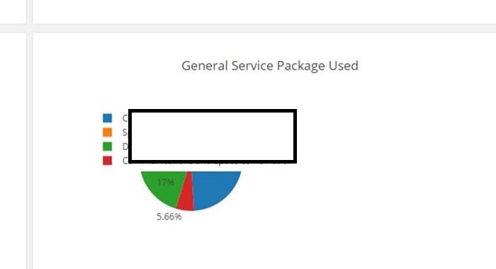
Thanks!