Hi,
I am developing several visualizations in Plotly (via Python, although I don’t mind if this is a JS-only solution) and am hitting several roadblocks that are crucial for me to address.
Side-by-side heatmap plots
I would like to have side-by-side contour plots with equal aspect ratios, like so:

This plot was built using ggplot2 using just some fake data and some not great color choices, but you get the idea:
- Side-by-side heatmap plots, each with their own colorbar / colorscale. What the color means here is different and on a different scale between the two plots, but they are side by side because the x and y axes are the same.
- Square aspect ratio. Really important and something I have had a really hard time figuring out how to do in Plotly generally, beyond this particular plot. With hours spent searching, I have not been able to find anything equivalent to
coord_fixed()in ggplot2 and this has been a big limitation I would say.
Here is my best attempt to do this type of figure in Plotly:
# imports
import numpy as np
import pandas as pd
from plotly import tools
import plotly.graph_objs as go
import plotly.offline as offline

from plotly.offline import init_notebook_mode
init_notebook_mode()

# setup some data
density = 25
grid_x1 = np.linspace(-1, 1, density)
grid_x2 = np.linspace(-1, 1, density)
grid2_x1, grid2_x2 = np.meshgrid(grid_x1, grid_x2)

X = {'x1': grid2_x1.flatten(), 'x2': grid2_x2.flatten()}
df = pd.DataFrame(X)
df['sd'] = 1 + 0.5 * df['x1']
df['y'] = df['x1'] - 0.5 * df['x2']
df['lb'] = df['y'] - 1.96 * df['sd']
df['ub'] = df['y'] + 1.96 * df['sd']

# plot
fig = tools.make_subplots(
    rows=1,
    cols=2,
    print_grid=False,
    shared_xaxes=True,
    shared_yaxes=True,
    horizontal_spacing=0.25,
)

fig.append_trace(
    go.Contour(
        z=df['y'].values.reshape((density, density)),
        x=grid_x1,
        y=grid_x2,
        contours=dict(coloring='heatmap'),
        ncontours=density,
        legendgroup='mean',
        showscale=True,
    ),
    1,
    1,
)
fig.append_trace(
    go.Contour(
        z=df['sd'].values.reshape((density, density)),
        x=grid_x1,
        y=grid_x2,
        contours=dict(coloring='heatmap'),
        ncontours=density,
        colorscale='Jet',
        legendgroup='sd',
        showscale=True,
    ),
    1,
    2,
)

fig['layout'].update(
    xaxis=dict(title='x1', zeroline=True),
    yaxis=dict(title='x2', zeroline=True),
    hovermode='closest',
    legend=dict(orientation="h"),
    height=600,
    width=900,
)

offline.iplot(fig)
Here’s the output:

There are several issues here:
- Even though they have different scales, the color scales always overlap (and they always go to the right-hand side)
- Square aspect ratio + the first plot weirdly takes up a lot of room and is not evenly spaced with the second plot
I have tried different legend groups, etc. and nothing seems to work.
Multiple surfaces in a 3-D surface plot
I’m fundamentally interested in representing a prediction out of a model sliced across 2 dimensions. There is some uncertainty around my prediction. One approach to doing this is via contour plots as described in the previous section. Another approach (and I’d like both to work) is to actually plot f(x) in 3-D, sliced by x1 and x2, with the uncertainty bounds there. So something like this:
I’ve gotten this to work like so:
data = [
    go.Surface(
        z=df['y'].values.reshape((density, density)),
        x=grid_x,
        y=grid_y,
    ),
    go.Surface(
        z=df['ub'].values.reshape((density, density)),
        x=grid_x,
        y=grid_y,
        showscale=False,
        opacity=0.95,
    ),
    go.Surface(
        z=df['lb'].values.reshape((density, density)),
        x=grid_x,
        y=grid_y,
        showscale=False,
        opacity=0.95,
    ),
]

layout = go.Layout(
    title='Predicted outcome',
    scene=go.Scene(
        xaxis=go.XAxis(title='x1'),
        yaxis=go.YAxis(title='x2'),
        zaxis=go.ZAxis(title='f(x)'),
    ),
    hovermode='closest',

)

fig = go.Figure(data=data, layout=layout)
offline.iplot(fig)
Here’s the problem – if my other surfaces are not simply uniformly shifted up or down from the main surface, the coloring breaks down. E.g. if I have something like this:
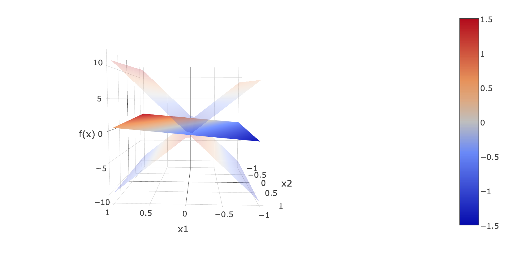
Even when showscale is set to False, the surfaces representing the uncertainty bounds are colored independently based on their own relative z scale. Is there a way to disable this? I would be fine having some sort of uniformly colored surface represent the uncertainty bounds w/o any coloring as long as the main surface representing the outcome is colored as above. Is this feasible?
Another question I have about color scales is if it’s possible to show a marker on the scale when you’re hovering over a part of the graph so you know where on the scale it falls?
I know there are a lot of questions here, but this is something I’ve been working on for days and have been stuck on this for a while now.