Now I get an amazing plot 
Many thanks to you all.
fig = make_subplots(rows=1,cols=3,
specs=[[{"type": "scatter"},
{"type": "scatter"},
{"type": "scatter"}
]
],
column_widths=[2.5, 2.5, 2.5],
shared_yaxes=True, shared_xaxes=True
)
fig.add_trace(go.Scatter(x=None, y=None, name="ghost1", showlegend=False), row=1, col=1)
fig.add_trace(go.Scatter(x=None, y=None, name="ghost2", showlegend=False), row=1, col=2)
fig.add_trace(go.Scatter(x=None, y=None, name="ghost3", showlegend=False), row=1, col=3)
fig.update_layout(xaxis4 = {'anchor': 'y', 'overlaying': 'x', 'side': 'top'})
fig.update_layout(xaxis5 = {'anchor': 'y2', 'overlaying': 'x2', 'side': 'top'})
fig.update_layout(xaxis6 = {'anchor': 'y3', 'overlaying': 'x3', 'side': 'top'})
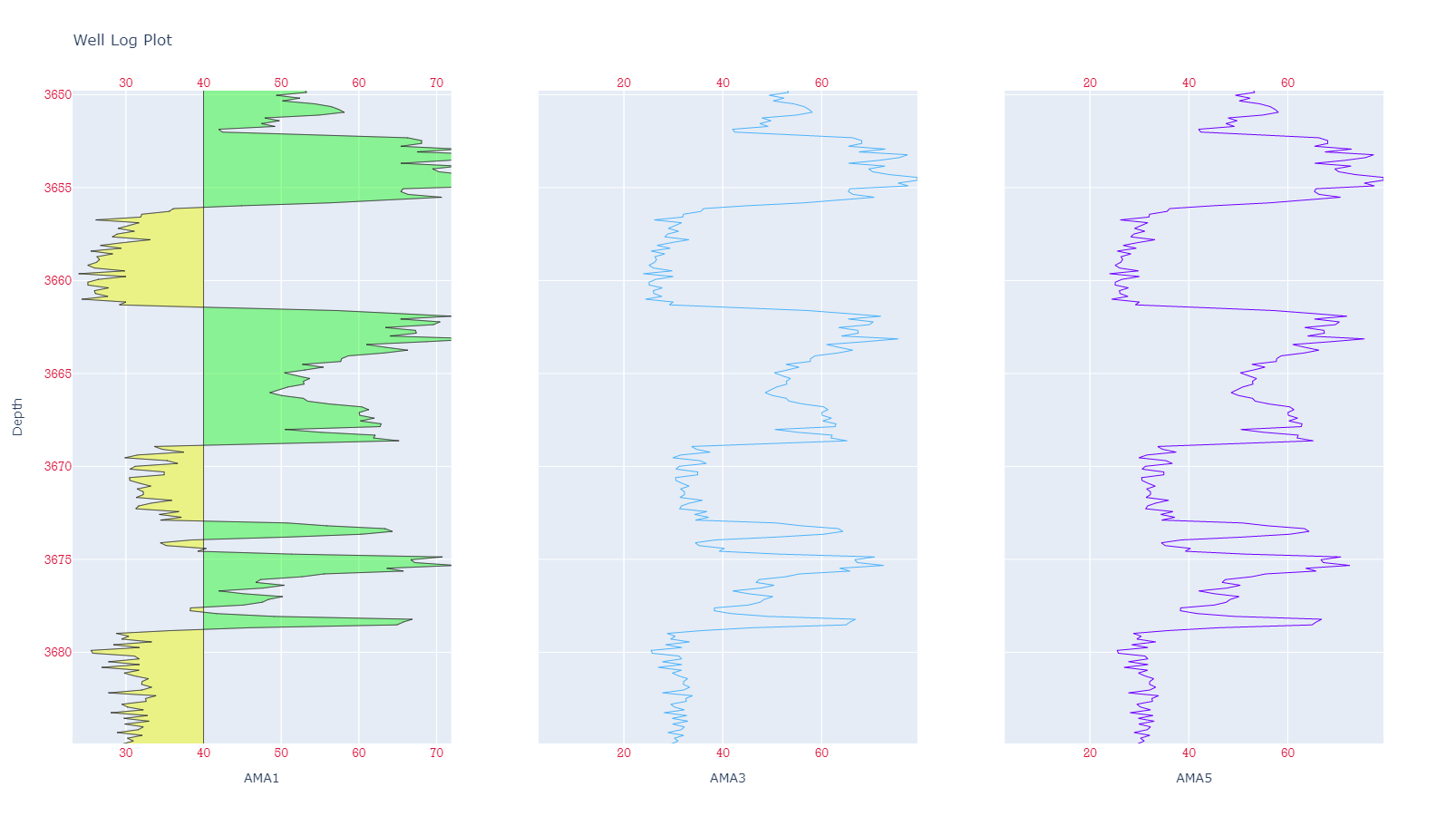
fig.add_trace(go.Scatter(x=Y_axeline, y=X_axe, line = dict(color = '#666768', width=0.5), hoverinfo='none', fill=None, mode='lines',line_color='black', showlegend=False), row=1, col=1) #trace0
fig.add_trace(go.Scatter(x=Y_axegrn , y=X_axe, line = dict(color = '#666768', width=0.5), hoverinfo='none', fill='tonexty', fillcolor='rgba(0,250,0,0.4)', mode='lines', showlegend=False), row=1, col=1) # fill area between trace0 and trace1
fig.add_trace(go.Scatter(x=Y_axeline, y=X_axe, line = dict(color = '#666768', width=0.5), hoverinfo='none', fill=None, mode='lines', line_color='black',showlegend=False ), row=1, col=1) #trace2
fig.add_trace(go.Scatter(x=Y_axered , y=X_axe, line = dict(color = '#666768', width=0.5), hoverinfo='none', fill='tonexty',fillcolor='#eaf286', mode='lines',showlegend=False), row=1, col=1)# fill area between trace0 and trace3
fig.add_trace(go.Scatter(x=Y_axe , y=X_axe, line = dict(color = '#666768', width=0.5),
text ="x+y",hoverinfo = "x+y", mode='lines',line_color='black',showlegend=False), row=1, col=1) #trace4
if threshold==threshold:
fig.add_trace(go.Scatter(x=Y_axe, y=X_axe, line = dict(color = '#4eb3f9', width=1),hoverinfo = "x+y",showlegend=False), row=1, col=2)
fig.update_xaxes(title_text="AMA3", row=1, col=2)
if threshold==threshold:
fig.add_trace(go.Scatter(x=Y_axe, y=X_axe, line = dict(color = '#7000ff', width=1),hoverinfo = "x+y",showlegend=False), row=1, col=3)
fig.update_xaxes(title_text="AMA5", row=1, col=3)
fig.update_traces(xaxis='x4',yaxis='y' , selector = ({'name':'ghost1'}))
fig.update_traces(xaxis='x5',yaxis='y2', selector = ({'name':'ghost2'}))
fig.update_layout(xaxis4_range=[Y_axe.min(),Y_axe.max()])
fig.update_layout(xaxis5_range=[Y_axe.min(),Y_axe.max()])
fig.update_layout(xaxis6_range=[Y_axe.min(),Y_axe.max()])
fig.update_xaxes(title_text="AMA1", row=1, col=1)
fig.update_xaxes(tickangle=0, tickfont=dict(family='Rockwell', color='crimson', size=14))
fig.update_yaxes(title_text="Depth", row=1, col=1, autorange='reversed', tickangle=0, tickfont=dict(family='Rockwell', color='crimson', size=14))
fig.update_layout(title_text="Log Plots", height=900)
fig.update_layout(title_text="Well Log Plot", height=900)
print(fig.layout)
fig.show()