I want to show thousands of lines with contrasting colors.
But thousands of categorical colors takes forever to render.
So I I’ve tried color = lineIndex % 10 but I find that when a color number repeats, plotly connects to the last datapoint of that color.
You can see the effect here:
import pandas as pd
d = pd.DataFrame(dict(
x=[1,2,’’,’’,5,6], #I’ve tried, 0, None, ‘’, etc.
y=[1,1,1,1,5,5],
color=[1,1,2,2,1,1],
))
fig = px.line(d, x=‘x’, y=‘y’, color=‘color’)
fig.update_traces(connectgaps=False)
fig
As you can see, connectgaps has no effect.
is there a way to insist on actual gaps?
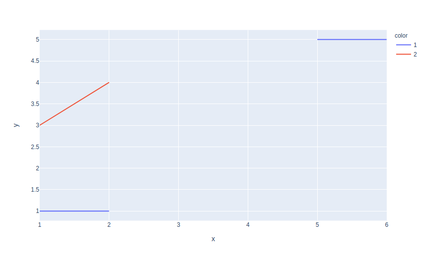
Hi @jonschull welcome to the forum! The way plotly express works for discrete colors is to separate the initial data in different traces, each one corresponding to one unique value of the color. It’s a good idea to try to add None here if you want to create a gap but you have to add it with color=1 otherwise the trace corresponding to color=1 will not know about it. Here is a working example below
import pandas as pd
import plotly.express as px

df = pd.DataFrame(dict(
x=[1,2,1, 2,5, 5,6], #I’ve tried, 0, None, ‘’, etc.
y=[1,1,3,4, None, 5,5],
color=[1,1,2,2,1, 1,1],
))

fig = px.line(df, x='x', y='y', color='color')
fig.update_traces(connectgaps=False)
fig.show()
If you have thousands of lines maybe there could be a clearer way to represent your data however? I don’t know, it depends on your applications of course.
Finally, if you upgrade your version of plotly you will have this nice legend title as in the screenshot attached :-).
Wow. (who knew?) . Well done. Thank you.