Hello fellow Plotly Dash coders! I want to share something that I’ve been working on for some time using Plotly Dash.
What is it for?
There is a free strategy game that I’ve been playing on and off for years called Battle for Wesnoth. The main team was creating a monthly report of the data that they collect about all online games played each month on the official server. I realized that, as an improvement, I could make a dashboard that connects directly to the source of their data and allows users to see and filter any information they want.
How does it look like now?

The Statistics Page

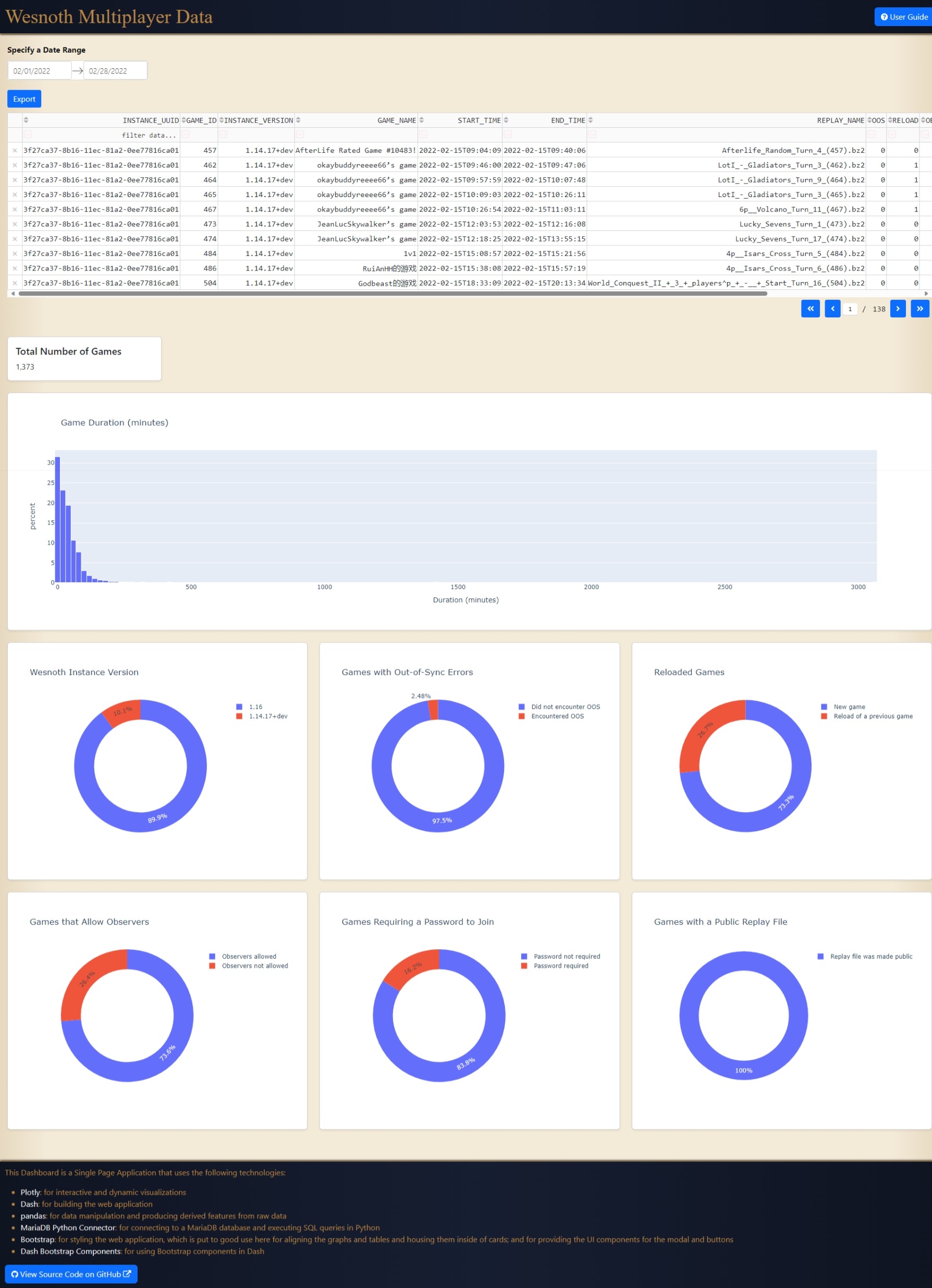
The Query Page
You can see the live version of the app here. It is a multi-page app that uses Dash Pages, but it only has two pages so far. Dash Bootstrap Components was used a lot.
The Header section at the top of the website contains a title, a User Guide button that displays a modal with usage info, and a primary navigation for going to the two pages implemented using Dash Pages.
The main section of the website is a Dash Pages Container that changes its content when the user clicks on the page links in the primary navigation in the header.
In both pages, after a user selects a Date Range, data is fetched from the database and then output on the dashboard.
In the first page, some overall descriptive statistics for the games played in the specified date range is presented as several donut plots.
In the second page, a Dash Datatable is used to present a list of all games played in the specified date range, and a histogram is shown below that conveys how the games are distributed based on Game Duration in minutes.
At the bottom of the website is a footer where I decided to show all the notable technologies used for creating the website, which includes links for going to the official Plotly website. It also contains links to the source code on GitHub where people can contribute or learn from the code.
About the Source Code
The source code is hosted on GitHub, where it has a detailed README. It was a repository that was originally created by me but has now been transferred under the ownership of the Wesnoth organization. Here are some things the app features that is relevant to developers:
- Automated tests using Dash Testing.
- Separate list of Python dependencies for development and production
- app runtime configuration using JSON or environment variables
Contributions Welcome
As of this posting, I have been the main author of this app so far, but I don’t need to have all the glory. We would be happy for others to contribute by fixing bugs, reviewing the code quality, and implementing feature requests or coming up with their own. There are a few open issues in the repository page.
The dashboard has not yet reached its full potential and is only making use of a fraction of the data from the database. To have an idea about what kind of information exists in the database, here is a link to a .sql file that contains the schema or table definitions of the database. A small sample of the database is included as a .sql file in the repository for development purposes.
If you are new to Plotly Dash, don’t be shy. You can try to run this on your own computer by following the README instructions. If there are things that you need help with regards to understanding the code, I am willing to answer questions.
An Impression I want to make
Some might look at Plotly Dash and think that it is a software tool to be utilized only for specialized or advanced applications of data analysis and simulation. I hope this project shows that Plotly Dash is practical for the simple task of just fetching data and then listing it and plotting it.
As an aside, the Battle for Wesnoth game is quite good in its own right. if you like probability, you will enjoy it’s probability-based combat. You have to mitigate bad luck, or bad RNG, as much as you can by creating the most favorable conditions. During play, whenever you get defeated, you must have the awareness to realize whether you have lost because you played poorly or if you have actually played well but only lost due to a rare stroke of bad luck.