Thank you for your interest in submitting your Dash app to the Plotly Explore Page platform, visited by thousands of Dash users daily.
Current submissions cycle will go until September 30, 2025.
To submit your app, please reply to this thread directly.
Please refer to the following suggestions when building and submitting your app. The more suggestions your app adheres to, the more likely it is to be added to the Explore Page.
Apps in the following categories are encouraged: Energy & Utilities, Business, Predictive Analytics & Forecasting, NLP, Connecting to APIs
App should look as good or better than the current apps on the platform
App should use different data than the other apps and try to cover a unique story
Content/story should be neutral or positive
App with live data that updates itself is encouraged
App that goes beyond exploratory analysis – app that perform advanced analytics
App that uses 3rd-party libraries (e.g., SciPy, spaCy, TensorFlow, Scikit-learn)
App that solves real-life problems, app that could have practical use cases
App content and results should be easy to access (we discourage requiring log-ins or uploading data as a precursor to seeing the full app).
The Plotly Example Apps team will review the apps submitted and update this post with the names of the apps that have been selected.
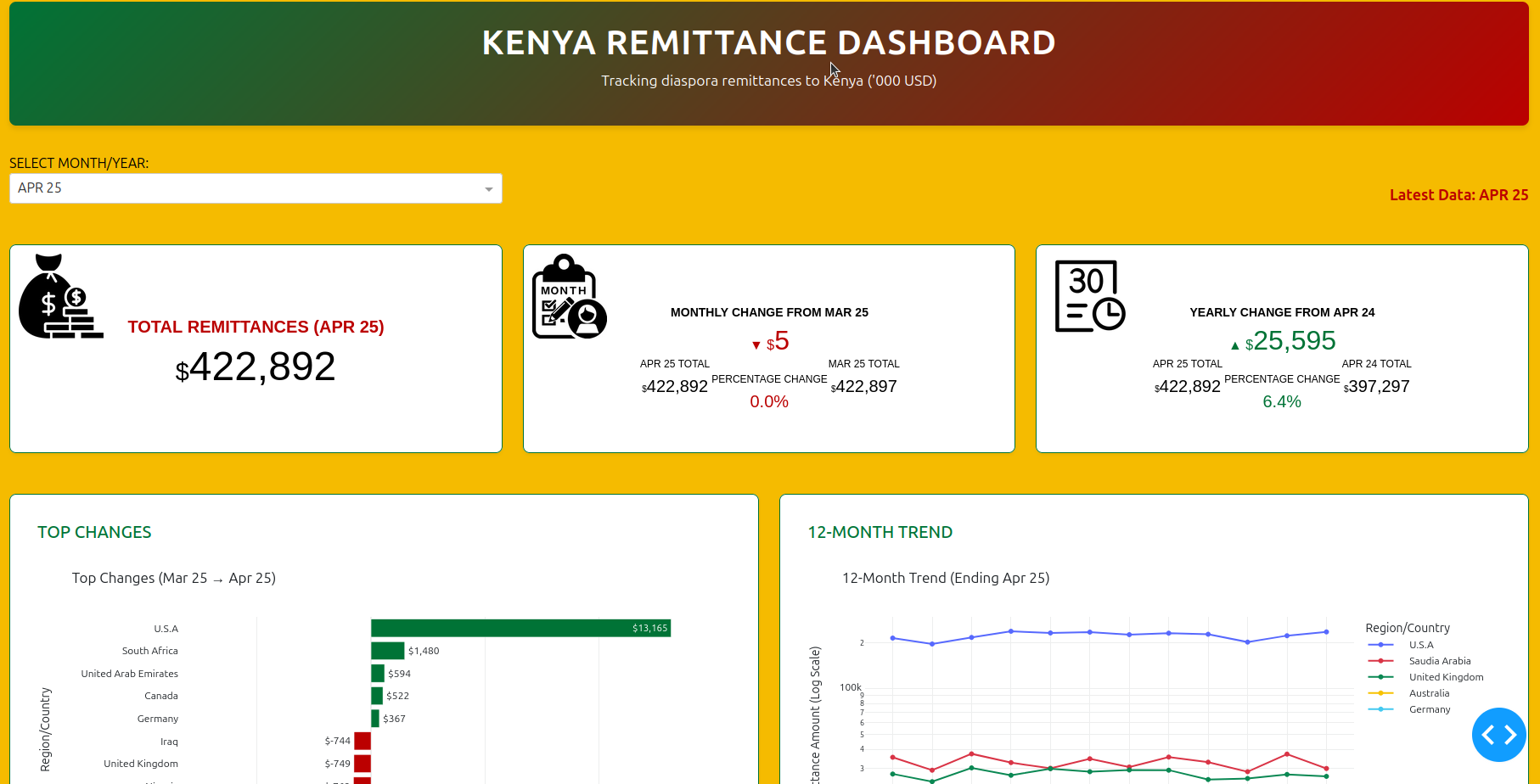
This interactive dashboard tracks monthly diaspora remittances to Kenya, offering a clear snapshot of inflow volumes, top country contributors, and trend shifts over time. Built with Dash and Plotly, it’s designed for policy teams, economic analysts, and program leads who need fast, exportable insights.
Key Features:
Headline Metrics: Total remittances for the selected month, with month-over-month and year-over-year comparisons
Top Country Changes: Bar chart showing the biggest shifts in remittance inflows by country
Snapshot of Last Year: Snapshot of of time like this last year
12-Month Trendline: Line graph visualizing remittance patterns from key regions like the USA, UK, and Saudi Arabia
Modular Layout: Built for clarity, reproducibility, and audit-friendly deployment across teams
After months of building, debugging, and iterating, Version 2 of my Remittance Dashboard is now live . It’s designed to make trends visible, comparisons intuitive, and insights actionable.
Pick any month — say JAN_25 (January 2025) — and the dashboard will:
Render total remittances in thousands of USD Show month-on-month change from DEC_24, both in value and percentage Compare with the same month last year (JAN_24) to show year-on-year shifts Highlight top 5 gainers and bottom 5 losers by country Plot a 12-month trend for the top 10 sending countries Visualize geographic distribution with a choropleth map Reveal the top 10 remittance sources for the selected month (Spoiler: USA always leads) Sunburst chart coming soon — still refining that one!
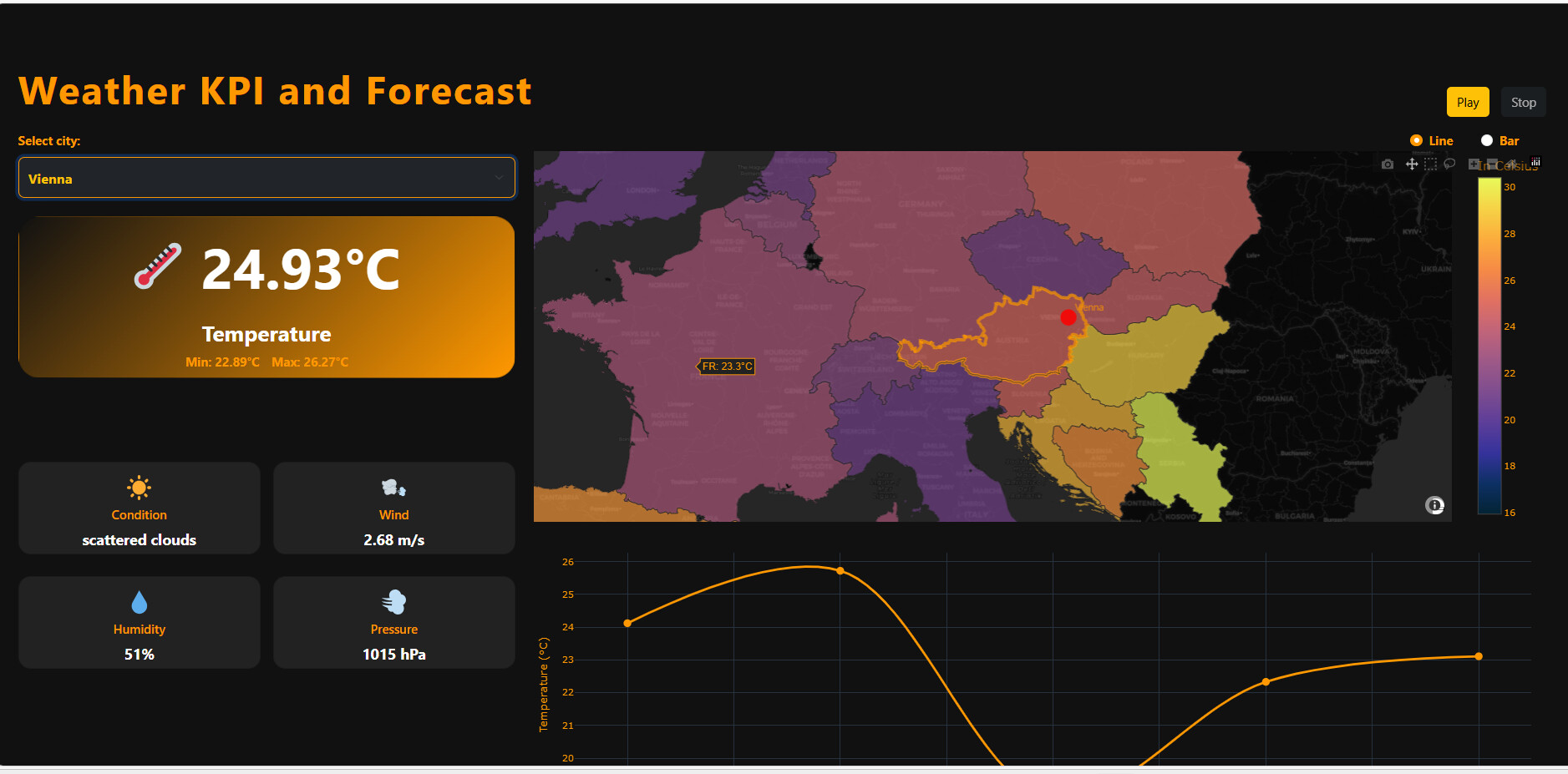
This summer’s weather is very extreme and interesting, so I created a weather KPI and forecaster as a hobby. The Weather KPI and Forecast dashboard uses API-based data to display real-time weather KPIs and forecasts.
The dashboard is built with Dash Bootstrap Components (DBC), making it fully responsive and mobile-friendly. All data is loaded from a .json file and the app updated dynamically via the OpenWeatherMap API, which is free up to a monthly limit.
I still plan to upload some countries to the json file.
The main panel shows the current temperature along with daily minimum and maximum values. Weather conditions are presented with short text and icons (e.g., sunny, cloudy). Wind speed is displayed in real time, measured in m/s. Humidity is shown as a percentage, indicating atmospheric moisture. Air pressure is provided in hPa, serving as a key forecasting metric. A choropleth map visualizes temperature distribution across regions. Temperature trends are illustrated through a time-series chart covering multiple days. Users can interact with controls such as city selection, play/stop buttons, and chart type switches.
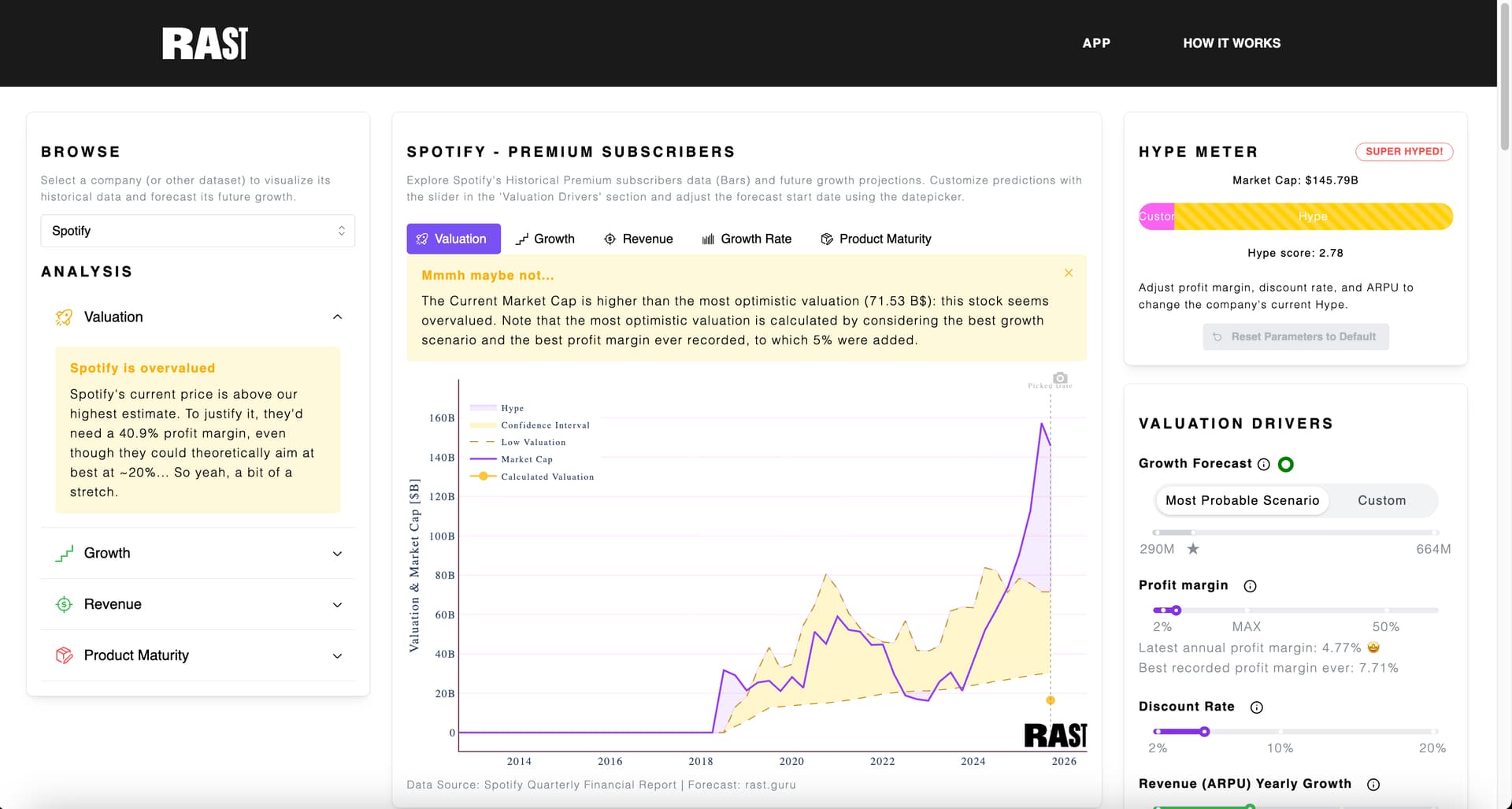
i’ve pushed RAST live a couple of months ago and it’s a pleasure to post it here . RAST is a company valuation tool, that allows users to understand whether a company is over or undervalued. The app is built on Dash using the Mantine framework, deployed with Heroku and linked to an Airtable database via APIs. The features include:
Predict a company’s metric growth (e.g. subscribers for Spotify)
Calculate the company valuation
Compare it with the current market cap (fetched live via APIs to finnhub)
Very much looking forward to getting some feedback!
I wanted to share with you “another maritime traffic app” !
“Another”, because there are plenty of websites available about this topic and displaying vessels around the world.
My motivation was to see how I could handle this on my side using aisstream.iowebsockets and the nice dash-leaflet component, to get a same real-time experience but at lower scale of course.
Select first an area where you want to display the maritime traffic.
Play then with filters and tooltip to get additionnal information on the vessels.
Since, there is not any DB behind the scene, you’ll get a refresh every 2 seconds of the latest vessels position but historical positions only the time you are looking at the app.
In order to be full stateless, the data collected is fully cleared on page refresh !
What a cool app, @Lucas_P .
It’s loading for me but I can’t get any vessels to appear inside the box. Does it take a few minutes for the data to load? I tried 4 different places in the Mediterranean Sea.