Setting up pie charts subplots with an appropriate size and spacing

I’m struggling setting up pie chart subplots with an appropriate size and spacing. If the size of a pie chart is to small then the data is not visible, if the spacing between subplots is not appropriate then the graph will be crammed up. So the layout of the subplots is the following 3 rows; 2 columns. Please see below snippet from the dataset:

violent_main=pd.DataFrame({'Counts': crimes[crimes['Class Main Cathegory'].notnull()==True].groupby(['Police District Number'])['Class Main Cathegory'].value_counts()}).reset_index()
violent_main

Snippet of the dataset:

I’m using the following code to plot:
#PD_1D
label_PD_1D=violent_main[violent_main[‘Police District Number’]==‘1D’][‘Class Main Cathegory’]
values_PD_1D=violent_main[violent_main[‘Police District Number’]==‘1D’][‘Counts’]

#PD_2D
label_PD_2D=violent_main[violent_main['Police District Number']=='2D']['Class Main Cathegory']
values_PD_2D=violent_main[violent_main['Police District Number']=='2D']['Counts']

#PD_3D
label_PD_3D=violent_main[violent_main['Police District Number']=='3D']['Class Main Cathegory']
values_PD_3D=violent_main[violent_main['Police District Number']=='3D']['Counts']

#PD_4D
label_PD_4D=violent_main[violent_main['Police District Number']=='4D']['Class Main Cathegory']
values_PD_4D=violent_main[violent_main['Police District Number']=='4D']['Counts']

fig = {
  "data": [
    {
      "values": values_PD_1D,
      "labels": label_PD_1D,
      "domain": {'x': [0.0, 0.35], 'y': [2.22, 2.53]},
      "name": "PD_1D",
      "hoverinfo":"label+percent+name",
      "hole": .4,  
      "type": "pie"
    },     
    {
      "values": values_PD_2D,
      "labels": label_PD_2D,
      "text":"CO2",
      "textposition":"inside",
      "domain":{'x': [0.50, 0.85], 'y': [2.22, 2.53]},
      "name": "PD_2D",
      "hoverinfo":"label+percent+name",
      "hole": .4,  
      "type": "pie"
    },
     {
      "values": values_PD_3D,
      "labels": label_PD_3D,
      "text":"CO2",
      "textposition":"inside",
      'domain': {'x': [0.0, 0.35], 'y': [.9, 1.13]},
      "name": "CO2 Emissions",
      "hoverinfo":"label+percent+name",
      "hole": .4,   
      "type": "pie"
    }  
  ],
  "layout": {
        "title":"Violent Crimes by main cathegory",
        "annotations": [
            {
                "font": {
                    "size": 20
                },
                "showarrow": False,
                "text": "PD_1D",
                "x": 0.12,
                "y": 0.5
            },
            {
                "font": {
                    "size": 20
                },
                "showarrow": False,
                "text": "PD_2D",
                "x": 0.73,
                "y": 0.5
                },
            {
                "font": {
                    "size": 20
                },
                "showarrow": False,
                "text": "PD_3D",
                "x": 0.20,
                "y": 0.25
                }
            ]
        }
    }
iplot(fig, filename='donut')

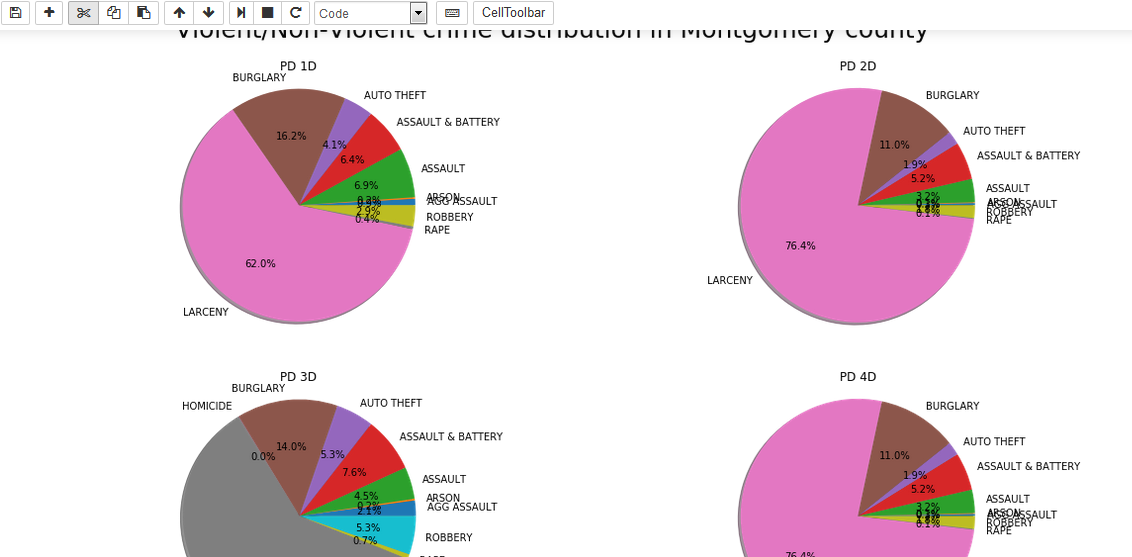
Within this code I’m trying to manipulate layout using the “domain”:{x:[],y:[]) However I can’t the layout desired. So for instance plot number 3 is smaller and above plot 1 and plot 2. What I would like is that plot to be the same size as the other plots but below then Please see below plot:

I’m hoping I can figure out the logic so I can plot the pie charts: 3 rows: 2 columns.
Please advise

@praslea The plot consisting in your 6 subplots should be inserted in the unit square [0,1]x [0,1]. It is displayed in a rescaled rectangle of length width, and height height (the values for width and height are set in layout).

Hence the domain for each pie chart should have the interval ends in [0,1]. In your settings you have a domain like this:
'domain': {'x': [0.0, 0.35], 'y': [.9, 1.13]}
with the right end 1.13, outside of [0,1]. That is why Plotly couldn’t handle such a cell.
To define the domain for each pie, take the square [0,1]x[0,1] and divide it in 6 cells:

domain1={‘x’:[0, 0.33], ‘y’:[0.66,1.0]}# for the cell (1,1)
domain2={'x:[0.66, 1], ‘y’:[0.66,1]}#cell (1,2)
domain3={‘x’:[0, 0.33], ‘y’:[0.33, 0.66]}#cell (2,1)
domain4={‘x’:[0.66, 1], ‘y’:[0.33, 0.66]}#cell (2,2)
domain5={‘x’:[0, 0.33], ‘y’:[0,0.33]}#cell (3,1)
domain6={‘x’: [0.66, 1], ‘y’:[0,0.33]}#cell (3,1)

This is just an example with a large space between horizontal cells, but you can adapt the width of each cell to your needs.

*PLease change the category of your question from plotly.js to python.

Hi
@empet

Thanks for the feedback I changed the tag to python.
Is it possible to make the plots bigger? I feel it’s really necessary for clarity. Or I’m constrained by these limits [0,1]x [0,1]?
Reason for me asking this is because I played with the values in the attempt to increase the size.
At the current scale the pie charts are small and the details are not visible:

I can achive this in matplotlib but I would rather use plotly if possible, because from an visual point of view from my perspective it’s much better…(plotly that is)
Attache print from matplotlib:

Any advice?

Hi @praslea,
In the previous message I said that the unit square is rescaled to a bigger plot window, setting in layout the window width and height:

layout=dict(title='Your title",
autosize=False,
height = 1000,
width = 900
)
fig = dict(data=data, layout=layout)

Here is my code https://plot.ly/~empet/14576 and this is the corresponding plot:
https://plot.ly/~empet/14574.embed

Hi

Thanks so much for this.
That helps a lot