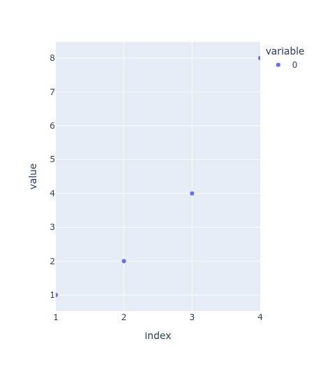
Axes in plots spans outside of plotted data by default (not much in this example, other plots might be more prominent)
import plotly.express as px
import pandas as pd

data = pd.Series([1,2,4,8], index=[1,2,3,4])
px.scatter(data)
How to get rid of the extra values below and above the actual data range? I don’t want to set values manually each time, especially when I don’t know the exact range in the data.
Autorange leaves gaps on x axis below lowest and highest values, I want the axis to be exactly the range of the data.
I also don’t want to set manually, because often I don’t know the exact highest and lowest values in plotted data. Also it gets complicated if there are multiple axis, more traces of different kinds etc.
So ideally something like autorange=True and no extra space on either side.
Thank you, I found the autorange options, but none of them achieves the thing I need, sadly.
Well, as often with plotly, I ended up writing my function which does something similar. Maybe will come handy for someone.
def clip_axis_range(
    fig,
    x_lower=True,
    x_upper=True,
    y_lower=False,
    y_upper=False
    ):
    """
    Clip plotly axis range to exactly match data.

    x- and y-axis, lower and upper bound are both free to choose.
    Iterates through data traces contained in figure, extracts min and max, and sets the respective axes range bounds to these.

    Parameters
    ----------
    fig: plotly.graph_objs._figure.Figure
        The figure to update.
    x_lower: bool
        Clip x axis lower range. Defautls to True.
    x_upper: bool
        Clip x axis upper range. Defautls to True.
    y_lower: bool
        Clip y axis lower range. Defautls to False.
    y_upper: bool
        Clip y axis upper range. Defautls to False.

    Returns
    -------
    plotly.graph_objs._figure.Figure
        Plotly graph with updated axis ranges.
    """
    x_vals_lower, x_vals_upper, y_vals_lower, y_vals_upper = [], [], [], []

    for _trace in fig["data"]:
        if _trace["x"] is not None:  # Trace has not empty "x" data
            x_vals_lower.append(min(_trace["x"]))
            x_vals_upper.append(max(_trace["x"]))

        if _trace["y"] is not None:  # Trace has not empty "y" data
            y_vals_lower.append(min(_trace["y"]))
            y_vals_upper.append(max(_trace["y"]))

    x_vals_lower = min(x_vals_lower)
    x_vals_upper = max(x_vals_upper)
    y_vals_lower = min(y_vals_lower)
    y_vals_upper = max(y_vals_upper)

    fig = fig.update_xaxes(
        autorangeoptions={
            "minallowed":[None, x_vals_lower][x_lower],
            "maxallowed":[None, x_vals_upper][x_upper]
        }
    )

    fig = fig.update_yaxes(
        autorangeoptions={
            "minallowed":[None, y_vals_lower][y_lower],
            "maxallowed":[None, y_vals_upper][y_upper]
        }
    )

    return fig