I’m trying to graph some live time-series data, and I can’t for the life of me figure out why my y axis is not reversing.
This is my layout for the chart:
#Layout for individual trace graph
livlayout= go.Layout(
autosize=True,
#width =  600,
height = 900,
font=dict(
          color='#a9a9a9',
          family = "Helvetica",
          size = 8,
          ),
margin=dict(
    l=40,
    r=40,
    b=40,
    t=5
),
hovermode="closest",
yaxis = dict(autorange = 'reversed'),
)
And here is the function that generates the data for the chart:
def gen_trace(rawjson, jobnum, trace):
joblist=[]
joblist.append(jobnum)
#Reads hidden div for dataframe
datadf = pd.read_json(rawjson, orient='split')
#Filters dataframe and selects x/y traces
datadf = datadf[datadf['JOB'].isin(joblist)]
ydata = datadf['Timestamp']
xdata = datadf[trace]

return{
    "data": [{
        "type" : 'scatter',
        "mode" : 'lines+markers',
        "line" : {
            "shape" : 'spline',
            "smoothing" : '2',
            "width" : '1',
            "color" : '#a9bb95'},
        "y" : ydata,
        "x" : xdata
    }]}
My data is requested from my SQL server. Specifically, I’m requesting the last 120 seconds of data. I’d like the x-axis to be at the top of the plot, and the newest data to appear at the bottom of the plot. Here is an example of how the plot looks now:
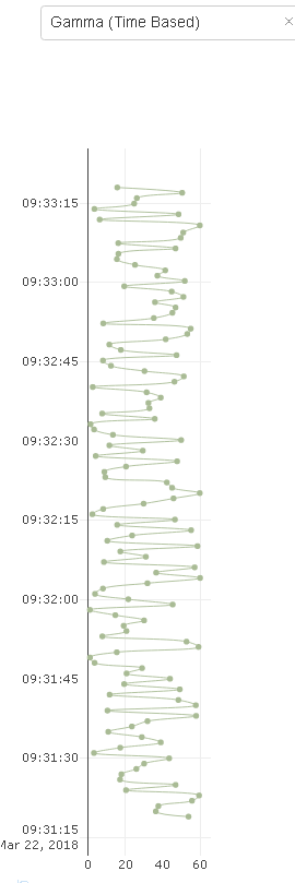
So pretty much all I want to do is reverse the Y axis. Any idea what I could be missing/doing wrong?
Thanks for the help!
