HI,
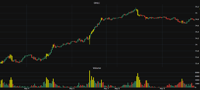
I’m using range break to filter out the dates with missing data. Earlier I was using category, but with category the graph doesn’t display x axis. The issue with range break is , the graph is not rendered properly. The candle stick and volume somehow get shrunk/thin. (images attached). Has anyone faced the same issue before?
The first image is with category (no time x-axis) and the second image with range break. Notice the thickness of the candles and volume bar.
Any help would be greatly appreciated :). I’m stuck here, and not sure how to fix it.
Hi!
Thanks for posting on the forum. Are you using plotly express or graph objects? And would you mind sharing some of your code?
Best,
Eliza
Thanks Eliza for your response. I’m using graph objects.
time_period_all = pd.date_range(start=data['bar_end_time'].iloc[0],
                                    end=data['bar_end_time'].iloc[-1],
                                    freq='1800S')
    time_period_all = [datetime.strftime(d, format='%Y-%m-%dT%H:%M:%SZ') for d in time_period_all]
    time_period_with_data = set(data['bar_end_time'].to_list())
    time_period_gaps = [d for d in time_period_all if d not in time_period_with_data]

candles.update_xaxes(rangebreaks=[dict(values=time_period_gaps, dvalue=1800000)])
candles.update_layout({'xaxis': {'showticklabels':  True},
                                           'yaxis': {'side': 'right'}})
The last candle could be less than 1800 seconds (30 minutes) depending on the current time.
What version of dash are using? There’s a known issue with rangebreaks in an old version of dash.
I’m using dash v2.8.1.
dash 2.8.1
dash-bootstrap-components 1.3.1
dash-bootstrap-templates 1.0.8
dash-core-components 2.0.0
dash-extensions 0.1.13
dash-html-components 2.0.0
dash-table 5.0.0
The issue is not with the data or missing time period, the candles/volume bars get shrunk/thinner.
Any help is appreciated. I’m not sure why the candle and bar size changes with showTickLabels=true, and it keeps getting thinner and thinner on every callback
Hello @ak2405,
Have you tried just using patch and only updating the data that is displaying and not resending the whole figure each time?
Thanks @jinnyzor . The main objective is to have a continuous candestick graph- remove the data points with no value/data. I’m not sure if there is a way better way to do it other than using range breaks.
I will try using patch. Thanks
You’ll need to update to dash 2.9+ for Patch(). ![]()
Thanks. Im reading the documentation for patch.
Also, is there a better way to remove empty data points from the graph other than using range break?


