I’m trying to sort a pandas Series and visualize it as a scatterplot, where the index values are strings (phone models), sorted by the values of the series.
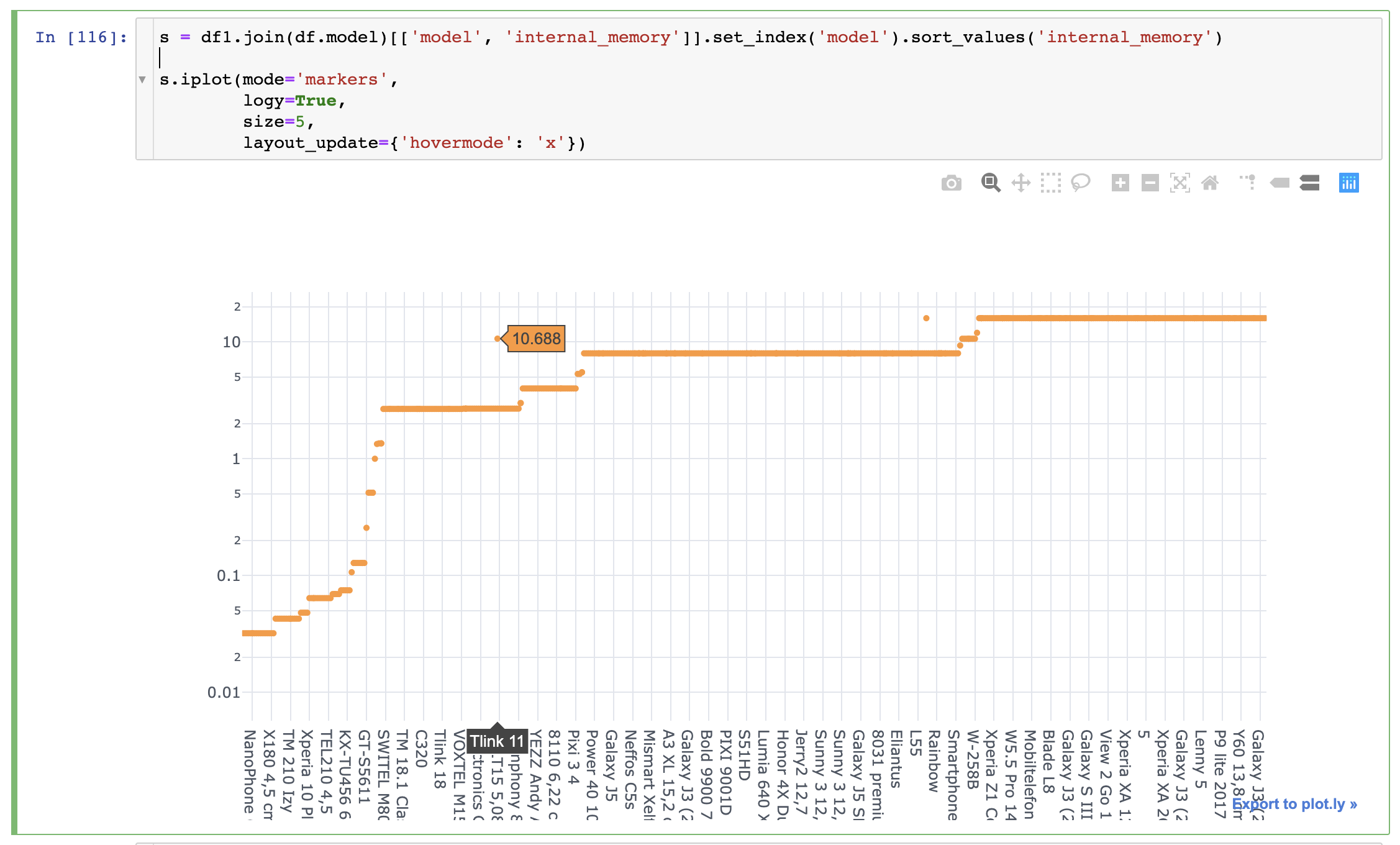
The problem is that for some rows, there are ‘gaps’ where their value is higher than it actually is
It’s not a problem of Pandas, as it seems like that specific row has the same value as the ones surrounding it, and Plotly is displaying a different value
Hi @xoelop, would it be possible to reproduce the problem with a standalone example with synthetic data (or by sharing your code and dataset), so that we can debug this? Also, what version of plotly are you using?
I suspect that’s what’s happening is that you have multiple y-values for certain categories, and Plotly will not duplicate categories on the x-axis. That’s why when you plot your series without an index in the second screenshot it looks right, because the x-axis is numerical.