Hi
Is it possible to replicate this scatter plot / pie chart combo in python plotly?
I essentially to build a scatter plot with variable size pie charts for each “bubble” on the scatter plot
Thanks
Hi
Is it possible to replicate this scatter plot / pie chart combo in python plotly?
I essentially to build a scatter plot with variable size pie charts for each “bubble” on the scatter plot
Thanks
Hey @gtg592v ,
I think it is possible.
import plotly.graph_objects as go
import math
def scatter_pie(radius, x, y, sectors):
colors = ["red","green","blue"]
angles = [360 * val / 100 for val in sectors]
angles = [math.radians(x) for x in angles]
nop = 100 #number of points
start_angle = 0
pie_segments = []
for i,j in zip(angles,colors):
end_angle = start_angle + i
d_theta = (end_angle - start_angle) / (nop - 1)
theta = [start_angle + i * d_theta for i in range(nop)]
x_segment = [x + radius * math.cos(t) for t in theta]
y_segment = [y + radius * math.sin(t) for t in theta]
# Add the center coordinates to close the circle segment
x_segment.append(x)
y_segment.append(y)
trace = go.Scatter(x=x_segment,
y=y_segment,
mode='lines',
fill="toself",
fillcolor=j,
line=dict(color='blue', width=2)
)
pie_segments.append(trace)
start_angle = end_angle
return pie_segments
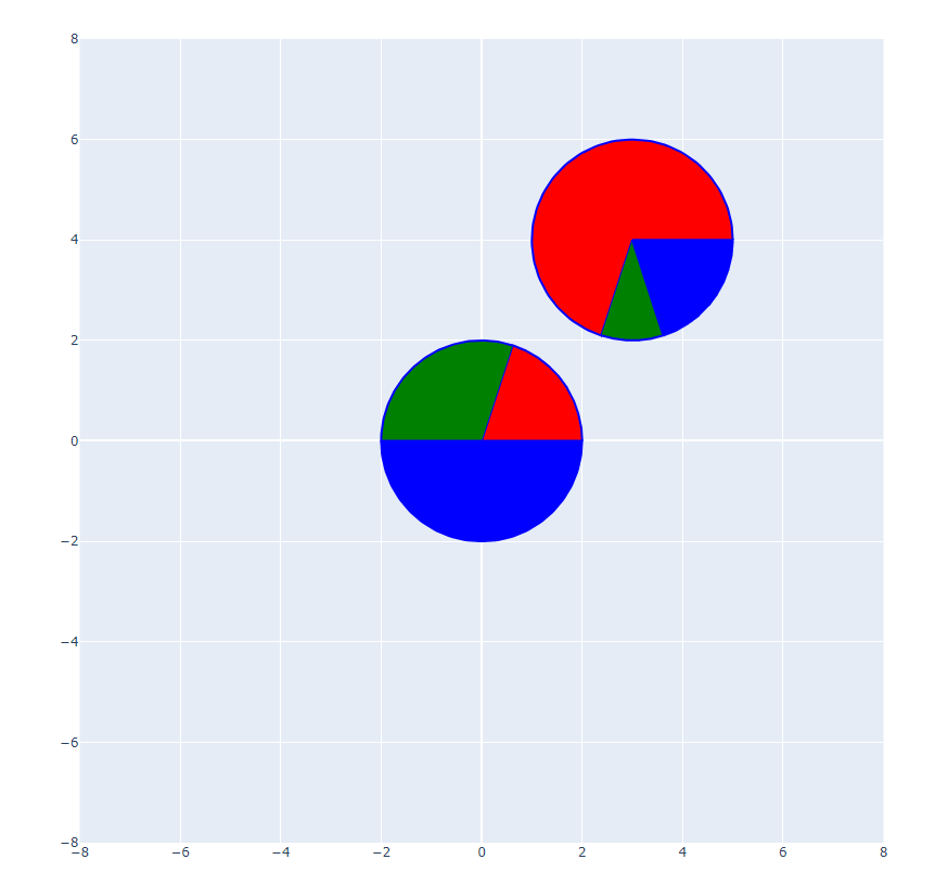
pie1 = scatter_pie(2,0,0,[20,30,50])
pie2 = scatter_pie(2,3,4,[70,10,20])
fig = go.Figure(pie1+pie2)
fig.update_xaxes(constrain='domain')
fig.update_yaxes(scaleanchor='x')
fig.update_layout(xaxis=dict(range=[-8, 8]),
yaxis=dict(range=[-8, 8])
)
fig.show()
Hello again @gtg592v ,
I edited my first post. Please see revised code and output figure.
Have a nice day.
Hi guys!
Nice one @akroma! I like it!
![]()