[I dont know in how far crossposts are allowed because I have also asked the question on [SO](Plotly + Python: have static annotations + multiple interactive annotations from dropdown menu - Stack Overflow)., sorry for being impatient]
I am creating a complex plot in python and plotly with a couple of (user defined) annotations. However, I also have a region of interest highlighted by default.
So I have two questions:
- Can I have static annotations (that are always displayed)
- Can I have two dropdowns that indepdantly show different kind of annotations?
The current challenge that I am facing is that the annotation as such works but they are canceling each other out.
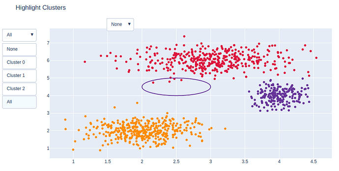
Below is an example of what I want to do. The variable RND contains an annotation that should always be displayed.
Then two dropdowns are filled with (partly dummy) coordinates. I want to use them indepedantly of each other, e.g. display Cluster0, ROI2, RND region or display cluster0 + RND or display all clusters + RND etc.
The code snippets are mainly taken from here.
In the screenshot the default annotation is shown with the two dropdowns (please ignore the layout):
I would highly appreciate any help!
import plotly.graph_objects as go

# Generate dataset
import numpy as np
np.random.seed(1)

x0 = np.random.normal(2, 0.4, 400)
y0 = np.random.normal(2, 0.4, 400)
x1 = np.random.normal(3, 0.6, 600)
y1 = np.random.normal(6, 0.4, 400)
x2 = np.random.normal(4, 0.2, 200)
y2 = np.random.normal(4, 0.4, 200)

# Create figure
fig = go.Figure()

# Add traces
fig.add_trace(
    go.Scatter(
        x=x0,
        y=y0,
        mode="markers",
        marker=dict(color="DarkOrange")
    )
)

fig.add_trace(
    go.Scatter(
        x=x1,
        y=y1,
        mode="markers",
        marker=dict(color="Crimson")
    )
)

fig.add_trace(
    go.Scatter(
        x=x2,
        y=y2,
        mode="markers",
        marker=dict(color="RebeccaPurple")
    )
)

# Add buttons that add shapes
cluster0 = [dict(type="circle",
                            xref="x", yref="y",
                            x0=min(x0), y0=min(y0),
                            x1=max(x0), y1=max(y0),
                            line=dict(color="DarkOrange"))]
cluster1 = [dict(type="circle",
                            xref="x", yref="y",
                            x0=min(x1), y0=min(y1),
                            x1=max(x1), y1=max(y1),
                            line=dict(color="Crimson"))]
cluster2 = [dict(type="circle",
                            xref="x", yref="y",
                            x0=min(x2), y0=min(y2),
                            x1=max(x2), y1=max(y2),
                            line=dict(color="RebeccaPurple"))]

RND = [dict(type="circle",
                            xref="x", yref="y",
                            x0=2, y0=5,
                            x1=3, y1=4,
                            line=dict(color="RebeccaPurple"))]

ROI_type2 = [dict(type="circle",
                            xref="x", yref="y",
                            x0=1, y0=3,
                            x1=2, y1=4,
                            line=dict(color="RebeccaPurple"))]

fig.update_layout({"shapes": RND})

fig.update_layout(
    updatemenus=[
        dict(buttons=list([
            dict(label="None",
                 method="relayout",
                 args=[{"shapes": []}]),
            dict(label="Cluster 0",
                 method="relayout",
                 args=[{"shapes": cluster0}]),
            dict(label="Cluster 1",
                 method="relayout",
                 args=[{"shapes": cluster1}]),
            dict(label="Cluster 2",
                 method="relayout",
                 args=[{"shapes": cluster2}]),
            dict(label="All",
                 method="relayout",
                 args=[{"shapes": cluster0 + cluster1 + cluster2}])
        ]), active=4
        ),

        dict(buttons=list([
            dict(label="None",
                 method="relayout",
                 args=[{"shapes": []}]),
            dict(label="ROI2",
                 method="relayout",
                 args=[{"shapes": ROI_type2}]),
        ]), direction="down", xanchor="left", x=0.2, y=1.08, yanchor="top")
    ]
)

# Update remaining layout properties
fig.update_layout(
    title_text="Highlight Clusters",
    showlegend=False,
)

fig.show()
