Hey everyone! Happy Monday 
I took Fable 5.1 for a spin with Plotly 4.0 last week and came up with this pretty awesome list of print-ready Plotly graphs as static PNG and SVGs: Plotly for Highly Customizable Print-Ready Data Visualization · Chris Parmer
I’ve noticed an influx of AI-written articles lately that compare different graphing libraries to each other, and have this funny tone that attempts to force a comparison. So they’ll say things like “Plotly is only for interactive graphics, if you want a static chart you’ll need to use a different library.” It’s a funny false dichotomy, as we engineered Plotly from Day 1 to be exceptional at print-ready graphing! Two things can be true at once 
So I put together this post to really highlight and show off the breadth and customizability of Plotly graphs, and intentionally rendered all of the graphs as beautiful print-ready visualizations instead of Plotly’s default interactive ones.
The other thing I wanted to show off in this post was all of the ways you can control the graphics using the underlying shapes and axes systems. Basically, I wanted to show off Plotly graphs that are as far away from the default trace types as possible, so that they’re almost unrecognizable from the default styles.
Here are some of my favs:

(Love using annotations as legend items, such a clean look and so easy to read: your eyes don’t have to move back and forth between trace plus legend. And as a colorblind user, having labels be close to the trace rather than distinguishing entirely from color is so helpful).
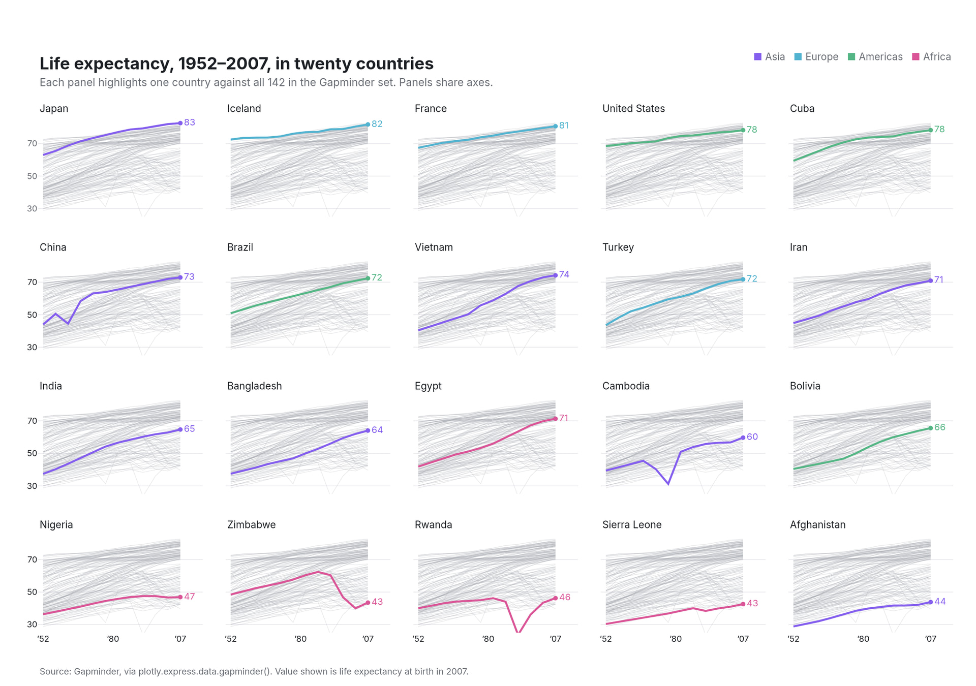
(I’ve always loved these charts that show the distribution of traces below the main highlighted trace. Very effective way to show the wide range of values, especially for things like time series where a single number like a mean or displaying the sample of points in a histogram doesn’t tell the same story)
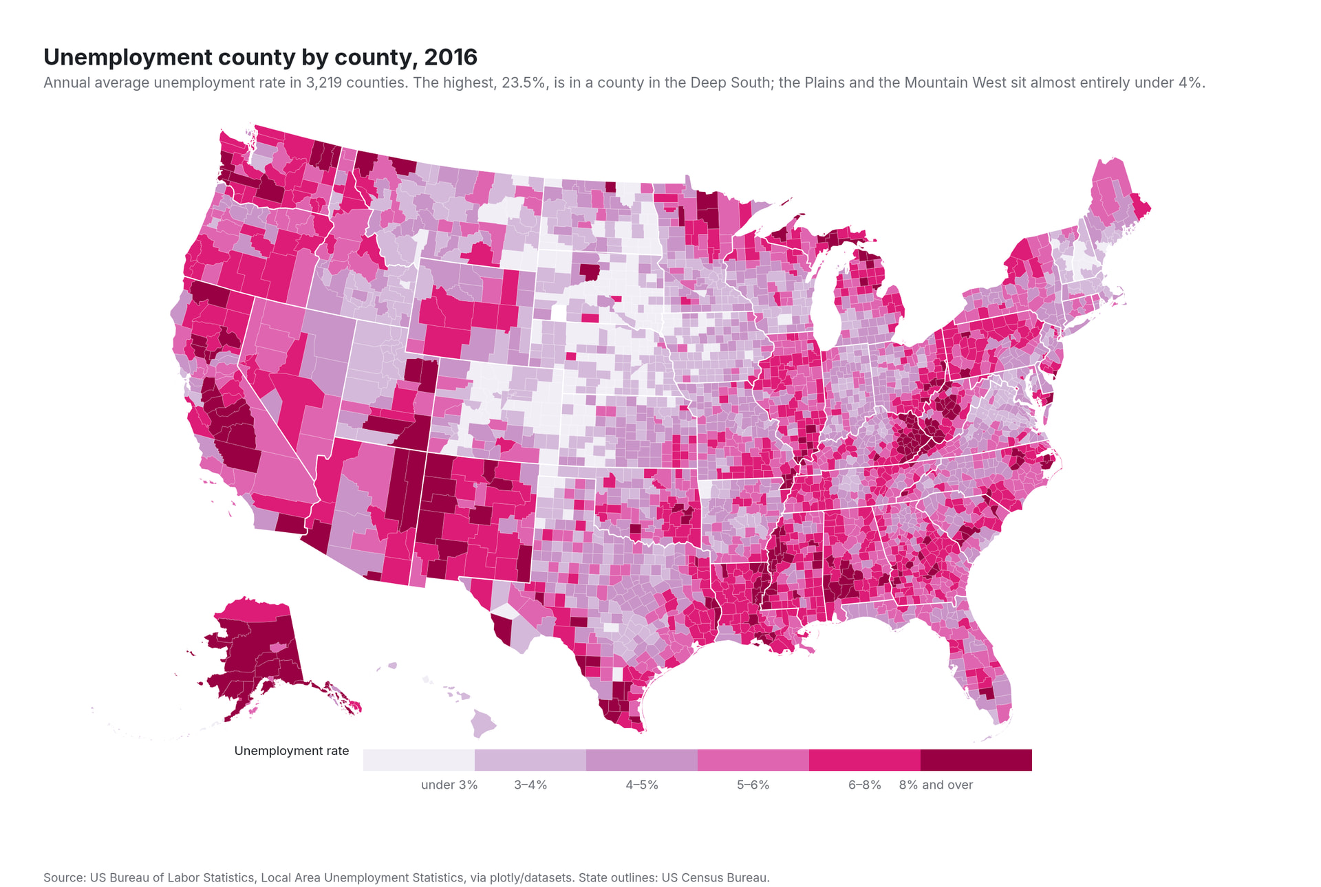
(This shade of pink is so nice in a sequential colorscale. Not all colors look great when displayed from light saturation to fully saturated)

(Great use of annotations and shapes to make tabular visualization with embedded charts).

(Throw back to a list of time series charts from last year. Wow have the models come a long way in terms of creating customized visualizations: ✨ Show & Tell Thread - Favorite Charts - #5 by chriddyp. Such a nice detail to include the month separators in this chart)
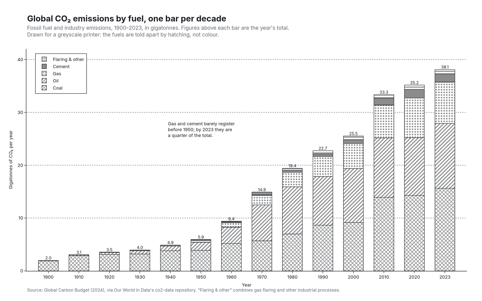
(These shaded patterns landed several years ago and I’d love to see more of them. Such an effective design for B&W print graphics)

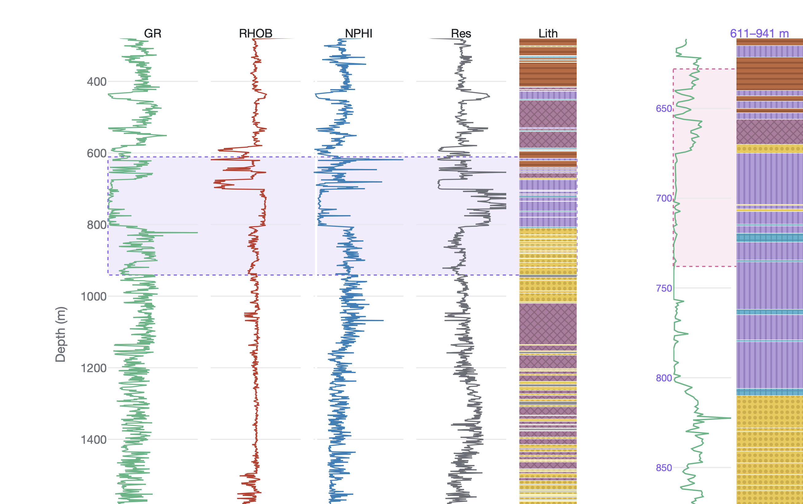
(A core tenant of Plotly’s design and architecture is consistency. So if we had a feature to one chart type, we try to make sure it’s available in all. So the same pattern hatching in those bar charts are available in shapes as well. And this feature uses Plotly’s new multi-axis shapes logic for these “striplog” charts, another example here: A Compendium of Canonical Charts · Chris Parmer).

(Domain-specific charts, especially scientific ones, have a ton of these standards/conventions, like these lines that span the bars. Great use of Plotly’s shape system to draw this. Speaking of domain specific charts, I’ve been compelling a bunch of them here as well: A Compendium of Canonical Charts · Chris Parmer)

(Ridgeline plots! Kind of a classic “graphic design” chart. I’ve probably seen more ppl wear the Joy Division Unknown Pleasures graphic tee than I’ve seen actual ridgeline charts in the wild.)

And a PSA - if you write any blog posts or social posts about Plotly, don’t sleep on it’s static image export and print-ready capabilities! It really is best in class. I mean, c’mon check out these vector graphics! You can just zoom in for days