Hello all,
I am trying to change the data value labels in a choropleth map legend that I created using Plotly Express. I have tried following the solution that was recommended here, but I can’t get it to work. I suspect it might be because I am not using a continuous color scale and so maybe the coloraxis_colorbar isn’t applicable? I am trying to do this without Graph Objects, if possible.
Here is the code I have working so far:
dfState = dfData[ (dfData['state_abbr'] == 'CO') ]

fig = px.choropleth(dfState, geojson=counties, locations='county_fips',
                        color='rucc',
                    color_discrete_map=color_map,
                            hover_data=["county_name"],
                           scope="usa",
                           labels={'rucc':'rucc'},
                            height=1000, width=1400,
                    category_orders={'rucc': ['1', '2', '3', '4', '5', '6', '7', '8', '9']}
                          )

fig.update_geos(fitbounds="locations", visible=True)

fig.update_layout(margin={"r":0,"t":0,"l":0,"b":0},
                  legend=dict(
                      yanchor="top",
                      y=0.99,
                      xanchor="left",
                      x=0.01))

fig.update_traces(marker_line_width=1, marker_line_color='black')

fig.show(height=1000, width=1400, scale=3.0)
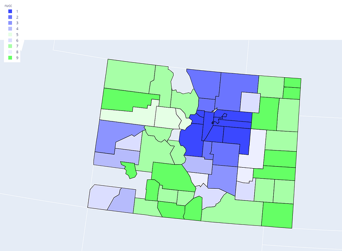
Here is my resulting figure:
I am trying to just relabel the values in the legend, so ‘1’ becomes ‘One’ (just using this as a placeholder text for the example), etc. One thing I want to note is that the values currently displaying in the legend (1, 2, 3, etc.) are all strings and NOT integers. I’m not sure if that matters…
Thanks!
