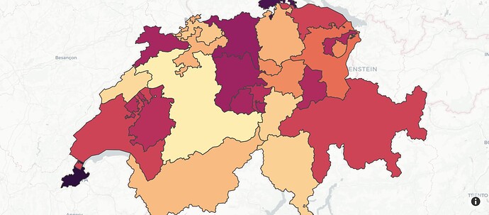
Is there a way to create additional choropleth (ideally Mapbox choropleths, but I’d settle for Plotly’s standard choropleth function) maps and layer them on top of a base choropleth so that I can easily show data related to Alaska and Hawaii with the continental US?
Something like this
Don’t believe my existing code is necessarily helpful, but here’s how I build my base map (removed my custom style so that anyone should be able to generate).
fig = px.choropleth_mapbox(
    df_mar,
    geojson=puma,
    locations="stpuma",
    color="inter_pct",
    range_color=(0,25),
    color_continuous_scale="Viridis",
    labels={"inter_pct": "Marriage (%)"},
    center={"lat": 37.0902, "lon": -95.7129},
    zoom=4.2,
    opacity=1.0,
    mapbox_style="white-bg"
)
fig.update_layout(
    coloraxis_colorbar=dict(
        bgcolor="rgba(22,33,49,1)",
        title="Marriage,<br>Percent Share",
        titlefont=dict(
            color="rgba(255,255,255,1)"
        ),
        tickfont=dict(
            color="rgba(255,255,255,1)"
        ),
    ),
    margin=dict(
        l=50,
        r=50,
        b=50,
        t=50,
        pad=4
    ),
    paper_bgcolor = "rgba(8,18,23,1)",
    plot_bgcolor = "rgba(8,18,23,1)",
    showlegend = True,
    annotations = [
        dict(
            x=-0.025,
            y=-0.04,
            xref='paper',
            yref='paper',
            text='Source: Census ACS 5 2015-2019',
            showarrow = False,
            font=dict(
                color="rgba(255,255,255,1)"
            ),
            bgcolor="rgba(8,18,23,1)",
        )
    ]
)
fig.update_traces(
    marker_line_width=0,
    below="waterway"
)
fig.show(width=1920, height=1080)

