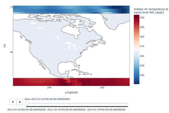
I was playing around with some animation frames and I’m looking for help on how to overlay a map with the correct xaxis (longitude) and y axis (latitude). I ended up using px.imshow to get the animation frames to work correctly, and in the same dataset the lat range is 15 to 75 and the lon range is 200 to 330. I wouldve thought that with the scattergeo lataxis and lonaxis being on the same figure as the heatmap that the axes would match but they do not and im not sure how to correctly align them/change the opacity of the map so you could actually see the map and heatmap simultaneously. See the following code for reference:
import plotly.express as px
import xarray as xr
from plotly import graph_objects as go

airtemps = xr.tutorial.open_dataset('air_temperature').air
data = airtemps.resample(time='D').mean(dim='time')
fig = px.imshow(data, animation_frame='time', color_continuous_scale='RdBu_r', origin='lower')
fig.add_trace(go.Scattergeo(lon=[], lat=[], mode='lines', showlegend=False))
fig.update_geos(projection_type='equirectangular',
                lataxis=dict(range=[-90, 90]),
                lonaxis=dict(range=[0, 360]),
                showframe=True,
                projection=dict(scale=1))
fig.update_layout(width=950,
                  height=650,
                  xaxis=dict(automargin=True,
                             tickmode='array',
                             tickvals=[0, 60, 120, 180, 240, 300, 360],
                             title='Longitude'),
                  yaxis=dict(tickvals=[-90, -75, -40, 0, 40, 75, 90])
                  )
fig.show()
i also thought that i needed to explicitly set the lat/long on the scatter geo to match that of the dataset, but they still dont match up-
import plotly.express as px
import xarray as xr
from plotly import graph_objects as go

airtemps = xr.tutorial.open_dataset('air_temperature').air
data = airtemps.resample(time='D').mean(dim='time')
fig = px.imshow(data, animation_frame='time', color_continuous_scale='RdBu_r', origin='lower')
fig.add_trace(go.Scattergeo(lon=[], lat=[], mode='lines', showlegend=False))
fig.update_geos(projection_type='equirectangular',
                lataxis=dict(range=[15, 75]), #these dimensons match
                lonaxis=dict(range=[220,330]),
                showframe=True,
                projection=dict(scale=1))
fig.update_layout(width=950,
                  height=650,
                  xaxis=dict(automargin=True,
                             tickmode='array',
                             tickvals=[0, 60, 120, 180, 240, 300, 360],
                             title='Longitude'),
                  yaxis=dict(tickvals=[-90, -75, -40, 0, 40, 75, 90])
                  )
fig.show()
in a perfect world i wouldve used contours instead of just a heatmap but couldnt figure out how to get the animation frames to work correctly. In this case since its quite data intensive i thought overlaying the map would be easier than figuring out how to get an animated contour to work… has anyone run into something similar? I would like to use this in a dash app where a user could specify the lat/long range, but if i cant get the correct image i need to scrap that idea ![]()

