Hi community,
I have been playing around with Histograms with Plotly Express: Complete Guide | by Vaclav Dekanovsky | Towards Data Science and Categorical Axes | Python | Plotly etc.
I got my non-numerical values shown on the y-axis but not sorted the order I want.
My y-axis would by
yaxis_List = {"01", "02", "03", "04", "5A", "5B", "06", "07", "08", "09", "10", "30", "31", "40", "41", "50", "51"}
but it sorts it always alphanumeric or throws an error. I have tried pretty much all combination I can think of, going to the documentation of
    import plotly.graph_objects as go
    import plotly.express as px
So, I’m wondering if this is possible at all?
All examples refer to a non-numeric x-axis.
thank you
stefan
Have you tried setting the category order? Categorical Axes | Python | Plotly
looks like 
I tried the following
fig = go.Figure([go.Scatter(x=df['TIMESTAMP'], y=df['STEP'], category_orders = yaxis_List)])
...
fig.update_yaxes(type="category", categoryarray=tuple(yaxis_List), categoryorder='array')
fig.update_yaxes(type="category", category_orders=yaxis_List)
but without any success
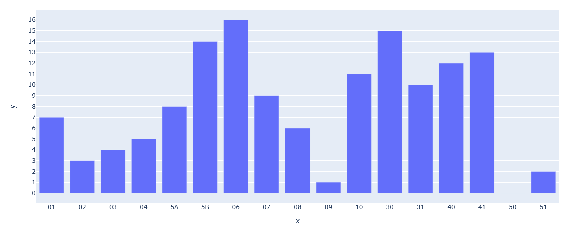
Works for me:
categories_ordered = np.array(["01", "02", "03", "04", "5A", "5B", "06", "07", "08", "09", "10", "30", "31", "40", "41", "50", "51"])
categories_shuffled = categories_ordered.copy()
np.random.shuffle(categories_shuffled)
values = np.arange(categories_shuffled.shape[0])

fig = px.bar(
    pd.DataFrame(np.c_[categories_shuffled, values], columns=["x", "y"]),
    x="x",
    y="y",
    category_orders={"x": categories_ordered}
)
fig.show()
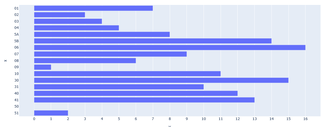
I’m sorry that I was not clear enough but the array shall be on the y-axis (vertical axis)
Should work exactly the same on the vertical axis?
not exactly i
import numpy as np
import plotly.express as px
import pandas as pd


categories_ordered = np.array(["01", "02", "03", "04", "5A", "5B", "06", "07", "08", "09", "10", "30", "31", "40", "41", "50", "51"])
categories_shuffled = categories_ordered.copy()
np.random.shuffle(categories_shuffled)
values = np.arange(categories_shuffled.shape[0])

fig = px.bar(
    pd.DataFrame(np.c_[categories_shuffled, values], columns=["x", "y"]),
    x="x",
    y="y",
    category_orders={"y": categories_ordered}
)
fig.show()
does
y-axis values are not ordered as defined (ok, 0 to 16 is added but even below the order is not as defined)
px.bar(
    pd.DataFrame(np.c_[vals_shuffled, values], columns=["x", "y"]),
    x="y",
    y="x",
    category_orders={"x": vals_ordered},
    orientation="h"
)
This?
rather this
x-axis: time/date
y-axis: category
(painted in PowerPoint)
any chance to get my painted chart done with plotly?