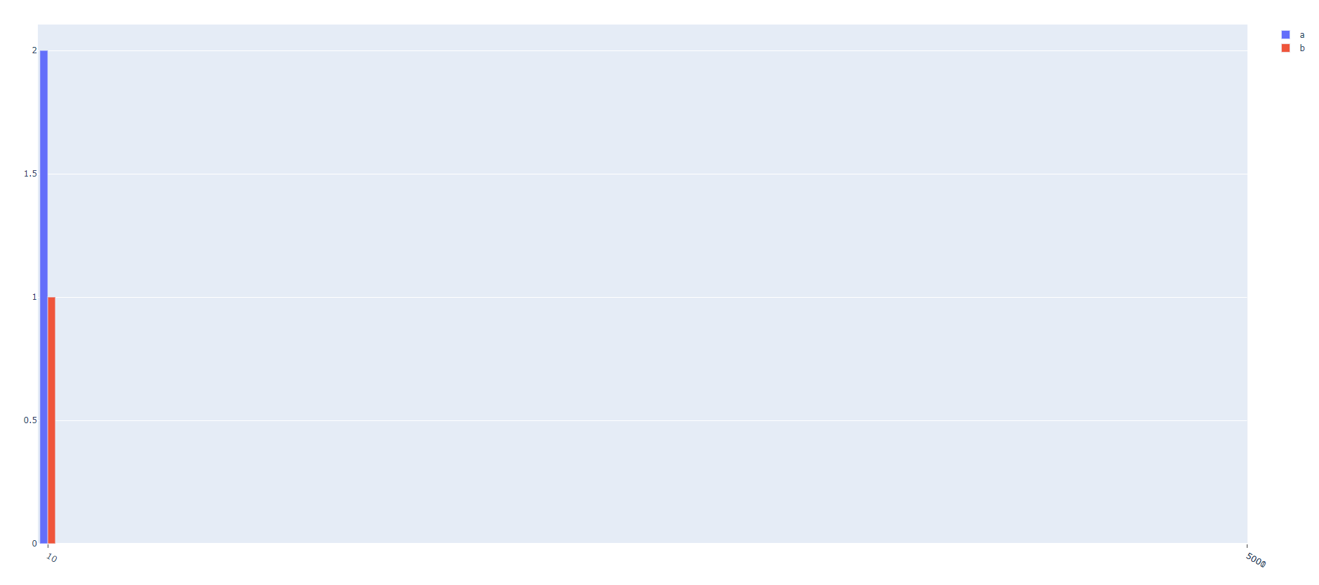
I have a list of numbers that I’m using to create bar graphs of the number of occurrences of each value.
The problem is I have a dynamic range, which can be large, and in those cases the bars are invisible. I can control their width but then on zooming in it looks really bad.
Any suggestions?
import plotly.graph_objects as go
from collections import Counter

data = {
    'a': [5000, 10, 10],
    'b': [10, 5001]
}

fig = go.Figure()
ticks = set()

for name, values in data.items():
    bar_data = Counter(values)
    ticks.update(set(bar_data.keys()))

    fig.add_trace(go.Bar(
        x=list(bar_data.keys()),
        y=list(bar_data.values()),
        name=name
    ))

fig.update_xaxes(ticks='outside', tickmode='array', tickvals=list(ticks))
fig