Need help in making Diverging Stacked Bar Charts

Hello all,

I am trying to do some sentiment analysis. I need help in creating a diverging horizontally stacked bar chart. For example see this image:

https://peltiertech.com/images/2016-08/Diverge-WhoLiesMore.png

Could someone please share an example of how to recreate a plot like this? where the values would be number of people who said yes/no/empty to a questionnaire. I need an example of the code in Python.

Thank you

Hi @jrmistry,

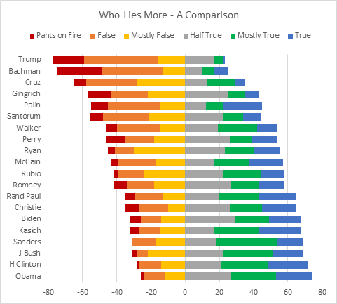
Here is an example of such horizontal relative bars:

import numpy as np
import pandas as pd
import plotly.graph_objects as go

d = {'Who': ['A', 'B', 'C', 'D', 'E', 'F'],
     'Pants on Fire': [9,7,6,4, 2, 1],
     'False': [7, 6, 4, 5, 2,1],
     'Mostly False': [5, 4, 6,4, 2, 6],
     'Half True' : [4,2,5,6,3, 2],
     'Mostly True': [5,3,2,3,4,3],
    ' True': [2,4,3,6, 6, 8]}
df = pd.DataFrame(d)

fig = go.Figure()
for col in df.columns[1:4]:
    fig.add_trace(go.Bar(x=-df[col].values,
                         y=df['Who'],
                         orientation='h',
                         name=col,
                         customdata=df[col],
                         hovertemplate = "%{y}: %{customdata}"))
for col in df.columns[4:]:
    fig.add_trace(go.Bar(x= df[col],
                         y =df['Who'],
                         orientation='h',
                         name= col,
                         hovertemplate="%{y}: %{x}"))    

fig.update_layout(barmode='relative', 
                  height=400, 
                  width=700, 
                  yaxis_autorange='reversed',
                  bargap=0.01,
                  legend_orientation ='h',
                  legend_x=-0.05, legend_y=1.1
                 )
fig

Here I didn’t set marker_color for Bar instances. They are plotted with the default colors. You may set your custom colors.

hovertemplate is defined such that to be displayed on hover, the name of person the poll referred to, and the corresponding value. You may change it.

1 Like

Thanks for posting this script. Successfully used with some of my own likert scale data. I’ve had real trouble changing the colours. I read the plotly documentation but I keep getting errors. Could you advise how we can implement gradient colours for each diverging stack (red for negative and green for positive responses)?
Thanks

@jrmistry

In the negative bar trace definition set:
marker_color='red' #or a hex colorcode or rgb
and for positive ones
marker_color='green'