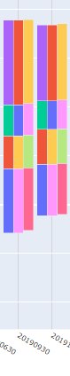
Grouped + Stacked Bar chart

Hi all,

Iā€™ve seen a few topics on this forum and on Github asking how to create a stacked + grouped chart. This may eventually be officially supported by Plotly but in the meantime we can use a workaround with:

  • Overlayed secondary y-axis
  • Bar offsets

Here is a minimum reproducible example of my solution. Note that the bar widths and offsets defined in this example are specific to a monthly dataset and would need to be adapted for other kinds of data.

import numpy as np
import pandas as pd
import plotly.graph_objects as go


# Create dummy data indexed by month and with multi-columns [product, revenue]
index = pd.date_range("2020", "2021", freq="MS", closed="left")
df = pd.concat(
    [
        pd.DataFrame(
            np.random.rand(12, 3) * 1.25 + 0.25,
            index=index,
            columns=["Revenue1", "Revenue2", "Revenue3"]
        ),
        pd.DataFrame(
            np.random.rand(12, 3) + 0.5,
            index=index,
            columns=["Revenue1", "Revenue2", "Revenue3"]
        ),
    ],
    axis=1,
    keys=["Product1", "Product2"]
)

# Create a figure with the right layout
fig = go.Figure(
    layout=go.Layout(
        height=600,
        width=1000,
        barmode="relative",
        yaxis_showticklabels=False,
        yaxis_showgrid=False,
        yaxis_range=[0, df.groupby(axis=1, level=0).sum().max().max() * 1.5],
       # Secondary y-axis overlayed on the primary one and not visible
        yaxis2=go.layout.YAxis(
            visible=False,
            matches="y",
            overlaying="y",
            anchor="x",
        ),
        font=dict(size=24),
        legend_x=0,
        legend_y=1,
        legend_orientation="h",
        hovermode="x",
        margin=dict(b=0,t=10,l=0,r=10)
    )
)

# Define some colors for the product, revenue pairs
colors = {
    "Product1": {
        "Revenue1": "#F28F1D",
        "Revenue2": "#F6C619",
        "Revenue3": "#FADD75",
    },
    "Product2": {
        "Revenue1": "#2B6045",
        "Revenue2": "#5EB88A",
        "Revenue3": "#9ED4B9",
    }
}

# Add the traces
for i, t in enumerate(colors):
    for j, col in enumerate(df[t].columns):
        if (df[t][col] == 0).all():
            continue
        fig.add_bar(
            x=df.index,
            y=df[t][col],
            # Set the right yaxis depending on the selected product (from enumerate)
            yaxis=f"y{i + 1}",
            # Offset the bar trace, offset needs to match the width
            # The values here are in milliseconds, 1billion ms is ~1/3 month
            offsetgroup=str(i),
            offset=(i - 1) * 1000000000,
            width=1000000000,
            legendgroup=t,
            legendgrouptitle_text=t,
            name=col,
            marker_color=colors[t][col],
            marker_line=dict(width=2, color="#333"),
            hovertemplate="%{y}<extra></extra>"
        )

fig.show()

Hope that helps some of yā€™all!

9 Likes

Very nice trick/workaround. Iā€™ve gotten this question a couple of times. Thanks for sharing this, @RenaudLN.

Hi @RenaudLN ! thank you for this trick. Iā€™m new to python and I was wondering if thereā€™s a way to have discrete values on the index, like ā€˜Californiaā€™, ā€˜Texasā€™, etc ?
I tried this but it gets stacked all together on the same bar, instead of getting different stacked bars.

1 Like

Exactly the same idea, the only thing you have to change is the width and offset. For categorical values, the step is 1 so we want something around 1/3 of that

import numpy as np
import pandas as pd
import plotly.graph_objects as go


# Create dummy data indexed by month and with multi-columns [product, revenue]
index = ["California", "Texas", "Arizona", "Nevada", "Louisiana"]
df = pd.concat(
    [
        pd.DataFrame(
            np.random.rand(5, 3) * 1.25 + 0.25,
            index=index,
            columns=["Revenue1", "Revenue2", "Revenue3"]
        ),
        pd.DataFrame(
            np.random.rand(5, 3) + 0.5,
            index=index,
            columns=["Revenue1", "Revenue2", "Revenue3"]
        ),
    ],
    axis=1,
    keys=["Product1", "Product2"]
)

# Create a figure with the right layout
fig = go.Figure(
    layout=go.Layout(
        height=600,
        width=1000,
        barmode="relative",
        yaxis_showticklabels=False,
        yaxis_showgrid=False,
        yaxis_range=[0, df.groupby(axis=1, level=0).sum().max().max() * 1.5],
       # Secondary y-axis overlayed on the primary one and not visible
        yaxis2=go.layout.YAxis(
            visible=False,
            matches="y",
            overlaying="y",
            anchor="x",
        ),
        font=dict(size=24),
        legend_x=0,
        legend_y=1,
        legend_orientation="h",
        hovermode="x",
        margin=dict(b=0,t=10,l=0,r=10)
    )
)

# Define some colors for the product, revenue pairs
colors = {
    "Product1": {
        "Revenue1": "#F28F1D",
        "Revenue2": "#F6C619",
        "Revenue3": "#FADD75",
    },
    "Product2": {
        "Revenue1": "#2B6045",
        "Revenue2": "#5EB88A",
        "Revenue3": "#9ED4B9",
    }
}

# Add the traces
for i, t in enumerate(colors):
    for j, col in enumerate(df[t].columns):
        if (df[t][col] == 0).all():
            continue
        fig.add_bar(
            x=df.index,
            y=df[t][col],
            # Set the right yaxis depending on the selected product (from enumerate)
            yaxis=f"y{i + 1}",
            # Offset the bar trace, offset needs to match the width
            # For categorical traces, each category is spaced by 1
            offsetgroup=str(i),
            offset=(i - 1) * 1/3,
            width=1/3,
            legendgroup=t,
            legendgrouptitle_text=t,
            name=col,
            marker_color=colors[t][col],
            marker_line=dict(width=2, color="#333"),
            hovertemplate="%{y}<extra></extra>"
        )

fig.show()

3 Likes

Wow! I canā€™t thank you enough! Thank you thank you so much! @RenaudLN

2 Likes

Can this be done with multiple sub-plots as well ?

I donā€™t see why not. However managing all the different y axes might become cumbersome.

Is there an easy way to say match my secondary_y axis to the primary of that sub plot ?
v/s match yaxis5 to y, yaxis6 to y2 and so on , assuming 4 subplots here .

There isnā€™t any builtin way to do this no, youā€™d have to manage it ā€œmanuallyā€. You may be able to reduce the lines of code via a good dict comprehension but still needs to be handled manually.

@RenaudLN Is it possible to add error bars to the stacked columns?

Perhaps this grouped and stacked bar chart with error bars is useful for someone too, see Control distance between stacked bars? - #3 by windrose

My college and I are trying to recreate this example but are running into an issue where only data from the final column is being visualized. We have formatted the data in the same way you have and code remains largely the same so cannot understand why only the last variable is being retained. We have posted this question to stackoverflow in the hope of finding a solution - pandas - Grouped and stacked bar charts in Python Plotly - Stack Overflow

Do you know of any reason that might be happening?

Weā€™ve noticed if we limit the number of colors in the colors dictionary to 2, say ā€œAggressionā€ and ā€œDisruptionā€ in this case, that we are able to have both display in the same figure. Is there any limitation that may be stopping >2 variables being displayed in the figure at once?

Hi @RenaudLN Super helpful trick, thanks for sharing! Was wondering how we could change the hovertemplate to also show the column names (in this case it would be Revenue1, Revenue2 etc.)? Iā€™m still a beginner to Plotly and tried playing around with customdata to no avail.

If you remove the <extra></extra> in hovertemplate it will keep this on hover:
image

You can also set hovermode to "x unified" in the layout to get something like this:
image

And you may want to format the hover value display with something like hovertemplate="%{y:.3f}"
image

2 Likes

just adding my 2 cents here;
On categorical axis, if we aim to get space before and after the group of bars, while keeping these bars centered around the xtick, above formula in the offset value does not work.

Assume we want to get 3 bars (each one being actually a stack of bars) whose width = 0.3, then they will be located at -0.45, -0.15, +0.15.

If 3 bars of width = 0.2, then they will be located at -0.3, -0.1, 0.1

Long story short, the formula for the offset will be:

-((n * w)/2) + i* w

id est w * ( i- n/2) where ā€œiā€ successively takes the value of 0, 1, 2 (cf example provided by RenaudLN), n is the number of bars, and w is the wished barā€™s width.

With this, the bars are correctly centered around the xtick;
eg if 3 bars of width 0.3:
0.3 * (0-3/2) = -0.45
0.3 * (1-3/2) = -0.15
0.3 * (2-3/2) = 0.15

image

@RenaudLN I wanted to increase the products to ten and have different products for each regions. The bars are getting erased and I am not able to get the entire plot. Please help