I am attempting to create a grouped bar chart with a scatter plot overlay.
Everything seems to be working except for when the fig displays…
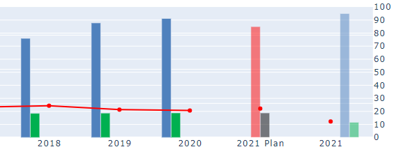
- The first set of traces has the grouped bars shifted to the left of the x axes point.
- The second set of traces has the grouped bars centered on the x axes point.
- The third group of traces has the grouped bars shifted to the right of the x axes point.
Yet the overlaid scatter plot has all markers centered.
Has anyone ever experienced this / can give any resources or guidance?
See in image below:
Here is some sample code:
(I am sourcing all the data from a single pandas DataFrame)
submissions = df['sub'][:-2]
selections = df['select'][:-2]
rate = df['rate'][:-2]
expected_year = df['year'][-2:-1]
expected_submissions = df['sub'][-2:-1]
expected_selections = df['select'][-2:-1]
expected_rate = df['rate'][-2:-1]
live_year = df['year'][-1:]
live_submissions = df['sub'][-1:]
live_selections = df['select'][-1:]
live_rate = df['rate'][-1:]

fig = make_subplots(specs=[[{"secondary_y": True}]])

# This set of grouped bars is displaying left of x axes point (need centered)
fig.add_trace(go.Bar(
    x=year,
    y=submissions,
    showlegend=False,
    name='Submissions',
    marker_color='rgb(79, 129, 189)'),
    secondary_y=False,)

fig.add_trace(go.Bar(
    x=year,
    y=selections,
    showlegend=False,
    name='Selections',
    marker_color='rgb(0, 176, 80)'),
    secondary_y=False,)

fig.add_trace(go.Scatter(x=year, y=rate * 100,
                          mode="lines+markers+text",
                          hovertemplate='Selection Rate: %{y:.1f}%<extra></extra>',
                          showlegend=False,
                          textfont=dict(
                              family="Arial, sanserif",
                              size=14,
                              color="rgb(255, 0, 0)"
                          ),
                          line=dict(color='rgb(255, 0, 0)', width=2),
                          name='Selection Rate',
                          ),
               secondary_y=True,)

# This set of grouped bars is displaying center of x axes point (Desired)
fig.add_trace(go.Bar(
    x=expected_year,
    y=expected_submissions,
    showlegend=False,
    name='Expected Sumbissions',
    marker_color='red',
    opacity=0.5),
    secondary_y=False,)

fig.add_trace(go.Bar(
    x=expected_year,
    y=expected_selections,
    showlegend=False,
    name='Expected Selections',
    marker_color='black',
    opacity=0.5),
    secondary_y=False,)

fig.add_trace(go.Scatter(x=expected_year, y=expected_rate * 100,
                          mode="lines+markers+text",
                          hovertemplate='Expected Selection Rate: %{y:.1f}%<extra></extra>',
                          showlegend=False,
                          textfont=dict(
                              family="Arial, sanserif",
                              size=14,
                              color="rgb(235, 15, 17)"),
                          opacity=1,
                          line=dict(color='rgb(255, 0, 0)', width=2),
                          name='Expected Selection Rate',),
               secondary_y=True,)

# This set of grouped bars is displaying right of x axes point (need centered)
fig.add_trace(go.Bar(
    x=live_year,
    y=live_submissions,
    showlegend=False,
    name='Live Submissions',
    marker_color='rgb(79, 129, 189)',
    opacity=0.5),
    secondary_y=False,)

fig.add_trace(go.Bar(
    x=live_year,
    y=live_selections,
    showlegend=False,
    name='Live Selections',
    marker_color='rgb(0, 176, 80)',
    opacity=0.5),
    secondary_y=False,)

fig.add_trace(go.Scatter(x=live_year, y=live_rate * 100,
                          mode="lines+markers+text",
                          hovertemplate='Live Selection Rate: %{y:.1f}%<extra></extra>',
                          showlegend=False,
                          textfont=dict(
                              family="Arial, sanserif",
                              size=14,
                              color="rgb(235, 15, 17)"),
                          opacity=1,
                          line=dict(color='rgb(255, 0, 0)', width=2),
                          name='Live Selection Rate',),
               secondary_y=True,)

fig.update_layout(title_text="Selection Rates",
                   barmode="group",
                   margin=dict(l=0, r=0, t=25, b=0),)
fig.update_xaxes(type='category',
                  range=[1.4, 12.6],
                  autorange=False,)
fig.update_yaxes(title_text="Number of Submissions/Selections",
                  secondary_y=False)
fig.update_yaxes(title_text="Selection Rate",
                  range=[0, 100],
                  dtick=10,
                  autorange=False,
                  secondary_y=True)```