I really like sinaplots in R from ggforce (https://ggforce.data-imaginist.com/reference/geom_sina.html) and I’d like to recreate a similar plot with Plotly.py however there doesn’t seem to be a good solution. However, when looking at the plotly express documentation is seems that this plot (https://plotly.com/python/violin/#violin-plot-with-box-and-data-points) with points has exactly what I would like. Is there a way to remove the violin plot and only keep the points on the left?

Welcome @willi2sr
The strip plot might be what your looking for.
Let me know if that helps.
Thank you @adamschroeder! We should definitely add an example about this function (I was not aware of it!). For example
import plotly.express as px
df = px.data.tips()
fig = px.strip(df, x='day', y='tip')
fig.show()

@adamschroeder @Emmanuelle, thank you so much! this is exactly what I was looking for.
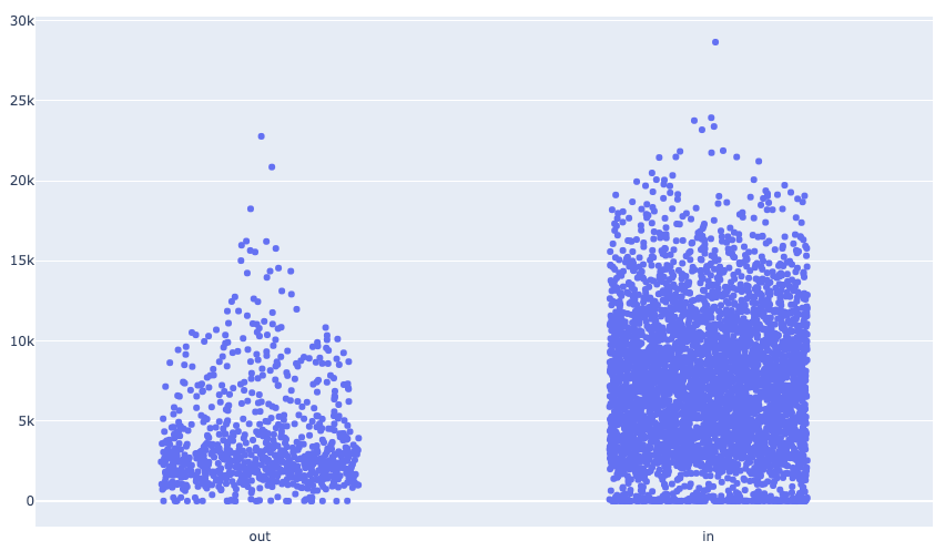
Addition: turns out it doesn’t deal with very many data points well. see below.
Hi @Emmanuelle and @adamschroeder,
Thanks again for your help here but it turns out px.strip is not exactly what I want because the density is not represented. I have a fair number of data points so it might be a bit harder I think with px.strip. I have an example below that shows how it would look plotting with geom_sina in R

vs. px.strip in python using
fig = px.strip(df, x = "xlab", y="ylab").update_traces(jitter = 0.9)
@willi2sr
I think that’s due to the y_axis range. If you fixed the y_axis range on px.strip to [0,30000], I think you’ll get a similar image to the one using geom_sina in R
