Hello,
I have created a dash app that generates a data table and creates a lollipop chart. It works fine to start, then the axis numbering and lines lose alignment and order.


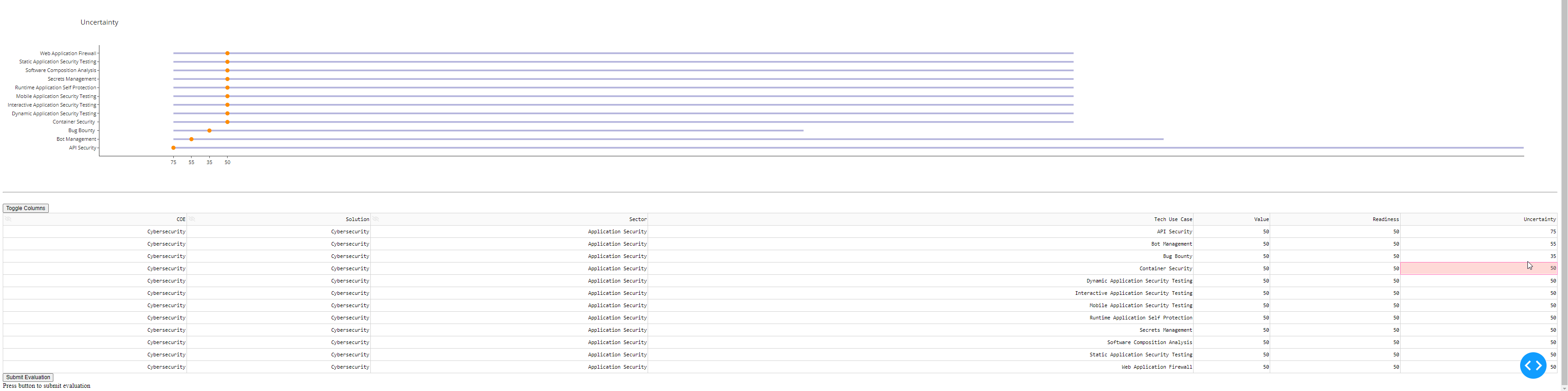
Below is my code
‘’’ python
import dash #(version 1.12.0)
from dash.dependencies import Input, Output, State
from dash.exceptions import PreventUpdate
import datetime
import dash_table
import dash_core_components as dcc
import dash_html_components as html
import plotly.express as px
import plotly.graph_objects as go
import plotly.io as pio
import pandas as pd
app = dash.Dash(name)
df = pd.read_csv(‘scoring.csv’)
coe_options = df.groupby(‘COE’)[‘Sector’].unique().apply(list).to_dict()
app.layout = html.Div([
dcc.Dropdown(
id=‘COE’,
options = [{‘label’: k, ‘value’: k} for k in coe_options.keys()],
value = ‘Cybersecurity’
),
html.Hr(),

dcc.Dropdown(id='sector'),

#html.Div(id='display-selected-values'),
html.Div(id='eval-container-value'),
html.Div(id='eval-container-Readiness'),
html.Div(id='eval-container-Uncertainty'),
html.Hr(),
html.Br(),
#create container for input datatable
dash_table.DataTable(
id=‘table’,
columns =
[
{“name”: i, “id”: i, “deletable”: False, “selectable”: True, “hideable”: False, “editable”: False}
if i == “Tech Use Case”
else {“name”: i, “id”: i, “deletable”: False, “selectable”: True, “hideable”: False, “editable”: True}
if i == “Value” or i == “Readiness” or i == “Uncertainty”
else {“name”: i, “id”: i, “deletable”: False, “selectable”: True, “hideable”: True, “editable”: False}
for i in df.columns
],
data=df.to_dict(‘records’),
),

html.Button(id="save-button",n_clicks=0,children="Submit Evaluation"),
html.Div(id="output-1",children="Press button to submit evaluation")
])
@app.callback(
Output(‘sector’, ‘options’),
Input(‘COE’, ‘value’))
def set_sector_options(selected_coe):
return [{‘label’: i, ‘value’: i} for i in coe_options[selected_coe]]
@app.callback(
Output(‘sector’, ‘value’),
Input(‘sector’, ‘options’))
def set_sector_value(sector_options):
return sector_options[0][‘value’]
@app.callback(
Output(‘table’, ‘data’),
[Input(‘sector’, ‘value’)])
def update_df(selected_sector):
filtered_df = df[(df.Sector == selected_sector)]
return filtered_df.to_dict(orient=‘records’)
#construct evaluation output
@app.callback(
Output(‘eval-container-value’, ‘children’),
[Input(‘table’, ‘data’)])
def update_chart(eval_data):
dff = pd.DataFrame(eval_data)
data = go.Scatter(
        y = dff["Tech Use Case"],
        x = dff["Value"],
        mode = 'markers',
        marker_color = 'darkorange',
        marker_size = 10,
        )
shapes = [dict(
            type='line',
            x0 = 0,
            y0 = i,
            x1 = dff["Value"].loc[i],
            y1 = i,
            line=dict(
                color='darkblue',
                width = 4),
            layer='below')
            for i in range(0, len(dff))]
layout = go.Layout(
    shapes = shapes,
    title='Value',
    template='simple_white')

fig = go.Figure([data], layout)
return[
    dcc.Graph(id='lollipop-chart', figure=fig)]
#construct readiness evaluation output
@app.callback(
Output(‘eval-container-Readiness’, ‘children’),
[Input(‘table’, ‘data’)])
def update_chart(eval_data):
dff = pd.DataFrame(eval_data)
data = go.Scatter(
        y = dff["Tech Use Case"],
        x = dff["Readiness"],
        mode = 'markers',
        marker_color = 'darkorange',
        marker_size = 10,
        )
shapes = [dict(
            type='line',
            x0 = 0,
            y0 = i,
            x1 = dff["Readiness"].loc[i],
            y1 = i,
            line=dict(
                color='darkblue',
                width = 4),
            layer='below')
            for i in range(0, len(dff))]
layout = go.Layout(
    shapes = shapes,
    title='Market Maturity',
    template='simple_white')

fig = go.Figure([data], layout)
return[
    dcc.Graph(id='lollipop-chart', figure=fig)]
#construct readiness evaluation output
@app.callback(
Output(‘eval-container-Uncertainty’, ‘children’),
[Input(‘table’, ‘data’)])
def update_chart(eval_data):
dff = pd.DataFrame(eval_data)
data = go.Scatter(
        y = dff["Tech Use Case"],
        x = dff["Uncertainty"],
        mode = 'markers',
        marker_color = 'darkorange',
        marker_size = 10,
        )
shapes = [dict(
            type='line',
            x0 = 0,
            y0 = i,
            x1 = dff["Uncertainty"].loc[i],
            y1 = i,
            line=dict(
                color='darkblue',
                width = 4),
            layer='below')
            for i in range(0, len(dff))]
layout = go.Layout(
    shapes = shapes,
    title='Uncertainty',
    template='simple_white')

fig = go.Figure([data], layout)
return[
    dcc.Graph(id='lollipop-chart', figure=fig)]
@app.callback(
Output(“output-1”,“children”),
[Input(“save-button”,“n_clicks”)],
[Input(‘sector’, ‘value’)],
[State(“table”,“data”)]
)
def selected_data_to_csv(nclicks, selected_sector,table1):
if nclicks == 0:
raise PreventUpdate
else:
submission_time = datetime.datetime.now().strftime("%Y%m%d")
pd.DataFrame(table1).to_csv(f"evaluations/{selected_sector}evaluation{submission_time}.csv",index=False)
return “Data Submitted”
if name == ‘main’:
app.run_server(debug=True)
‘’’
Thank you for any help!