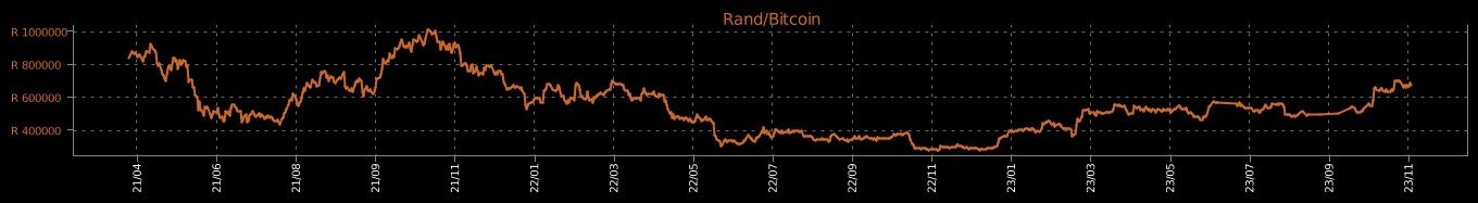
I am redoing a graph that I previously had with another package. The line is very smooth compared to the values. How do I change the code to have the line not smoothed out, or finer grained ?
Thank you for your answer.
I thought the same. I have tried all of the following separately but none of them changes the y axis lables to be in even multiples.
fig.update_layout(layout_yaxis_range=[800000.00,1400000.00])
fig.update_yaxes(tickvals = [800000,900000,1000000,1100000,1200000,1300000],
                               ticktext=['{:.2}M'.format(x / 1000000) for x in df['value']],
                               ticktext = ['800000','900000','1000000','1100000','1200000','1300000'],
                               tick0 = 800000, dtick = 200000
)
Tickvals and ticktext changes the yaxis labels but then the line is gone:
After cleaning up my data (in a previous cleanup n.00 was converted to n00.00 by mistake in some cases) the line was still the same shape. I finally fixed it with:
df['value'] = pd.to_numeric(df['value'])
And now it is exactly how I wanted. Thank you all.