I am trying to implement something like this in plotly dash . The above image is a plotly graph built in r.
I have to replicate and embed this graph in my plotly dash app.
Check out this python facet_grid wrapper: https://plot.ly/python/facet-plots/
Usage in Dash:
import plotly.figure_factory as ff

import pandas as pd
mpg = pd.read_table('https://raw.githubusercontent.com/plotly/datasets/master/mpg_2017.txt')

fig = ff.create_facet_grid(
    mpg,
    x='displ',
    y='cty',
    facet_row='cyl',
    facet_col='drv',
    marker={'color': 'rgb(234, 239, 155)'},
)

dcc.Graph(id='graph', figure=fig)
Hey ,
Thanks a lot Chris for the solution.
Hey Chris,
Is there any way to increase the space (facet rows) between different facets?
Also when i am trying to put labels on the bars, it is showing me same labels for all the rows. I am doing something like this:
t = dff[['Stream', 'Time', 'Value']]
fig1 =  ff.create_facet_grid(
    t,
    x='Time',
    y='Value',
    text = t['Value'].round(1),
    textfont=dict(size=14, color='#FFFFFF'),
    textposition = 'auto',
    facet_row='Stream',
    marker={'color': 'rgba(20, 15, 51, 1)'},
    ggplot2= True,
    width = 1400,
    height=800,
    trace_type='bar')
Can you please help me out in this…
Hey there,
Is there any way to increase the space (facet rows) between different facets?
Currently there is no way to this from within ff.create_facet_grid. The FF is creating a subplot with a default row_width and column_width for the cells. We are currently working on a sparklines FF which is going to be an extension to the functionality of the facet grid and will be adding this support. See the PR if you want to follow the progress.
Also when i am trying to put labels on the bars, it is showing me same labels for all the rows.
I don’t know if you mean text labels that are meant for each facet row. If you do, then use facet_row_labels to put labels along the facet rows. See help(ff.facet_grid) for more info on the params
Hope this helps.
Hey Adam,
Thanks for your reply over this.
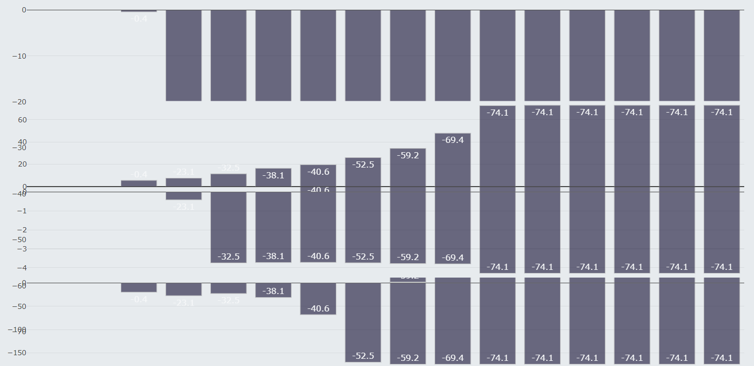
By text labels , I meant the text values on the bars(Please refer to the screen shot attached).
If you can see, the heights(values) of all the bars are different but they all show the same labels(the text over them).
Also i have tried implementing the same graph using GGPLOT, but i am not able to integrate in my dash app.
Although i can see the graph in my console(using plot.show), but cant find a way to integrate it in the plotly dash app.
So , if you can suggest a way to integrate ggplot graphs in plotly dash app, that would be really helpful.
Thanks