How to: plotly express, dashed line, facet_col, multiple y series

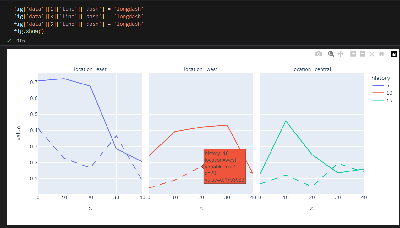
I’m attempting to plot the following dataframe such that “col2” is plotted with a dashed line.

fig = px.line(df, x='x', y=['col1', 'col2'], facet_col='location', color='history')
fig.show()

After reading the examples and API doc’s, I haven’t quite figured out how to use options like line_dash, line_dash_sequence, or line_dash_map. I’ve also tried variations of the following but I can’t make the selector select “col2” data:

fig = px.line(df, x='x', y=['col1', 'col2'], facet_col='location', color='history', width=1000)
fig.update_traces(patch={"line": {"dash": "dot"}}, selector={'name': 'col2'})
fig.show()

Here’s same test sample data:

import pandas as pd
import numpy as np
import plotly.express as px

def make_data(location='east', history=5, size=5, scale=1.0):
    data = {
        'x': [10*x for x in range(size)],
        'col1': np.random.rand(5) * scale,
        'col2': np.random.rand(5) * scale / 2,
        'history': [history for x in range(size)],
        'location': [location for x in range(size)]
    }
    return pd.DataFrame(data)

df1 = make_data()
df2 = make_data(location='west')

df = pd.concat([
    make_data(),
    make_data(location='west', history=10, scale=0.75),
    make_data(location='central', history=15, scale=0.5)
    ])

fig = px.line(df, x='x', y=['col1', 'col2'], facet_col='location', color='history')
fig.show()

The dataframe looks like this:

The sample line plot looks like this:

I’d like “col2” in the sample plot to be dashed (or dotted). Is this possible with plotly express or do I need to resort to the plotly.graph_objs? Thank you in advance for any tips or suggestions you can offer.

Hi @mr_bear
:wave: Welcome to the community.

There is a lot of flexibility to update the figure you build. One way to start is to print(fig['data']) and explore what part of it you’d like to update, then find out how to drill down to that part of the figure.

In your case, you’d like to update the data traces where location=west. These are fig['data'][2] and fig['data'][3].

If you add these two lines of code right above the fig.show(), it should work:

fig['data'][2]['line']['dash'] = 'longdash'
fig['data'][3]['line']['dash'] = 'longdash'

The docs have more information on the line style options.

Thanks for the great tip. I did not realize you could “drill down” on the data using fig['data']. Thank you. That helped modify this simple example (see details below) via trial and error.

If someone knows, I’m wondering if there is a “programmatic” way to set the dash line based on the column name when there are multiple series for the y-axis (and across multiple facets). For example, when I hover I see the following:

I would like to set a dash line for any line that has the variable “col2”. I’m not sure if that is possible.

Note: with the excellent tip and a little trial and error, I was able to generate the plot I want with this code:

fig['data'][1]['line']['dash'] = 'longdash'
fig['data'][3]['line']['dash'] = 'longdash'
fig['data'][5]['line']['dash'] = 'longdash'

edit: the reason I’m seeking a programmatic solution is because the example I provided is slightly simplified. My real data has 18 traces (2 y-axis series, 3 categories each, with 3 facets each). And they may change based on the data. So to solve this with trial and error is not very tractable.

Okay, I was able to do this with the selector option in fig.update_traces(). Here’s how I tackled it. Thanks @adamschroeder for the help!

def selector(column_name):
    # just need to be careful that "column_name" is not any other string in "hovertemplate" data
    f = lambda x: True if column_name in x['hovertemplate'] else False
    return f
fig.update_traces(patch={"line": {"dash": "dot"}}, selector=selector("col2"))
fig.show()
1 Like