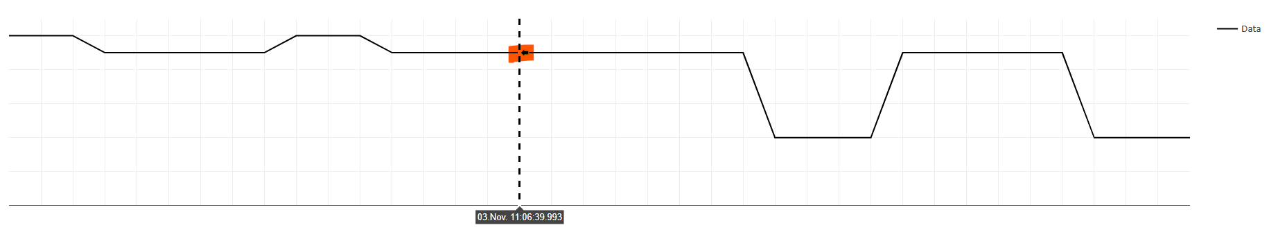
How can i remove the arrow/box from the y data and only show the x data in the box next to the x-axis.
Hey @thomas_ggg
I am aware of responding in python, the solution should be the same:
import plotly.graph_objects as go
import numpy as np

x = np.arange(100)
y = np.random.randint(100, size=100)

fig = go.Figure(
    go.Scatter(
        x=x,
        y=y,
        hoverinfo='x',  # show x-axis label only
    ),
    layout=dict(
        hovermode='x',
        xaxis=dict(
            showspikes=True,
            spikemode='across',
        ),
    )
)
fig.show()
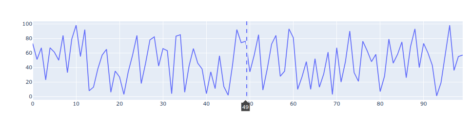
mrep hoverinfo
Thank you for the response, you are absolutely right.
I dont´t know how i didn’t come up with this solution.
Sometimes it’s enough to just talk about it. Glad i could help.