How to create annotated heatmaps in subplots?

Hello.
I’m trying to create a subplot of annotated heatmaps using Dash + Plotly.
Without using annotated heatmaps (from Figure Factory), the following code get what I want:

...
fig = make_subplots(rows=1, cols=2)
fig.add_trace(go.Heatmap(x=x1, y=y1, z=z1, colorscale='RdBu'), row=1, col=1)
fig.add_trace(go.Heatmap(x=x2, y=y2, z=z2, colorscale='RdBu'), row=1, col=2)
...

But, when I try to use annotated heatmaps, it becames hard. (In matplotlib, it’s just passing an parameters annot=True ).
Does anyone can help me?

Changing my code to that:

fig1 = ff.create_annotated_heatmap(z=df_fr_review.values, colorscale='RdBu')
fig2 = ff.create_annotated_heatmap(z=df_doid_review.values, colorscale='RdBu')

for i in range(len(fig1.data)):
    fig1.data[i].xaxis='x1'
    fig1.data[i].yaxis='y1'
fig1.layout.xaxis1.update({'anchor': 'y1'})
fig1.layout.yaxis1.update({'anchor': 'x1'})

for i in range(len(fig2.data)):
    fig2.data[i].xaxis='x2'
    fig2.data[i].yaxis='y2'
fig2['layout']['xaxis2'] = {}
fig2['layout']['yaxis2'] = {}
fig2.layout.xaxis2.update({'anchor': 'y2'})
fig2.layout.yaxis2.update({'anchor': 'x2'})

fig.add_trace(fig1.data[0], row=1, col=1)
fig.add_trace(fig2.data[0], row=1, col=2)
fig.layout.update(fig1.layout)
fig.layout.update(fig2.layout)

Results in this (no annot information on the second figure):

Hi @rtadewald,

Is this method simpler than that you tried before?

import numpy as np
import plotly.graph_objs as go
import plotly.figure_factory as ff
from plotly.subplots import make_subplots
import string

#Define data for heatmap
N=5
x = np.array([10*k for k in range(N)])
y = np.linspace(0, 2, N) 
z1 = np.random.randint(5,15, (N,N))
z2 = np.random.randint(10,27, (N,N))
mytext = np.array(list(string.ascii_uppercase))[:25].reshape(N,N)


fig1 = ff.create_annotated_heatmap(z1, x.tolist(), y.tolist(),  colorscale='matter')
fig2 = ff.create_annotated_heatmap(z2, x.tolist(), y.tolist(), annotation_text=mytext, colorscale='Viridis')

fig = make_subplots(
    rows=1, cols=2,
    horizontal_spacing=0.05,
    
)

fig.add_trace(fig1.data[0], 1, 1)
fig.add_trace(fig2.data[0], 1, 2)

annot1 = list(fig1.layout.annotations)
annot2 = list(fig2.layout.annotations)
for k  in range(len(annot2)):
    annot2[k]['xref'] = 'x2'
    annot2[k]['yref'] = 'y2'
fig.update_layout(annotations=annot1+annot2)  
1 Like

It worked! Thank you, my friend.

@rtadewald

OK! Please close the issue opened on plotly.py. I created the example above to answer your issue, but meanwhile you posted the question here, too.

There’s one more thing that I’ve noticed here.
Using your code, some points doesn’t show any information.

image

Here’s the code:

fig = make_subplots(rows=1, cols=3, subplot_titles=("Fill Rate", "Operations Counts", "React Delta Order Id"))
fig1 = ff.create_annotated_heatmap(x=df_fr.columns.to_list(), y=df_fr.index.to_list(), z=df_fr.values, hoverinfo='z')
fig2 = ff.create_annotated_heatmap(x=df_count.columns.to_list(), y=df_count.index.to_list(), z=df_count.values, hoverinfo='z')
fig3 = ff.create_annotated_heatmap(x=df_doid.columns.to_list(), y=df_doid.index.to_list(), z=df_doid.values, hoverinfo='z')

fig.add_trace(fig1.data[0], 1, 1)
fig.add_trace(fig2.data[0], 1, 2)
fig.add_trace(fig3.data[0], 1, 3)

annot1 = list(fig1.layout.annotations)
annot2 = list(fig2.layout.annotations)
annot3 = list(fig3.layout.annotations)

for k in range(len(annot2)):
    annot2[k]['xref'] = 'x2'
    annot2[k]['yref'] = 'y2'

for k in range(len(annot3)):
    annot3[k]['xref'] = 'x3'
    annot3[k]['yref'] = 'y3'
fig.update_layout(annotations=annot1+annot2+annot3)

@rtadewald,
Please inspect your data frame and its column conversions tolist to see what is recorded in the position where no info is displayed. Without data I cannot express any opinion. The code is ok.

I changed to a simpler data, just for debug. The code keeps the same.
That’s the data:

df_fr = pd.DataFrame([[1, 2, 3], [8, 6, 5]])
df_count = pd.DataFrame([[1, 2, 3], [4, 5, 6]])
df_doid = pd.DataFrame([[1, 2, 3], [4, 5, 6]])

And that’s what I got:

@rtadewald

This odd behaiour occurs because after fig definition via make_subplots, fig.layout.annotations is already initialized with subplot_titles (my initial example had no titles) .

In this case you have to add the new annotations, read from fig1, fig2, fig3 as follows:

new_annotations = annot1+annot2+annot3

for anno in new_annotations:
    fig.add_annotation(anno)

These lines of code replace:

fig.update_layout(annotations=annot1+annot2+annot3)

,
When your subpolots contain many cells ,not only 2-3, define
new_annotations =[] and extend it by new_annotations.extend(), not by concatenating with +.

Thank you again. It worked!
Last one, I promise:

Do you know why, using that code, both of my plots are with white color and the centered one with black color?
What’s the logic for Plot.ly painting them differently?

@rtadewald
Plotly maps z-values to a colorscale Depending on the colorscale you are setting in layout.coloraxis, if it is a sequential one, like in the last plot you posted here, the smaller z-values are mapped to lighter colors, while the bigger - to darker colors. Another colorscales have darker colors corresponding to smaller values.

But why in the first heatmap, bigger numbers and small numbers gets white (and illegible), and in the middle one, they respected what you said?

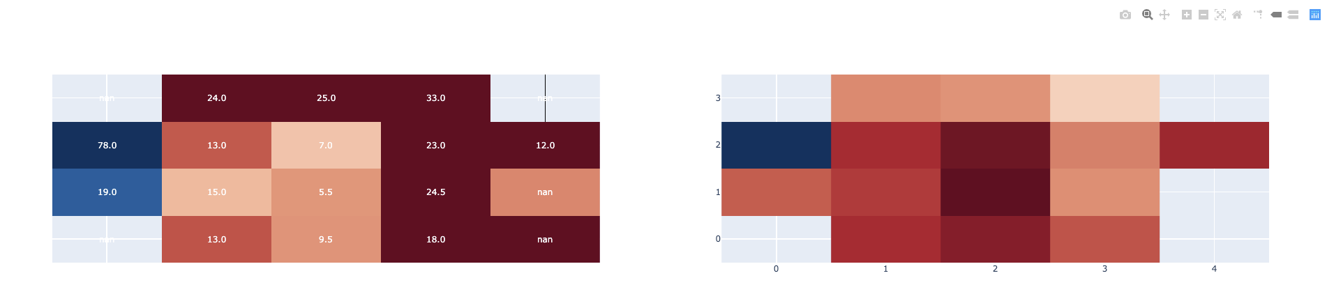
@rtadewald It seems that your z-data are missing in some cells. In one of the them we can see nan as an annotation. You can set 'connectgaps=True` in Heatmap definition to fill those cells with an interpolated color.

I don’t think it solved, the colors keep different, but now, ‘nan’ values are colored hehe

@rtadewald

As I already said initially without having your data I cannot figure out what is happening :frowning:

Also I don’t know what colors are different. More precision would be useful…

On the image, you can see that the right graph is with white text colors (what makes it sometimes illegible), and the other ones are with black and white colors. You can see the same pattern on the first graphs I’ve send here, where you have my code and the data.

@rtadewald
OMG!!! You are referring to font color!!! The annotation font_color is assigned by ff.create_annotated_heatmap

To change the colors to only one for eaple black you should update the annotations:

new_annotations = annot1+annot2+annot3

for anno in new_annotations:
    anno.update(font_color ='black')
    fig.add_annotation(anno)

Sorry for the misunderstood. Using your code set all colors to ‘black’, but how to make them smart, like the center graph (white text colors to darker background colors, and vice versa)?

Here https://github.com/plotly/plotly.py/blob/master/packages/python/plotly/plotly/figure_factory/_annotated_heatmap.py#L192 is how the text color is set when the colorscale belongs to this list:

colorscales = [
            "Greys",
            "Greens",
            "Blues",
            "YIGnBu",
            "YIOrRd",
            "RdBu",
            "Picnic",
            "Jet",
            "Hot",
            "Blackbody",
            "Earth",
            "Electric",
            "Viridis",
            "Cividis",
        ]

Because your colorscale isn’t in this list, you should update annotation font color following the same rule like that implemented in the method get_text_color().

Hello,

It seems that this example breaks if I add either of the following arguments to the call of make_subplots:

  • subplot_titles=[‘a’, ‘b’]
  • row_titles = [‘A’]

When I specify either argument, some of the heatmap cells are empty

Do you have any suggestions?

Thanks in advance!