Hi,
Boxplots help me with data exploration a lot and sometimes coloring the boxes with a continuous variable helps greatly.
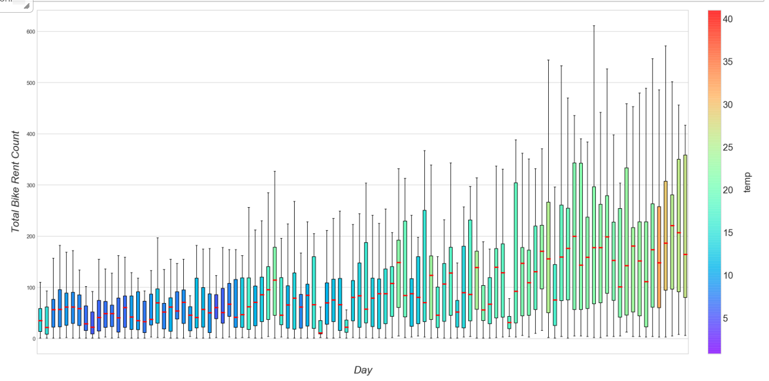
However, I cannot find a way to do this in Plotly. I am looking for a solution like the image below:
I have a solution below, but I cannot plot the colorbar legend. Can anyone advise?
Code:
from plotly.offline import download_plotlyjs, init_notebook_mode, iplot
init_notebook_mode(connected=True)
import pandas as pd
import numpy as np
import matplotlib.pyplot as plt
import matplotlib

#test data:

cost = [1, 2, 3, 4, 100, 1000, 100, 50, 30, 20, 5000, 1000, 10000, 3000, 20000]
hours = [5, 15, 20, 50, 100, 500, 25, 1, 5, 3, 20, 50, 75, 100, 200]

df = pd.DataFrame([cost, hours]).T.rename(columns={0:"Cost", 1: "Hours"})
df.loc[0:5, 'project'] = 'project1'
df.loc[5:10, 'project'] = 'project2'
df.loc[10:15, 'project'] = 'project3'

pivotCol = 'project'
pivotVals = 'Cost'
colorCol = 'Hours'
pivot = df.pivot(columns=pivotCol, values=pivotVals)

# get the mean for each project and create dict:

values = df.groupby(pivotCol).mean()[colorCol ]

vmin, vmax = values.min(), values.max()

values_dict = values.to_dict()

# normalize values:

norm = matplotlib.colors.Normalize(vmin=vmin, vmax=vmax)

cmap = matplotlib.cm.get_cmap('Spectral')

traces = []

for count, i in enumerate(pivot.columns):

    #color = cmap(norm(values_dict[i]))
    color = 'rgb' + str(cmap(norm(values_dict[i]))[0:3])

    trace = go.Box(
                    y=pivot[i],
                    name = i,
                    boxpoints = 'outliers',
                    whiskerwidth=1,
                    marker = dict(color=color, size=2),
                    line = dict(color=color, width=1),
                    )

    traces.append(trace)

layout = go.Layout(title = "Box Plot",
                       yaxis=dict(type='log', autorange=True),
                       showlegend=True,
                       hovermode = "x"
                      )

fig = go.Figure(data=traces, layout=layout)

iplot(fig)