zxdawn
January 20, 2024, 10:22pm
1
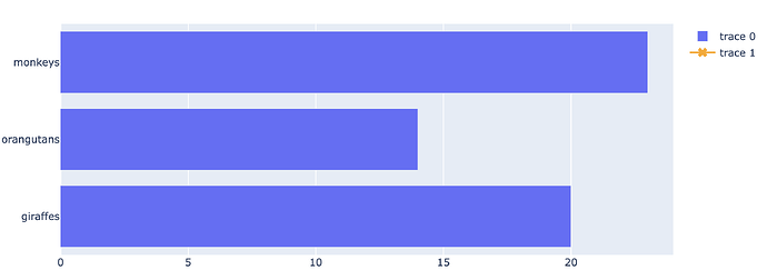
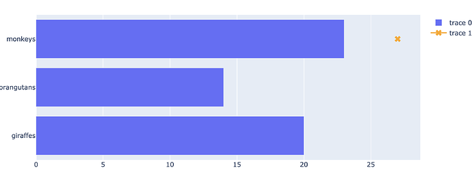
I want to add some “x” markers outside of the bar. I have tried this:
import plotly.graph_objects as go

fig = go.Figure(go.Bar(
            x=[20, 14, 23],
            y=['giraffes', 'orangutans', 'monkeys'],
            orientation='h'))

fig.add_trace(go.Scatter(y=['monkeys'], x=[27],
                            marker=dict(color='orange',
                                        symbol='x',
                                        size=10,
                            )
                            ),
                )

fig.update_layout(xaxis=dict(range=(0, 24)))
fig.show()
This will limit the xaxis to the original plot, but missing the added scatter marker.
Any ideas are welcome
AIMPED
January 20, 2024, 11:01pm
2
Hey @zxdawn , maybe annotations?
Over 17 examples of Text and Annotations including changing color, size, log axes, and more in Python.
zxdawn
January 21, 2024, 11:41am
3
Thanks, I have tried this:
fig.add_annotation(dict(font=dict(color='orange',size=15),
                                        x=30,
                                        y='monkeys',
                                        showarrow=False,
                                        text="x",
                                        textangle=0,
                                        ))
The xaxis changed to a larger range. I want to add a “x” marker without changing the original xaxis.
AIMPED
January 21, 2024, 8:43pm
4
You could use a different reference for the annotaion, in this case, che range is not changed.
fig.add_annotation(
    dict(
        font=dict(
            color='orange',
            size=15
        ),
        x=1.0,
        xref='paper',
        y='monkeys',
        showarrow=False,
        text="x",
        textangle=0,
    )
)
zxdawn
January 21, 2024, 10:34pm
5
Nice! I tested it and it works well.
However, it doesn’t work for subplots:
import plotly.graph_objects as go

fig = make_subplots(rows=2, cols=2,
                    shared_xaxes=True,
)

fig.add_trace(
    go.Bar(x=[20, 14, 23],
            y=['giraffes', 'orangutans', 'monkeys'],
            orientation='h'))

fig.add_annotation(
    dict(
        font=dict(
            color='orange',
            size=15
        ),
        x=1.05,
        xref='paper',
        y='monkeys',
        showarrow=False,
        text="x",
        textangle=0,
    ),
    row=1, col=1,
)

fig.show()
It seems the x value is not relative to paper, but the absolute x value.
Changing xref='paper', to xref='x domain', works for subplots.
1 Like
![]()


