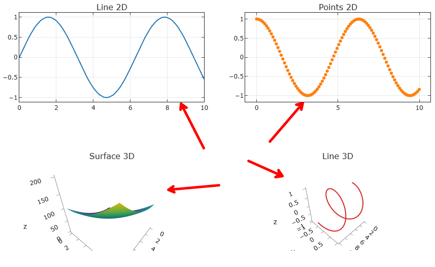
Thanks! I think that adjusting the coordinates solved the problem, because I really need to work with one figure, not in jupyter environment. So, I had to add 2 shapes.
I also had some struggle with the template="simple_white" setting, needing to set manually fillcolor, layerand opacity, but I think it worked in the end.
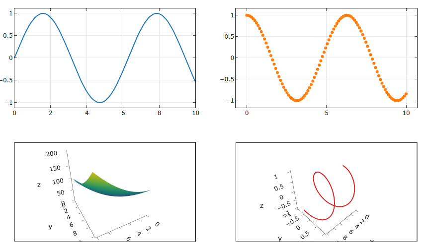
I final code became:
import numpy as np
import plotly.graph_objects as go
from plotly.subplots import make_subplots

x = np.linspace(0, 10, 100)
y = np.sin(x)
z = np.cos(x)

sh_x = np.linspace(0, 10, 100)
sh_y = np.linspace(0, 10, 100)
sh_x, sh_y = np.meshgrid(sh_x, sh_y)
sh_z = sh_x**2 + sh_y**2

fig = make_subplots(
    rows=2,
    cols=2,
    specs=[
        [{"type": "xy"}, {"type": "xy"}],
        [{"type": "scene"}, {"type": "scene"}],
    ],
)


fig.add_trace(
    go.Scatter(x=x, y=y, mode="lines"),
    row=1,
    col=1,
)
fig.add_trace(
    go.Scatter(x=x, y=z, mode="markers"),
    row=1,
    col=2,
)
fig.add_trace(
    go.Surface(z=sh_z, x=sh_x[0], y=sh_y[:, 0], colorscale="Viridis", showscale=False),
    row=2,
    col=1,
)
fig.add_trace(
    go.Scatter3d(x=x, y=y, z=z, mode="lines", line=dict(width=4)),
    row=2,
    col=2,
)
fig.update_layout(
    height=800,
    width=900,
    showlegend=False,
)


fig.add_shape(
    type="rect",
    xref="paper",
    yref="paper",
    x0=0,
    y0=0,
    x1=0.45,
    y1=0.425,
    line=dict(color="black", width=1),
    layer="below",
    fillcolor="white",
    opacity=1.0,
)

fig.update_layout(
    template="simple_white",
    plot_bgcolor="white",
    height=500,
    margin=dict(l=50, r=40, t=30, b=0),
)

fig.update_xaxes(mirror="allticks", ticks="inside", showgrid=True)
fig.update_yaxes(mirror="allticks", ticks="inside", showgrid=True)


fig.add_shape(
    type="rect",
    xref="paper",
    yref="paper",
    x0=0.55,
    y0=0,
    x1=1,
    y1=0.425,
    line=dict(color="black", width=1),
    layer="below",
    fillcolor="white",
    opacity=1.0,
)

fig.show()
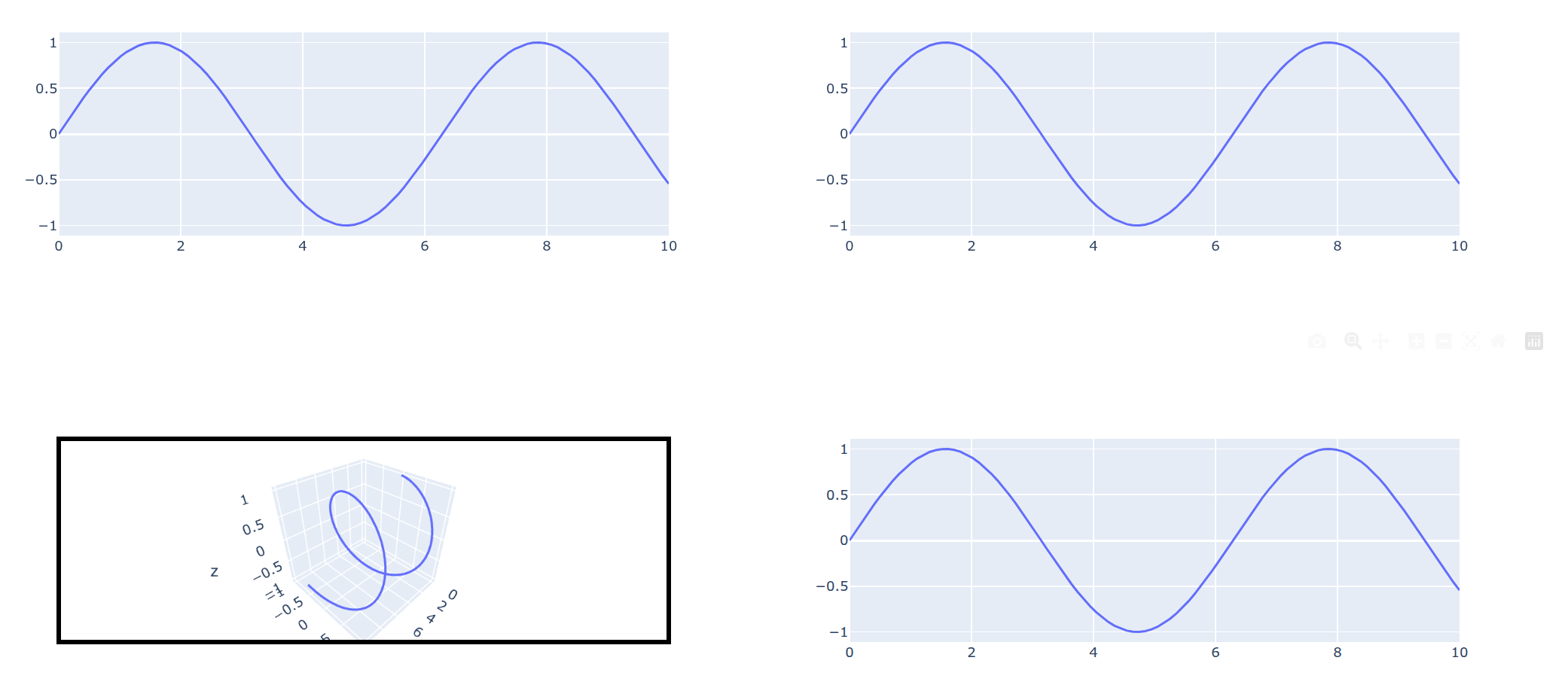
With result: