I have a candlesticks chart of some stock in plotly python. The picture is below:
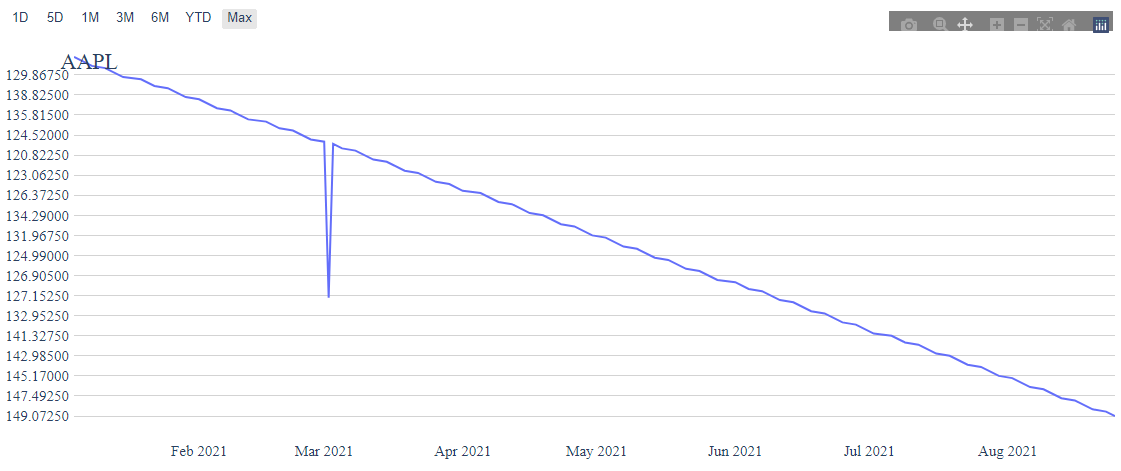
This is working fine. But when I tried to add a line chart. Everything scattered. The picture is below:
Is there any way to make it correct? Below is my code:
response = response.json()['values']
ts = pd.DataFrame.from_records(response)
fig = go.Figure(data=[go.Candlestick(x=ts['datetime'],
                                         open=ts['open'],
                                         high=ts['high'],
                                         low=ts['low'],
                                         close=ts['close'],
                                         line=dict(width=1))])

 response_ti = response_ti.json()['values']
 df_ti = pd.DataFrame.from_records(response_ti)
 fig.add_trace(go.Line(x=df_ti['datetime'],y=df_ti[technical_indicator],))
Apart from a (potential) deprecation warning, I think this would do the trick:
response = response.json()['values']
ts = pd.DataFrame.from_records(response)

response_ti = response_ti.json()['values']
df_ti = pd.DataFrame.from_records(response_ti)

fig = go.Figure(
    data=[
       go.Candlestick(
           x=ts['datetime'],
           open=ts['open'],
           high=ts['high'],
           low=ts['low'],
           close=ts['close'],
           line=dict(width=1)
       ),
       go.Line(
            x=df_ti['datetime'],
            y=df_ti[technical_indicator],
       ),
    ]
)
(Tested on v5.0.0)
@jlfsjunior I have changed according to your answer. The error is still there. Do you have any other solution. I’m stuck with this part.
ts = pd.DataFrame.from_records(response)
if technical_indicator:
   response_ti = requests.request("GET", url_ti)
   if response_ti:
       response_ti = response_ti.json()['values']
       df_ti = pd.DataFrame.from_records(response_ti)
       fig = go.Figure(data=[go.Candlestick(x=ts['datetime'], open=ts['open'], high=ts['high'],
                                             low=ts['low'], close=ts['close'], line=dict(width=1)
                                             ),
                              go.Line(x=df_ti['datetime'], y=df_ti[technical_indicator])])
   else:
        fig = go.Figure(data=[go.Candlestick(x=ts['datetime'], open=ts['open'], high=ts['high'],
                                             low=ts['low'], close=ts['close'], line=dict(width=1))])
I am not sure what could be the problem to be honest… Here’s my own reprex:
import pandas as pd
import plotly.graph_objects as go

import pandas_datareader as web

df = web.data.DataReader('GOOG', 'yahoo', "2021-01-01", "2021-08-25").reset_index()

fig = go.Figure(
    data=[
        go.Candlestick(
            x=df['Date'],
            open=df['Open'],
            high=df['High'],
            low=df['Low'],
            close=df['Close'],
            line=dict(width=1),
        ),
        go.Line(
            x=df['Date'],
            y=df['Volume'] / 5_000,
        )
    ]
)

fig.show()
Output:
It could be something different in df_ticompared to ts (in my case they are the same df), like different timestamps… Which version of plotly are you on?
I used the same data frame too, but it still showing that faulty chart. I’m using plotly latest version.
@jlfsjunior Greetings, I created the line chart using the data, I’m getting from the API and it is generating that kind of chart.
Here is the data head I’m printing.
Now what should I do to fix this chart.
@jlfsjunior Hello, Thanks for the help. I have figured it out. Actually the data I’m gettting from the API is in string from. I converted this to float and everything works fine. Thanks again.
Kemmer
August 28, 2021, 9:35am
10
Thanks for update and quick reply. I’ll be sure to keep an eye on this thread. Looking for the same issue.
kroger feed schedule
@Kemmer Please check your data types, as it was pointed out as the problem .