Hi all,
FIrst time using Plotly. I’ve put together a map of New York using a portion of the following data, and have added in County/FIPS information: US Accidents (2016 - 2021) | Kaggle
It is starting to take shape, so I have had a go at adding some color to it (see below).
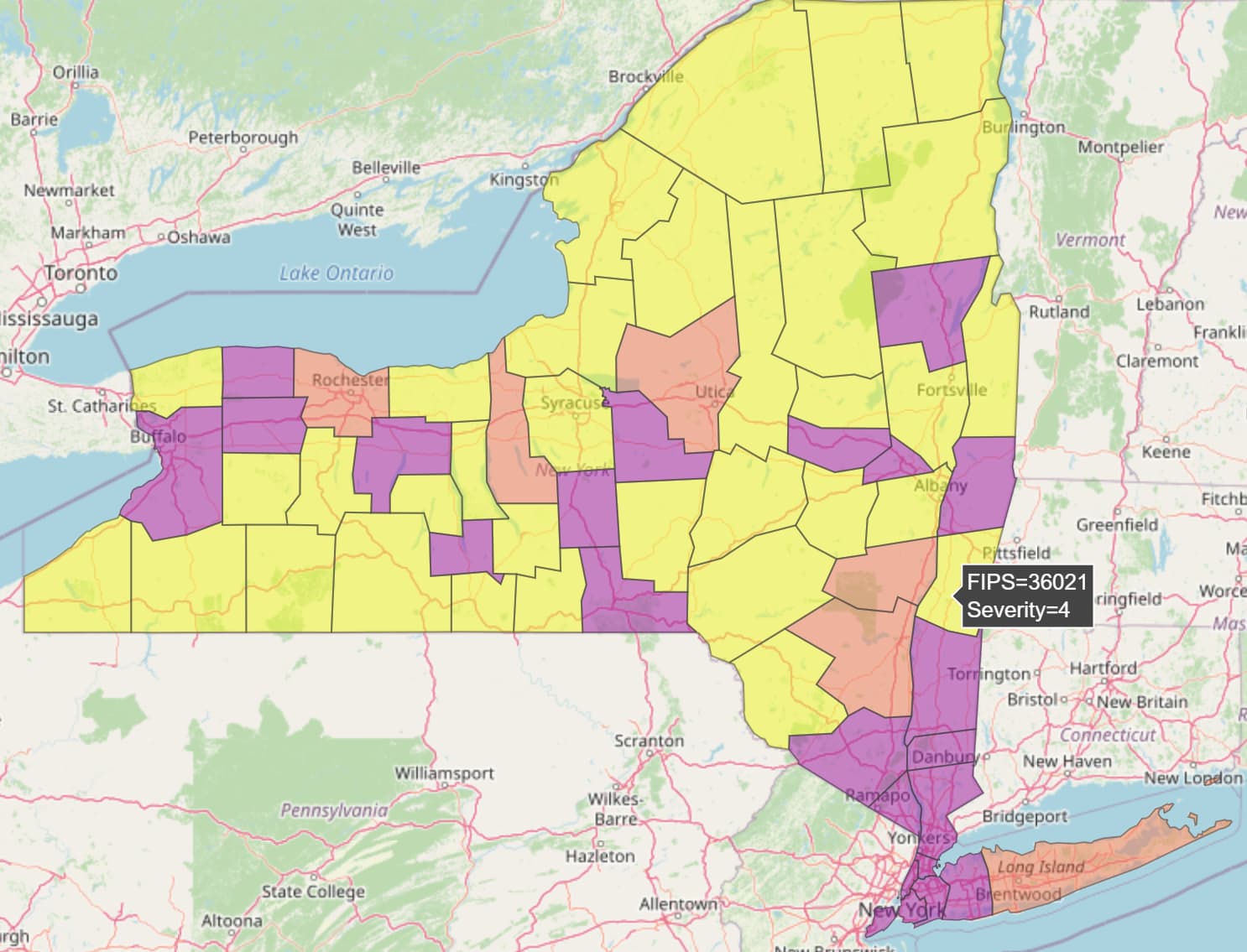
I used a column called Severity to do this, which returns a number between 1 and 4.
I am trying to understand how the color has been assigned:
Pictured you can see that FIPS 36021 has a Severity of 4. If I look at the data for 36021, there are 279 rows with an average of 2.3 (there are 12 rows with a value of 1, 216 x 2, 7 x 3, and 44 x 4).
It seems like this should be showing a Severity of 2 - Can anyone shed some light on how this might be working? Any help would be greatly appreciated!
Thank you