How can I reverse the numerical order on color bar

Hello everyone, I have a question regarding the color bar legend for graphs involving continuous color scales.

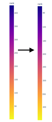
I was wondering if there is a way for me to reverse the order of the color bars, such that the lowest numbers are on the top and the highest numbers are on the bottom.

I have tried using:
fig.update_coloraxes(reversescale=True)
However, it only reversed the color scale and not the numerical scale.

I am more so trying to accomplish something like this:

Hi @Conor ,

As far as I know, that feature is not available in built-in right now.

But it does not mean impossible.

The possible solution that came up into my mind is by creating 2 same plot objects , Scatter as example.
After that, by using those 2 plot objects you can :

  1. set the first plot to display the colorbar with reverse range color scale using labelalias attribute.
  2. the second plot has role to show the trace only. You need to reverse the colorscale using reversescale=True and hide the colorbar of second plot using showscale=False .

Here the code of those scenario

import plotly.graph_objects as go
import numpy as np

y_data =  [10,20,30,40,50,60,70,80,90,100]
x_data = [10,20,30,40,50,60,70,80,90,100]
tickvals = [0, 25, 50, 75, 100]
reverse_labelalias = dict([(k,str(v)) for k,v in zip(tickvals,sorted(tickvals, reverse=True))])

fig = go.Figure(data=[
   	# First plot to show the colorbar only
   	go.Scatter(
   	    y = y_data,
   	    x = x_data,
   	    mode='markers',
   	    name='',
   	    marker=dict(
   		        size=16,
   		        color=y_data,
   		        showscale=True,
   		        colorbar=dict(
   		        title="Rank",
   		        tickmode="array",
   		        tickvals= tickvals,
   		        labelalias= reverse_labelalias,
   	    	)
   	    )
   	),

   	# Second plot to show the trace only
   	go.Scatter(
   	    y = y_data,
   	    x = x_data,
   	    mode='markers',
   	    name='Rank',
   	    marker=dict(
   		        size=16,
   		        color=y_data,
   		        reversescale=True,
   		        showscale=False,
   		        colorbar=dict(
   		        title="Rank",
   		        tickmode="array",
   		    )
   	    )
   	)
   ]
)

fig.update_layout(showlegend=False, title="Reverse Range Scale")

fig.show()

Hope this help you.
2 Likes

I am trying this idea out right now. My interface is using px, so I have been trying to re-work this solution with plotly express in mind. Right now I am trying to overlay the coloraxis/colorbar from another graph, however, it seems to not be working as expected.

As of now the problem is that the colorbar from legendTrace isn’t showing. Is there something that I am doing wrong that prevents this from working?

My code is as follows:

fig = px.scatter(df_melted, x="value", facet_col_spacing=0.04, y="y", facet_col="feature",color='rank',color_continuous_scale='Plasma_r', facet_col_wrap=2,custom_data=['id'], hover_data={'id': True},  category_orders={ 
                    "feature": [feature + "_v" for feature in features]})
fig.update_coloraxes(showscale=False)
fig.update_yaxes(matches=None)
 trendFig = px.scatter(df_melted, x="value", facet_col_spacing=0.04, y="y", facet_col="feature",  facet_col_wrap=2, trendline="ols", category_orders={ 
                    "feature": [feature + "_v" for feature in features]}) 
legendTrace = px.scatter(df_melted, x="value", facet_col_spacing=0.04, y="y", facet_col="feature",color='rank',color_continuous_scale='Plasma', facet_col_wrap=2,custom_data=['id'], hover_data={'id': True},  category_orders={ 
                    "feature": [feature + "_v" for feature in features]})
 trendFig.update_traces(visible=False, selector=dict(mode="markers"))
 legendTrace.update_traces(visible=False, selector=dict(mode="markers"))
 legendTrace.update_coloraxes(showscale=True)
 fig.add_traces(trendFig.data)
 fig.add_traces(legendTrace.data)


I apologize if my code is a bit messy, I am fairly new to dash/plotly as a whole.

Hi @Conor ,

Try to change last five lines into lines below:

trendFig.update_traces(visible=False, selector=dict(mode="markers"))
# comment a line below
# legendTrace.update_traces(visible=False selector=dict(mode="markers"))
legendTrace.update_coloraxes(showscale=True)
# switch position 2 last lines
fig.add_traces(legendTrace.data)
fig.add_traces(trendFig.data)

Unfortunately it is still not working; would you know of an alternative way of going about this?

Hi @Conor ,

Here the code with Plotly Express version.

import plotly.express as px
import pandas as pd 


df = pd.DataFrame({'x_data':[10,20,30,40,50,60,70,80,90,100],'y_data':[10,20,30,40,50,60,70,80,90,100]})
tickvals = [0, 25, 50, 75, 100]
reverse_labelalias = dict([(k,str(v)) for k,v in zip(tickvals,sorted(tickvals, reverse=True))])

# First plot to show the colorbar only
fig = px.scatter(df, x="x_data", y="y_data")
fig.update_traces(marker=dict(
			        size=16,
			        color=df["y_data"],
			        showscale=True,
			        colorbar=dict(
			        title="Rank",
			        tickmode="array",
			        tickvals= tickvals,
			        labelalias= reverse_labelalias,
		    	)
		    ))
# Second plot to show the trace only
fig1 = px.scatter(df, x="x_data", y="y_data")
fig1.update_traces(name='Rank',
		    marker=dict(
			        size=16,
			        color=df["y_data"],
			        reversescale=True,
			        showscale=False,
				        colorbar=dict(
				        title="Rank",
				        tickmode="array",
				    )
			    )
		    )


fig.add_traces(fig1.data)

fig.update_layout(showlegend=False, title="Reverse Range Scale")

fig.show()

This seems to be working on a colab notebook! However, when I implemented the concept into my code, I get this weird error:

ValueError: Invalid property specified for object of type plotly.graph_objs.scatter.marker.ColorBar: β€˜labelalias’

                legendFig.update_traces(marker=dict(
			        color=df_melted["rank"],
			        showscale=True,
			        colorbar=dict(
			        title="Rank",
			        tickmode="array",
                    labelalias = reverse_labelalias,
			        tickvals = tickVal,
		    	)
		        ))

I am not sure what could be causing this; since the colab notebook is not having this issue.

Hi @Conor ,

Please check the version of your Plotly.
it is possible that the problem is version gap issue.