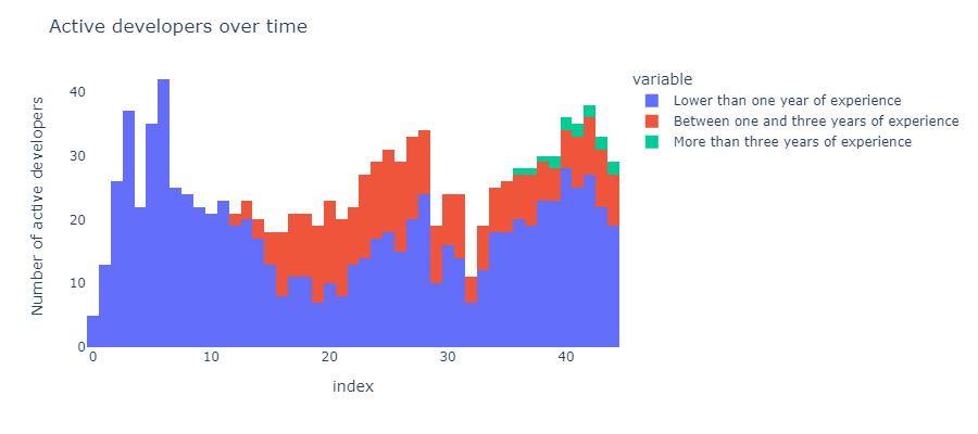
Here is the plot with your code and your data (except the color):
So I don’t know why you get gaps 
I stress again: your data are samples from discrete distributions (like binomial, geometric distribution, and so on), because each column consists in integer values. Hence there is no reason to illustrate their distribution estimation with a massive, not a real histogram with gaps.
But if you insist on such a presentation, then I can suggest just to reinstall Plotly. During the last days more questions have been addressed here on forum or as an issue on plotly.py repo, concerning unexpected behavior of different traces, and after reinstallation the issue disappeared.