Plotly Studio is backed by Plotly charts, so they are customizable to your heart’s content.
Theme vs Component Styles
There are two ways to style Plotly charts in Studio:
- The Theme chapter covers most styles and applies them throughout the app:
- Chart bar and line colors
- Grid Lines
- Typograph
- Within an individual chart, you can override these styles as well as customize additional aspects of your chart like:
- Ticks and labels
- Date formatting
- Hover text
- Legend placement
- and more!
Chart styles:
I like adding a Chart styles: section in the prompt so that I can re-use the entire section across multiple charts, projects, and even team members.
High Level Styles
These styles can be really high level, like:
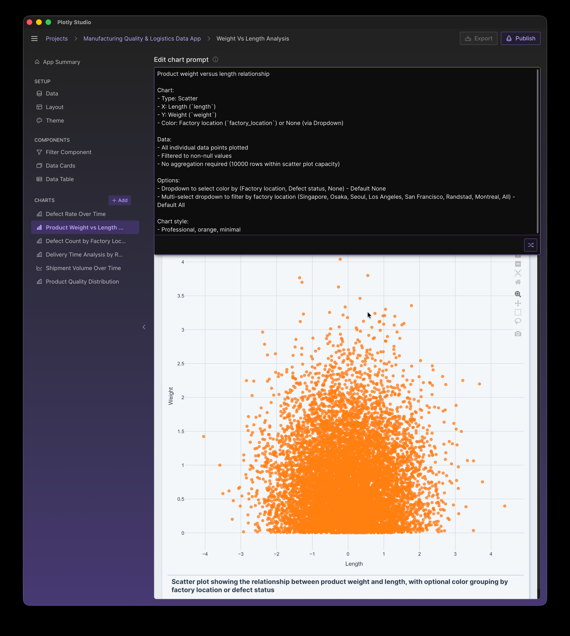
Chart style:
- Professional, orange, minimal
or
Chart style:
- Dark theme
- Neon colors
- Monospace fonts

High Level vs Detailed Styling
When you specify high level details, Plotly Studio will “fill in the details” with the exact color codes and definitions. It may have a different interpretation each time you create a new chart or remix an existing one - just like you’d get a different result if you gave high level instructions to a colleague.
However, if you supply more details - like the exact color codes - Plotly Studio will use those directly and your charts will be highly reproducible.
The details can be found by examining the spec or the code. A common workflow is to copy and paste details from the spec or the code back into the prompt to “lock down” the behavior with specific details.
For example, here is the auto-generated spec for the high level “Professional, orange, minimal” prompt. Note how it includes the exact hex codes:
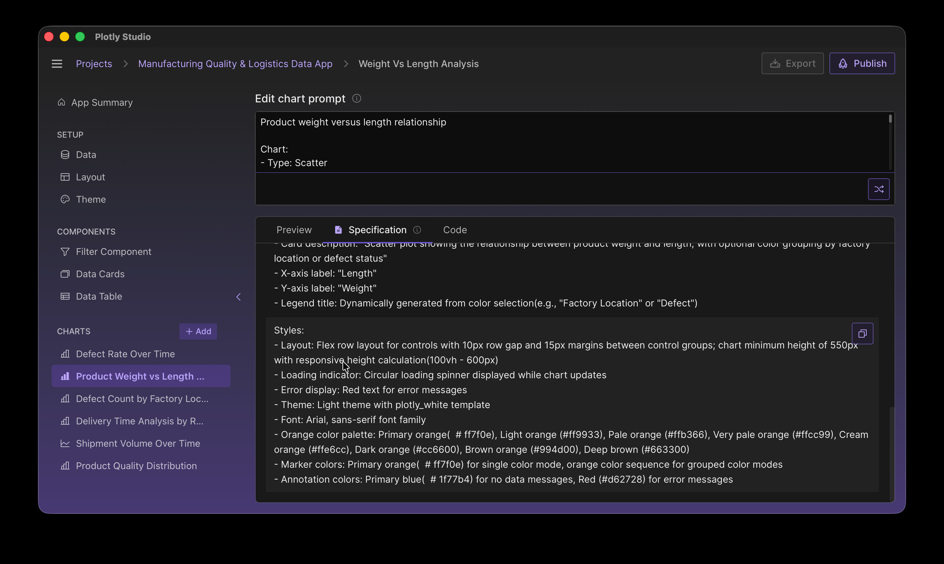
Styles:
- Layout: Flex row layout for controls with 10px row gap and 15px margins between control groups; chart minimum height of 550px with responsive height calculation(100vh - 600px)
- Loading indicator: Circular loading spinner displayed while chart updates
- Error display: Red text for error messages
- Theme: Light theme with plotly_white template
- Font: Arial, sans-serif font family
- Orange color palette: Primary orange(  # ff7f0e), Light orange (#ff9933), Pale orange (#ffb366), Very pale orange (#ffcc99), Cream orange (#ffe6cc), Dark orange (#cc6600), Brown orange (#994d00), Deep brown (#663300)
- Marker colors: Primary orange(  # ff7f0e) for single color mode, orange color sequence for grouped color modes
- Annotation colors: Primary blue(  # 1f77b4) for no data messages, Red (#d62728) for error messages
Highly Specific
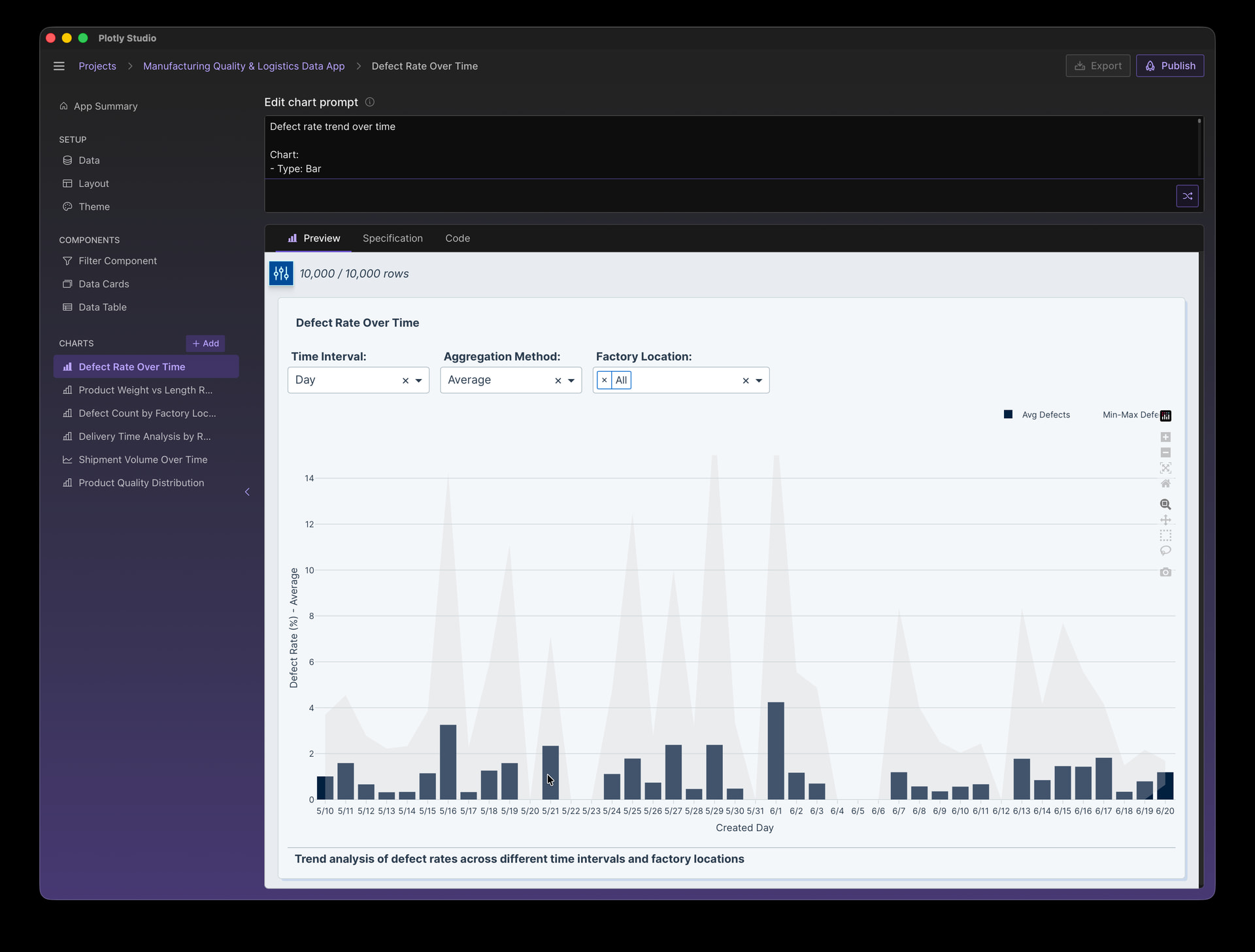
Here’s a default time series chart in Plotly Studio:
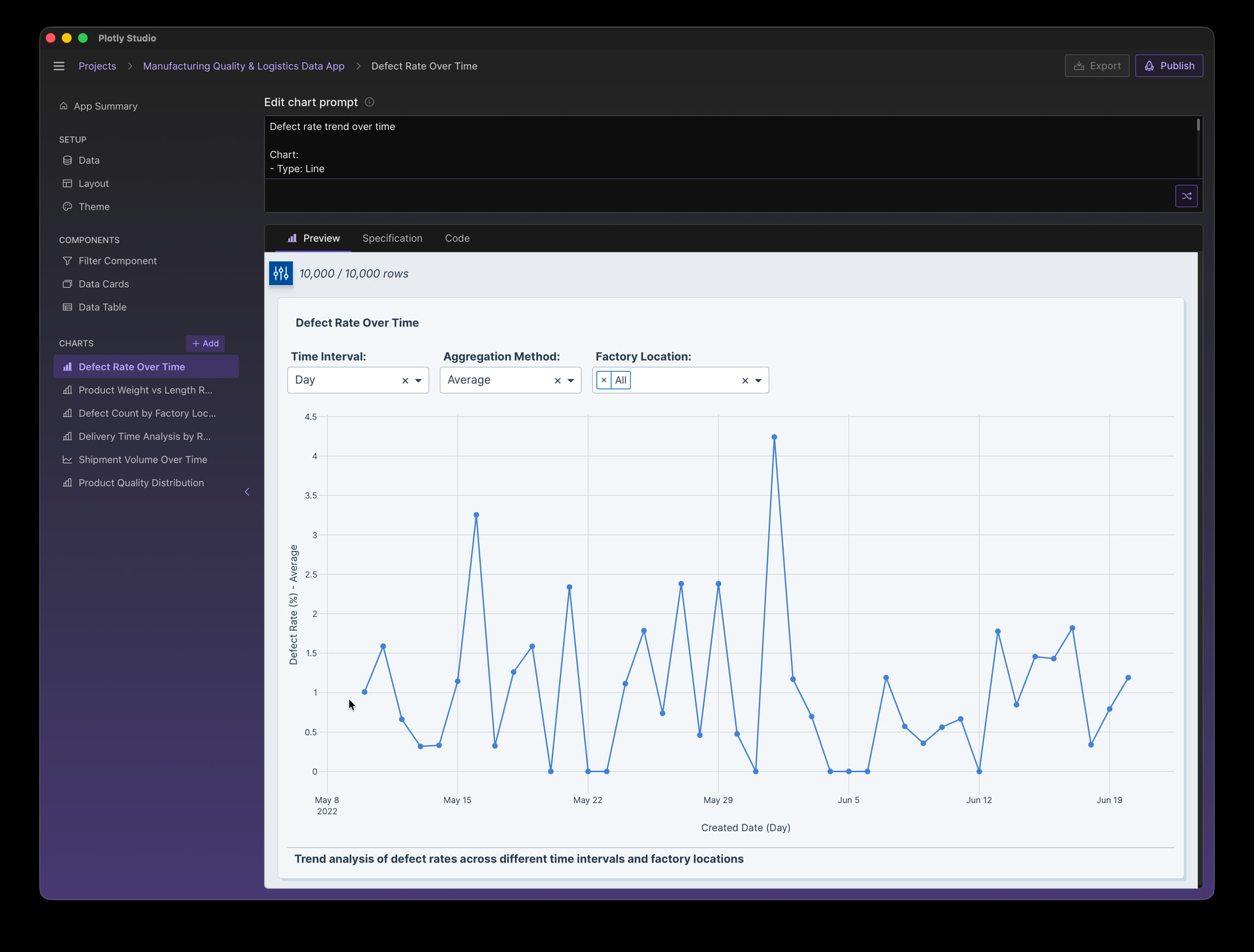
Now let’s customize this in several ways:
Styles:
- No vertical gridlines
- Date format: "5/8"
- X Title: "Created Day"
- Line and marker color- Navy: `#001f3f`
- Y axis range: 0 to 15
- Additional area band in light grey that displays minimum and maximum around the points
- Display legend in the top right corner and horizontal
- Legeld Labels: bar: "Avg Defects", area: "Min-Max Defects"
- Display x-axis labels for every day
- Include tick marks
Styles in the Spec File
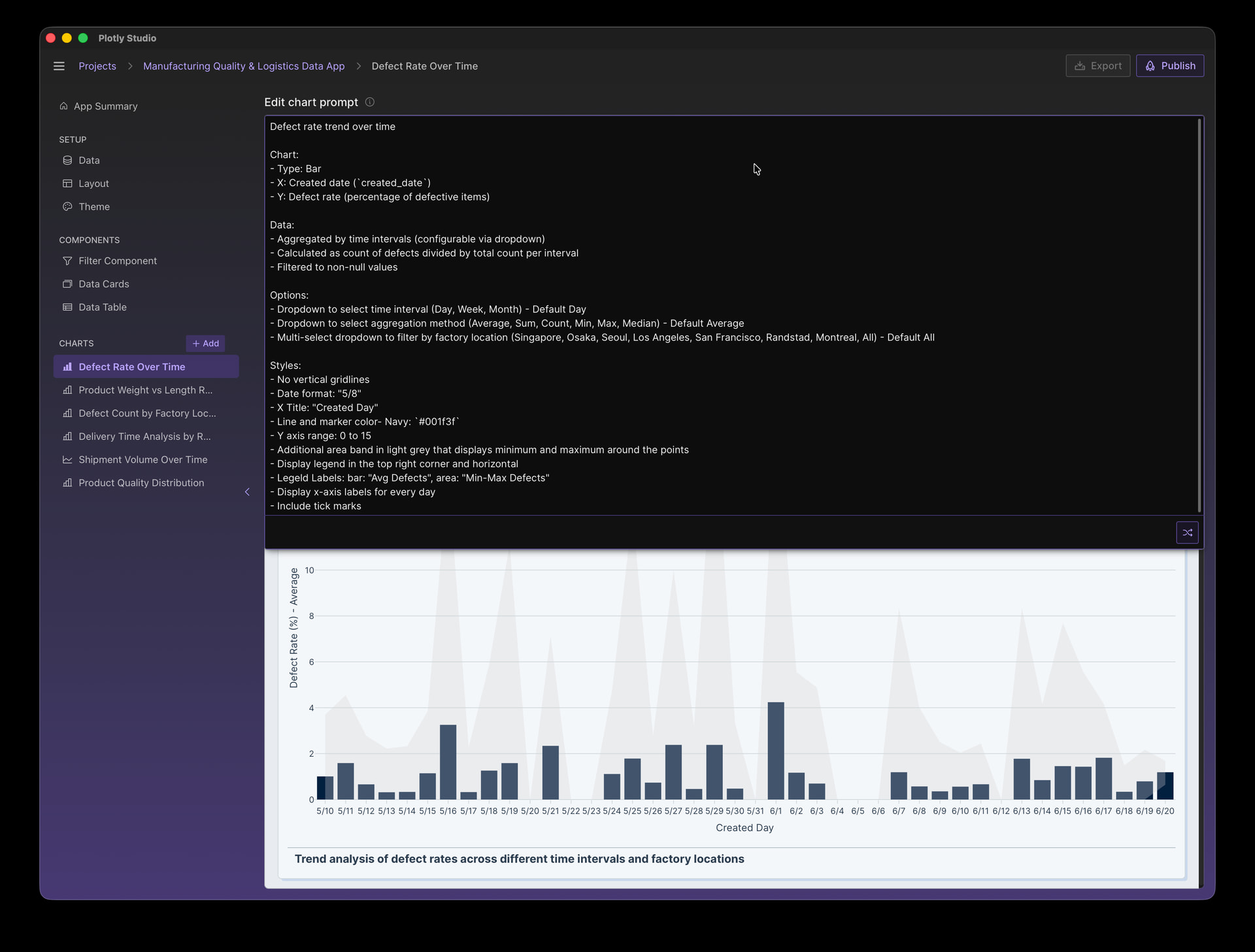
Even when we’re highly specific about our styles, it can be helpful to examine the spec file and how the style definitions were auto-generated.
For the example above, the spec file shows us the chart styles in even more precise language, filling in the details like the exact color codes, the exact date format, and the exact legend position:
Styles:
- X-axis: Grid hidden, date format "%-m/%-d", tick interval set to 86400000 milliseconds(1 day), ticks displayed outside the plot area
- Y-axis: Fixed range from 0 to 15
- Range area(when "All" selected): Semi-transparent gray fill(rgba(211, 211, 211, 0.3)), zero-width lines, legend entry labeled "Min-Max Defects", no hover
- Legend: Horizontal orientation, positioned above chart(y=1.15), anchored to top-right(yanchor="top", xanchor="right", x=1)

So in our prompt we says “legend in the top right corner”. Plotly Studio translated that into a position “y=1.15, yanchor=“top”, xanchor=“right”, x=1”. If we wanted to modify this, we could copy and paste this exact definition into our prompt and modify the numbers.
Similarly with colors. In our prompt we said “light grey”. Plotly Studio used the color “Semi-transparent gray fill(rgba(211, 211, 211, 0.3)”. If we wanted a different grey, we could take this exact color and paste it back into our prompt and change it there.
This is one the things I love most about working with AI and Plotly Studio - you are able to work in language that is as high level or highly detailed as you’d like. Plotly Studio will show you the exact details in the spec file, so even if you work with high level language in the first pass you can make it more precise in your second pass by seeing how Plotly Studio interpreted your request in the Specification tab.
Making Edits - Patching, Regenerating, and Remixing
When you make a change to your prompt, Plotly Studio will attempt to “patch” the code and visualization based off of the change that you made in your prompt rather than generating it from scratch. This has two advantages:
- Other important elements of your chart - like the data analytics, the dropdowns, etc - shouldn’t change
- It’s faster, because only a few lines of code will change rather than regenerating the entire chart
If the generation gets “stuck” - where you aren’t seeing your changes reflected in the output - then you have two options:
- Create a new chart with the entire prompt to have a fresh generation
- Click the prompt button without making any edits to the prompt. This button will turn in to the remix button:
 which will do an entirely new generation rather than patching (since there was no prompt change to patch)
The Advantage of Styling in Prompts
I really enjoy writing these prompts. There a few amazing things that a prompt-based workflow enables:
- Reproducibility and sharing - I save sections of my prompts - like styles - to reuse in other charts and projects. Since it’s just text, it’s really portable. I can also easily share these with colleagues or publish them online or in internal wikis. It’s like writing functions in code, but even easier because I don’t need to worry about the exact contracts and backwards compatibility.
- Fuzzy syntax - I forget the exact properties in the Python library for styling charts. We have great documentation in Single-page reference in Python, but it’s nice to be able to just say “place the legend in the top right corner and make it horizontal” without needing to remember the exact syntax.
- All of the styling overrides in one place - When I work with GUI based software, it can be tricky to see exactly what changed as the options are hidden behind hundreds of menus. In these prompts, all of the details are just right there.
Additional Resources
- Plotly Studio Documentation: Overview - Plotly Documentation
- Plotly Python Reference Documentation - this can be helpful to see even more examples and understand exactly what properties are available “under the hood”. Single-page reference in Python
Hope this helps! If you have trouble styling your chart just how you want it, make a new topic in the forum and we can try to help you out ![]()