Hello
I am trying to create a Scatter Plot type graph focused on country FRANCE. I have latitude and longitude along with Province name with price and number of records. I am looking for a graph similar to the below.
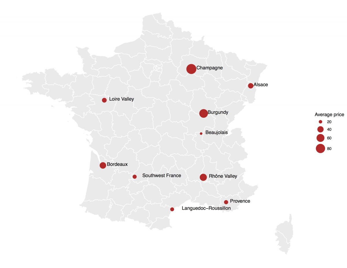
Data is as follow
country,lat,lon,province,price,total
France,43.185395,3.155021,Languedoc-Roussillon,1,1082
France,43.47198,6.005143,Provence,2,1021
France,44.469596,4.801154,Rhône Valley,3,1318
France,44.493923,1.173853,Southwest France,4,1601
France,44.946792,-0.503963,Bordeaux,5,6111
France,46.224982,4.685808,Beaujolais,6,532
France,47.032347,4.817344,Burgundy,7,4308
France,47.563005,-0.4289267,Loire Valley,8,1786
France,48.142572,7.306696,Alsace,9,1680
France,48.815661,4.169706,Champagne,4,1370
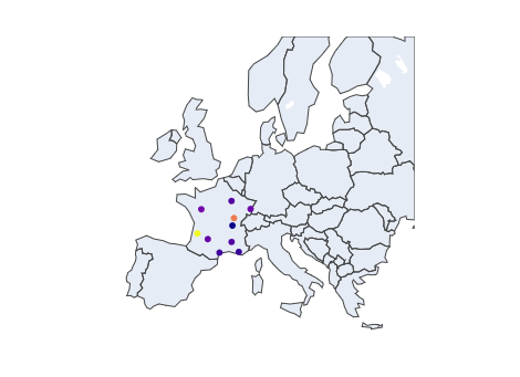
I have the below python code, but it doesn’t focus on just FRANCE, didn’t find any options to limit to FRANCE.
import numpy as np

df_frn1 = pd.DataFrame({'country' : np.array(['France', 'France', 'France', 'France', 'France', 'France', 'France', 'France', 'France', 'France' ]),
                                 'lat' : np.array([43.185395, 43.471986, 44.469596, 44.493923, 44.946792,46.224982,47.032347, 47.563005, 48.142572 ,48.815661]),
                                 'lon' : np.array([ 3.155021,  6.005143,  4.801154,  1.173853, -0.503963, 4.685808 ,4.817344 ,-0.4289267 ,7.306696,  4.169706]),
                                 'province' : np.array(['Languedoc-Roussillon','Provence','Rene Valley','Southwest France','Bordeaux','Beaujolais','Burgundy','Loire Valley','Alsace', 'Champagne']),
                                 'price' : np.array([1,2,3,4,5,6,7,8,9,7]),
                                 'total' : np.array([1082,1021,1318,1601,6111,532,4308,1786,1680,1370 ])
                                })

df_frn1


import plotly.graph_objects as go
import pandas as pd

fig = go.Figure(data=go.Scattergeo(
    lon = dfrn1['lon'],
    lat = dfrn1['lat'],
    text = dfrn1['province'],
    mode = 'markers',
    marker_color = dfrn1['price'],
))

fig.update_layout(
    title = 'Average price by Provience',
    geo_scope = 'europe'
)

fig.show()
Output of the above code is the following graph
Can you help me to create the graph similar to first one for above data set.